
Authors:


Introduction
In this final article of our series on building an end-to-end Transaction Cost Analysis (TCA) framework, we focus on leveraging the enriched dataset deriving from the data enrichment module process discussed previously. Our goal here is to present a detailed analysis using a variety of metrics and benchmarks to understand the costs involved in trading financial instruments. In addition to analysing these costs, we'll introduce a User Interface (UI) that implements a presentation layer visualizing our findings using Streamlit. This UI will allow us to access both an overall summary and detailed company-level insights.
The following short video demonstrates the capabilities of our application:
Application Workflow
First, let’s look into the application workflow to understand how the analysis and visualisation is implemented. The diagram below presents the high-level workflow starting from the user triggering the analysis through the appropriate UI connected to the visualization layer.
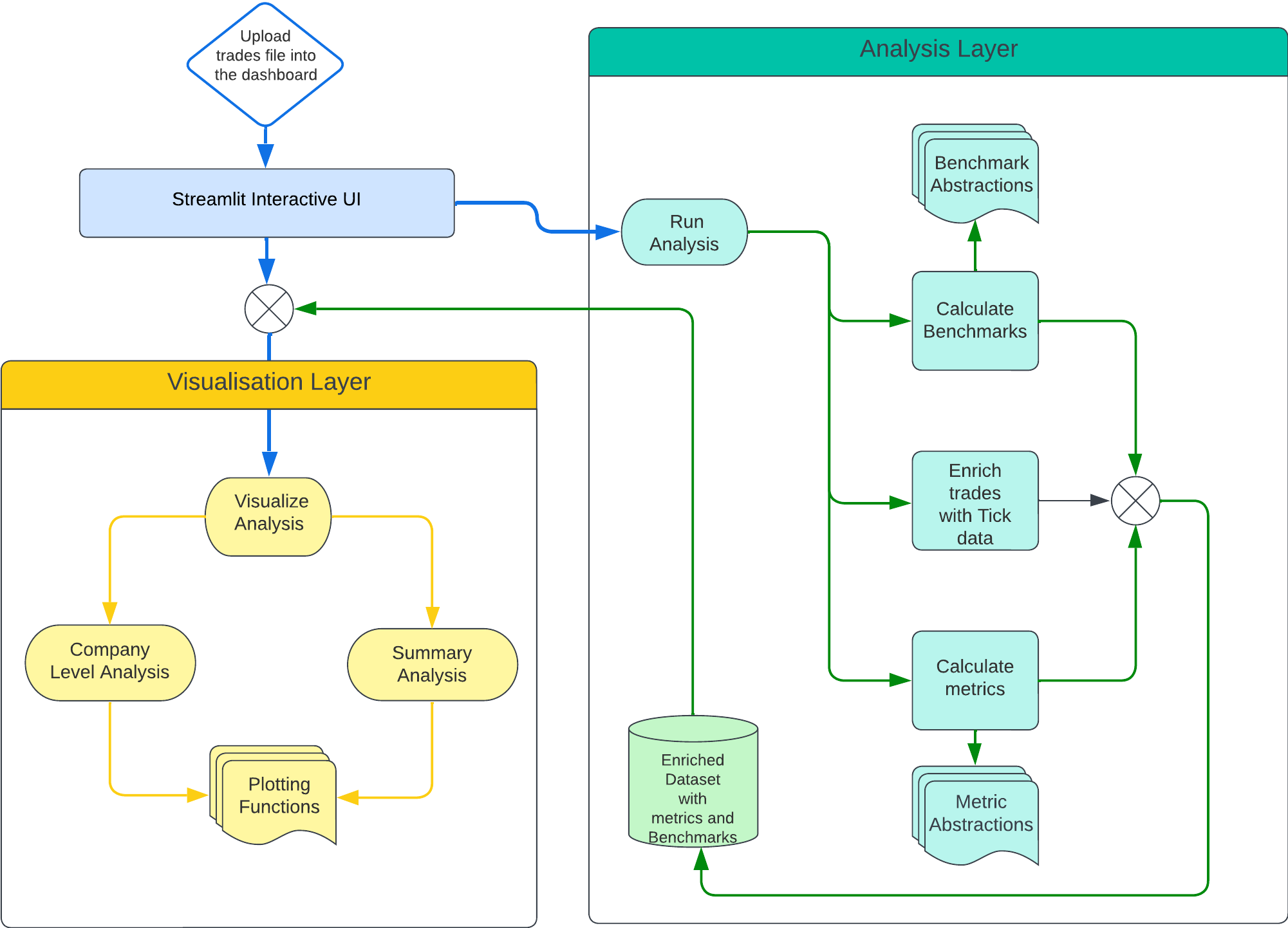
After the user uploads their trades dataset, the process begins with Streamlit activating the Analysis module. This initial step enriches the trades by incorporating previously extracted tick data. Following that, the module proceeds to calculate a comprehensive array of metrics and benchmarks, enriched with calculated insights. Upon completion of these calculations, Streamlit initiates the Visualization layer, supplying it with the augmented dataset.
Within the Visualization layer, we build a variety of plots, both at the company level and in various levels of aggregations. These visual representations are then showcased on the Streamlit dashboard, providing users with an intuitive and detailed view of their data.
Once the trade is uploaded the following function from StreamLitVisualisation object is called to trigger the analysis and the visualisation layers:
def perform_analysis(self):
if self.uploaded_file:
trades_df = pd.read_csv(self.uploaded_file)
tca_result_df = self.tca_analysis(trades_df, 100)
tca_result_df = self.add_datetime_components(tca_result_df)
tca_result_df = self.add_latency_duration_components(tca_result_df)
self.visualise_analysis(tca_result_df)
Analysis Layer
The analysis layer is triggered by tca_analysis function which in turn calls the run function of the TCAAnalysis singleton object where we have encapsulated the analysis logic.
The run function is designed to process and analyze a dataset of trades.
def run(self, trades_df, arrival_latency, benchmark_classes, metric_classes):
enriched_data = self.enrich_data_with_market_trades(trades_df)
enriched_data['arrival_time'] = pd.to_datetime(enriched_data['signal_time']) + timedelta(milliseconds=arrival_latency)
rics = enriched_data['RIC'].unique()
for ric in rics:
signals = enriched_data.loc[(enriched_data['RIC'] == ric)]['signal_time'].unique()
for signal_time in signals:
trades_ric = enriched_data.loc[((enriched_data['signal_time'] == signal_time) & (enriched_data['RIC'] == ric))]
trades_before_arrival = trades_ric.loc[trades_ric['arrival_time'] > trades_ric['trade_time']]
trades_ric = self.calculate_becnmarks(trades_ric, trades_before_arrival,benchmark_classes)
trades_ric = self.calculate_metrics(trades_ric, metric_classes)
self.df_analytics = pd.concat([self.df_analytics, trades_ric])
return self.df_analytics
The function begins by enriching the trades data with market trades through the enrich_data_with_market_trades function. This function reads previously extracted files from a folder we have prepared during the trade enrichment step and then merges those with the supplied trade data. Following this enrichment, the function adjusts the arrival time of the trades by adding a specified latency to the signal time, accounting for the delay between the signal generation and its actual arrival in the market order book.
The function then iterates over each unique RIC in the enriched dataset. For each RIC, it filters the generated signals further narrowing down the dataset on unique signal times, to ensure that each trade is accurately aligned with its corresponding market condition.
For trades associated with each signal time and RIC, the function identifies those occurring before the calculated arrival time to separate the last seen trades before the arrival of the order in the matching engine. It then applies a series of benchmarks to these pre-arrival trades. Similarly, metrics are calculated on actual trades using our library of metric classes, applying analytical methods to assess the trade performance and price impact.
Both the benchmarks and metrics are derived from a list of classes provided to the function. We have also built an abstract class for benchmarks and metrics to enable extensibility and to ensure consistency amongst all subclasses implementing these methods.
class MetricBenchmarkBase(ABC):
@property
@abstractmethod
def name(self):
pass
@abstractmethod
def calculate(self, trades):
pass
The MetricBenchmarkBase class introduces two key components essential to all our metric and benchmark calculations, the name property acting as a unique id and the calculate method, designed to take a dataset of trades and perform a calculation that yields the benchmark's/metric’s value.
Following the definition of the abstract class, let’s also present how a subclass would inherit from it to implement benchmarks and metrics.
class ArrivalPriceBenchmark(MetricBenchmarkBase):
@property
def name(self):
return 'arrival_price'
def calculate(self, trades_before_arrival):
try:
return trades_before_arrival['Price'].iloc[-1]
except IndexError:
return np.nan
This subclass provides implementations for the abstract methods inherited from MetricbenchmarkBase. The name property returns the string 'arrival_price', while the calculate method takes a dataset of trades that occurred before the arrival of a new trade and calculates the benchmark's value which is the price of the last trade before the arrival, representing the "arrival price" of the asset.
class SlippageMetric(MetricBenchmarkBase):
@property
def name(self):
return 'slippage'
def calculate(self, trades_ric):
return ((trades_ric['trades_vwap'] - trades_ric['signal_price'])*trades_ric['position'])/trades_ric['trades_vwap']*10000
Similarly, in SlippageMetric , the name property returns the string 'slippage’. The calculate method then implements the specific logic to calculate slippage using the volume-weighted average price (VWAP) of executed trades, the signal price and the position (indicating whether the trade was a buy or sell, and its size), normalising and returning the result in basis point scale.
This structure allows for a flexible and extendable approach to benchmark and metric calculations, where different types of benchmarks can be implemented by simply implementing new subclasses inheriting from MetricBenchmarkBase.
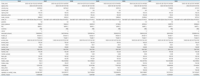
The result of the Analysis module is an aggregated dataframe which includes the enriched trades with computed metrics and benchmarks ready for further visualization. Below we show the Transposed version of the dataframe for single order id to get the flavour of the enriched dataframe:
df.loc[df['order_id'] == 'f2e1c8b7-e21c-4df9-8238-00acc47c40c3'].T
Visualization Layer
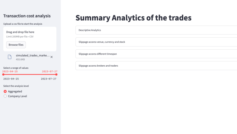
After the enriched dataframe is calculated, the perform_analysis function of the StreamLitVisualisation object adds several supplementary components (date, time, duration) and triggers the visualisation layer by calling the following function:
def visualise_analysis(self, data):
start_date, end_date = st.sidebar.slider('Select a range of values', data_trades['date'].min(), data_trades['date'].max(),
(data_trades['date'].min(), data_trades['date'].max()))
select_component = st.sidebar.radio(
"Select the analysis level",
("Aggregated", "Company Level")
)
if select_component == "Company Level":
selected_company = st.sidebar.selectbox(
"Select a Company",
data['RIC'].unique(),
)
filtered_data_company = data[(data['RIC'] == selected_company) &
(data['date'] >= start_date) &
(data['date'] <= end_date)]
self.render_company_level_analysis(filtered_data_company)
elif select_component == "Aggregated":
filtered_data_agg = data[(data['date'] >= start_date) &
(data['date'] <= end_date)]
self.render_aggregated_analyis(filtered_data_agg)
This function implements the UI for TCA. The UI facilitates dynamic interaction, allowing users to filter and view the analysis based on specific criteria, including date ranges and analysis levels.
Following date selection, the user can select the granularity of the analysis: "Aggregated" and "Company Level". Below is the screenshot of the respective page:
Aggregated Analysis
"Aggregated" analysis filters the entire dataset based on the selected date range without differentiating by company. A dedicated dashboard is generated using render_aggregated_analysis, offering several views to analyze slippage across time, assets, venue, currency, and brokers/traders. The render_aggregated_analysis function and it’s dependencies can be viewed directly from the source code here. Now let’s look into some of the visualisations of the aggregated view:
The screenshot below demonstrates the analysis of slippage across different trading venues, currencies, and stocks, revealing interesting patterns in the data. Notably, the London Stock Exchange (LSE) exhibits the lowest slippage levels, reflected also in currency level analysis for GBp. This contrasts with higher slippage observed for trades executed on Euronext Amsterdam and Paris, denominated in EUR. Among the LSE-traded stocks, BARC.L and VOD.L stand out for their relatively low average slippage of 6.1 basis points (bp) and 4.9bp, respectively. Conversely, ORAN.PA experiences the highest slippage at 10.28bp, with SHEL.AS and BNPP.PP also showing significant slippage above 9bp.
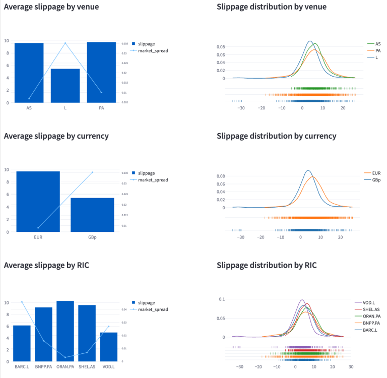
Interestingly, despite LSE stocks presenting a higher spread, they have lower slippage, a finding that might seem counterintuitive at first glance. Further investigation into the order books of BARC.L and BNPP.L sheds light on this. BARC.L's offers higher liquidity, and it can accommodate larger volumes more easily, often without needing to go beyond 6 levels in the order book when executing a market order. In contrast, filling significant volumes for BNPP frequently requires delving through all 10 levels of the order book. This highlights that while a narrow spread is typically linked to lower slippage under normal market conditions, this relationship can be influenced by several factors, including market liquidity, volatility, and the size of the orders.
Additionally, the screenshot presents a distribution of slippage across various assets, currencies, and stocks to provide a comprehensive overview of slippage dynamics in different market segments.
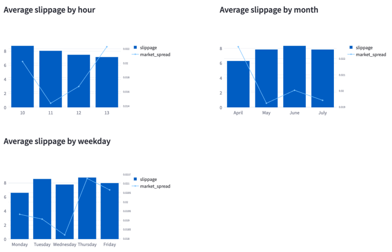
The subsequent screenshot, which details slippage across time, day, and month, indicates that slippage tends to be higher during the first half of the day, with a gradual decrease as the day progresses. Furthermore, it's observed that, on average, Monday's experience lower slippage, while Thursdays experience the highest. This overview provides only a snapshot of slippage trends and more in-depth analysis might be needed to uncover the underlying factors contributing to these patterns.
Company level analysis
Upon selection of "Company Level", a dropdown menu appears to select a company. Upon selecting a company, the function filters the dataset to include only the trades associated with the chosen company for dashboard purposes, some of which we will review in the scope of this article.
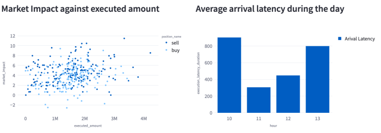
The company-level analytics feature distinct sections for analysing Buy, Sell, and All trades. Illustrated in the screenshot from the All-trades section are two key metrics for BARC.L: the average arrival latency throughout the day and a scatter plot correlating market impact with executed volume. The scatter plot reveals a positive correlation between the size of the trade and slippage for both sell and buy orders. This indicates that larger orders typically lead to proportionately larger slippages. Additionally, sell transactions tend to generate slightly higher slippages than buy executions. Regarding arrival latency, there is a noticeable increase around 10 AM and 1 PM, with periods of relatively lower latency observed in between these times for BARC.L.
In our examination of Buy trades for BARC.L, we specifically look at the Trades Volume-Weighted Average Price (VWAP) in relation to benchmarks like the market best, mid, and market VWAP prices. The analysis reveals that our trades align closely with, and are slightly higher than, the market mid-price, yet notably higher than both the market VWAP and the market best prices.
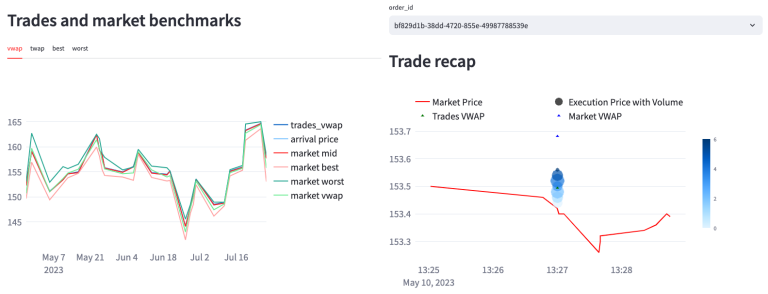
Additionally, we explore a detailed review of a specific order through an adjacent plot, focusing on the recap of this order. This analysis shows that the order was filled across six executions, achieving a trades VWAP of 153.49, which compares favorably to the market VWAP of 153.68 at that time, and exceeds the current market price of 153.42. It's important to clarify that our trades are simulated, meaning they do not accurately represent live market transactions and their potential impact. However, this simulation provides a hypothetical perspective on how our trades could influence the market if they were executed live. Furthermore, conducting this analysis with actual trades rather than simulations would offer a more precise depiction of trade performance relative to the market benchmarks.
Conclusion
Throughout this series of articles, we've presented how to build an end-to-end transaction cost analysis framework from scratch. The journey began with trade simulation and enrichment, leveraging the capabilities of LSEG Tick History API. This enriched dataset then served as the foundation for the analysis of trading costs, using a variety of metrics and benchmarks to understand the performance of trade execution in the market.
We have also built an interactive UI using Streamlit displaying aggregated and company level analytics, allowing users to select a specific date range and company for the analysis. We have also presented a detailed examination of buy, sell, and all trade analysis, showcasing a wide range of comparisons between our executions and the existing market conditions.
We hope that this comprehensive framework could serve as a vital resource for financial professionals to build their own TCA frameworks and optimize their trading executions.
- Register or Log in to applaud this article
- Let the author know how much this article helped you