

Libraries Used: DatastreamPy, lseg.data
Level: Intermediate | Time: 30min
Introduction
This article introduces LSEG's SDG Factor-In dataset: a structured, quantitative framework that maps the UN's 17 Sustainable Development Goals to country-level scores, wealth-adjusted performance gaps, and layered risk signals - updated annually with coverage from 2000 to present across 190+ countries.
The article is structured in two halves. The first provides context on the SDG framework and LSEG's scoring methodology. The second is a hands-on walkthrough: four interactive visualizations and a news integration, built with Python and LSEG Datastream, that together form a sovereign sustainability dashboard.
A companion Jupyter notebook is available for download so you can run the code directly with your own Datastream credentials.
Part I: The Sustainable Development Goals - A Primer
What Are the SDGs?
In September 2015, all 193 UN member states adopted 17 Sustainable Development Goals — a universal blueprint to end poverty, protect the planet, and ensure shared prosperity by 2030.
The SDGs are distinguished from earlier development frameworks (such as the Millennium Development Goals) by three design principles:
- Universal — they apply to every country, regardless of income level
- Integrated — progress on one goal affects others (e.g., health outcomes influence economic productivity; water access enables food security)
- Measurable — 169 targets and 231+ unique indicators, tracked annually
The Goals
| # | Goal | Core Focus |
|---|---|---|
| 1 | No Poverty | Eradicate extreme poverty; social protection systems |
| 2 | Zero Hunger | Food security; sustainable agriculture; nutrition |
| 3 | Good Health & Well-Being | Reduce mortality; universal health coverage |
| 4 | Quality Education | Inclusive, equitable education; lifelong learning |
| 5 | Gender Equality | End discrimination; empower women and girls |
| 6 | Clean Water & Sanitation | Universal access; sustainable water management |
| 7 | Affordable & Clean Energy | Universal access; increase renewables share |
| 8 | Decent Work & Economic Growth | Sustained, inclusive growth; full employment |
| 9 | Industry, Innovation & Infrastructure | Resilient infrastructure; industrialization; R&D |
| 10 | Reduced Inequalities | Reduce income inequality within and among countries |
| 11 | Sustainable Cities & Communities | Safe, resilient, inclusive urbanization |
| 12 | Responsible Consumption & Production | Sustainable resource use; reduce waste |
| 13 | Climate Action | Combat climate change and its impacts |
| 14 | Life Below Water | Conserve and sustainably use ocean resources |
| 15 | Life on Land | Protect ecosystems; halt biodiversity loss |
| 16 | Peace, Justice & Strong Institutions | Rule of law; accountable, inclusive institutions |
| 17 | Partnerships for the Goals | Strengthen means of implementation; global cooperation |
How They Interconnect
The SDGs form an interdependent system rather than 17 isolated targets:
- SDG 4 (Education) is a long-lead indicator for SDG 8 (Decent Work) — investments in human capital typically take 7–10 years to manifest in labour market outcomes.
- SDG 6 (Clean Water) directly enables SDG 2 (Zero Hunger) and SDG 3 (Health) — water stress cascades into food insecurity and disease burden.
- SDG 16 (Peace & Justice) underpins nearly all other goals — institutional capacity is a prerequisite for sustained progress.
- SDG 13 (Climate Action) failures compound into SDG 1 (Poverty), SDG 2 (Hunger), and SDG 11 (Cities) as climate events displace populations and damage infrastructure.
This interdependency is formalized in the Wedding Cake Model (visualized in Part IV), which frames the SDGs as nested layers: the biosphere supports society, which in turn supports the economy.
Part II: SDG Data in a Financial Context
Relevance to Capital Markets
SDG data operates at the sovereign level - the macro environment in which corporate activity and capital allocation decisions take place. Because SDG scores reflect structural trends (education pipelines, environmental degradation, institutional quality), they tend to move ahead of the market events they eventually influence.
| SDG Signal | Financial Relevance |
|---|---|
| Environmental degradation trends | Physical and transition risk exposure |
| Social stability indicators | Sovereign credit and political risk assessment |
| Institutional quality trajectory | Governance premium/discount in bond spreads |
| Human capital investment levels | Labour market quality outlook (7–10yr horizon) |
| Energy transition pace | Policy environment for sector-level allocation |
SDG scores are backward-looking by construction (they measure last year's outcomes), but the trends they reveal - a country's multi-year trajectory - serve as forward-looking context for sovereign risk assessment.
Absolute Scores vs. Wealth-Adjusted Gaps
A common limitation of raw SDG indices is that they report absolute performance without adjusting for economic capacity.
Consider a score of 60 on SDG 3 (Health):
- For a country with GDP/capita of $1,000, this represents strong performance relative to available resources - a signal of policy effectiveness.
- For a country with GDP/capita of $40,000, this suggests underperformance relative to economic capacity - a potential structural concern.
LSEG's SDG Factor-In dataset addresses this by providing a wealth-adjusted scoring methodology that separates ability from achievement.
Two Complementary Views
The dataset provides two measures for each SDG, per country, per year:
- Indicator Score (absolute): Where a country stands on a normalized 1–100 scale (100 = best performer globally)
- Percentage (wealth-adjusted gap): How far above or below the expected performance for a country at that income level
Used together, these measures enable more nuanced country comparisons and can surface dynamics that absolute scores alone may not reveal.
Part III: The LSEG Model
Data Sources
The LSEG model leverages about 230 KPIs (or indicators), 80% of which are sourced from official UN SDG Database (i.e., around 185). We selectively enhance these metrics through additional KPIs from other high quality sources, including the World Bank, the International Roads Federation, Enerdata, EMDAT, LSEG KPIs.
The coverage spans 2000 to present. across 190+ countries.
The Scoring Cascade
Raw Indicator Values (heterogeneous units)
↓ Normalize to 1–100 scale (100 = best globally, 1 = worst)
Indicator Scores
↓ Average underlying scores → Normalize to 1–100
Target Scores (sub-SDG level, 1–4 indicators each)
↓ Average underlying targets → Normalize to 1–100
SDG Scores (17 goals)
↓ Equally-weighted average → Normalize to 1–100
Overall SDG Score
Note
All scores at every level are globally comparable across countries and years.
Data Coverage Notes
- Some SDG targets are excluded where underlying indicators have insufficient geographic coverage, are redundant, or are not comparable across countries
- The wealth-adjustment uses GDP per capita as the income benchmark
- Scores are updated annually and typically reflect a T-1 or T-2 reporting lag
- The official target/indicator taxonomy is maintained at unstats.un.org/sdgs/metadata
pip install DatastreamPy lseg-data pandas numpy plotly matplotlib ipywidgets openpyxl
You'll also need:
- A valid Datastream username and password (typically starting with Z - contact your LSEG Account Manager to request access)
- The SDG Factor-In metadata file exported from Datastream Navigator
Step 1 - Importing the libraries
# LSEG Libraries
import DatastreamPy as dsws
import lseg.data as ld
# Data manipulation
import pandas as pd
import numpy as np
import re
# Visualization
import matplotlib.pyplot as plt
import matplotlib.patches as mpatches
import plotly.graph_objects as go
# Interactive widgets (Jupyter)
import ipywidgets as w
from IPython.display import display, clear_output
Step 2- Authenticate
ds = dsws.DataClient(
username=('Your_Username'),
password=('Your_Password'),
)
# Verify the connection (optional step)
try:
ds.get_data(tickers='VOD', fields='P', kind=0)
print("Connection successful!")
except Exception as e:
print(f"Connection failed: {e}")
Store credentials using environment variables, a .env file (excluded from version control), or your organization's secrets manager. Avoid hardcoding credentials in shared notebooks.
Step 3 - Load the Metadata
The metadata file maps countries x SDG metrics to Datastream symbols. To obtain it:
- Navigate to Datastream Navigator
- Under Series Search, filter for SDG Factor-In series by country
- Export as an Excel file
Then load it as a DataFrame:
df = pd.read_excel("LSEG Sovereign Sustainability Series List.xlsx", sheet_name="SDG Factor In")
The resulting DataFrame contains four key columns:
| Column | Description | Example |
|---|---|---|
| Market | Country name | "United Kingdom" |
| Name | SDG metric name | "SDG3: Good Health" |
| Unit | Score type | "Indicator" or "Percentage" |
| Symbol | Datastream RIC | "UKSDG3I" |
This lookup table is referenced by every visualization that follows.
Visualization 1: Animated Trend Chart
Purpose: Track one SDG metric across up to 3 countries from 2000 onward, animated year by year.
This visualization is useful for identifying divergence and convergence patterns - countries that scored similarly in earlier years but have since taken different trajectories. The animation highlights inflection points such as policy changes or structural reforms.
lookup = df.set_index(['Market', 'Name', 'Unit'])['Symbol'].to_dict()
w_country = w.SelectMultiple(options=sorted(df['Market'].unique()), rows=8, layout=w.Layout(width='280px'))
country_box = w.VBox([w.Label('Select max 3 Countries (hold ctrl):'), w_country])
w_unit = w.ToggleButtons(options=['Percentage', 'Indicator'], description='Unit:', layout = w.Layout(margin='0 0 10px 0'))
w_sdg = w.Dropdown(options=sorted(df[df['Unit']=='Percentage']['Name'].unique()), description='SDG:', style={'description_width':'initial'}, layout=w.Layout(width='580px'))
w_btn = w.Button(description='Plot', button_style='primary', layout=w.Layout(width='100px'))
out = w.Output()
def on_unit_change(change):
w_sdg.options = sorted(df[df['Unit'] == change['new']]['Name'].unique())
w_unit.observe(on_unit_change, names='value')
def plot(_):
selected = list(w_country.value)[:3]
tickers = {lookup[(c, w_sdg.value, w_unit.value)]: c
for c in selected if (c, w_sdg.value, w_unit.value) in lookup}
if not tickers: return
with out:
clear_output(wait=True)
raw = ds.get_data(tickers=','.join(tickers), start='2000-01-01', kind=1)
raw.columns = raw.columns.get_level_values(0)
raw.index = pd.to_datetime(raw.index).year
years = raw.index.tolist()
# Pre-compute fixed axis ranges
all_vals = raw[[t for t in tickers]].stack().dropna()
y_min, y_max = all_vals.min(), all_vals.max()
pad = (y_max - y_min) * 0.05
frames = [
go.Frame(
name=str(yr),
data=[go.Scatter(x=raw.loc[:yr, t].dropna().index,
y=raw.loc[:yr, t].dropna().values,
mode='lines+markers', name=n)
for t, n in tickers.items()]
) for yr in years
]
fig = go.Figure(
data=[go.Scatter(x=[], y=[], mode='lines+markers', name=n) for n in tickers.values()],
frames=frames,
layout=go.Layout(
title=w_sdg.value, xaxis_title='Year', yaxis_title=w_unit.value,
hovermode='x unified',
xaxis=dict(range=[years[0]-1, years[-1]+1]),
yaxis=dict(range=[y_min - pad, y_max + pad]), # fixed - no rescaling
updatemenus=[dict(type='buttons', showactive=False, y=-0.15, x=0.1,
buttons=[
dict(label='▶ Play', method='animate', args=[None, dict(frame=dict(duration=100, redraw=True), fromcurrent=True)]),
dict(label='⏸ Pause', method='animate', args=[[None], dict(mode='immediate')])
])],
sliders=[dict(
steps=[dict(method='animate', label=str(yr), args=[[str(yr)], dict(mode='immediate', frame=dict(duration=100))]) for yr in years],
x=0.1, len=0.9, currentvalue=dict(prefix='Year: ', visible=True, xanchor='center')
)]
)
)
fig.show()
w_btn.on_click(plot)
display(w.VBox([w.HBox([country_box, w.VBox([w_unit, w_sdg, w_btn], layout=w.Layout(padding='0 0 0 20px'))]), out]))
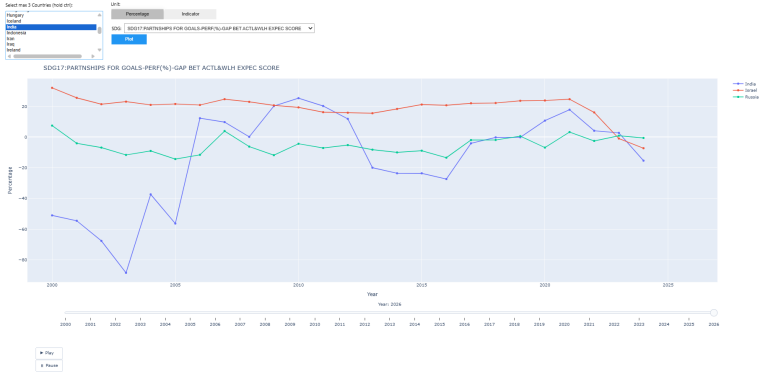
Suggested exploration: Compare countries at different income levels on SDG3: Good Health using the Percentage unit. The wealth-adjusted gap often reveals a different ranking than the absolute score.
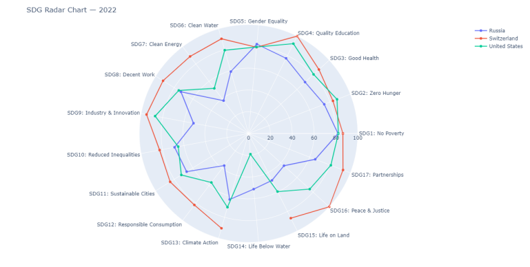
Visualization 2: Radar Chart
Purpose: Compare up to 5 countries across all 17 SDGs for a chosen year. A larger polygon area indicates stronger overall SDG performance.
This view is useful for identifying a country's structural profile whether performance is balanced across goals or concentrated in specific areas, and where relative strengths and vulnerabilities lie.
df_indicators = df[df["Unit"] == "Indicator"]
w_country2 = w.SelectMultiple(options=sorted(df_indicators["Market"].unique()), rows=10, layout=w.Layout(width='250px'))
country_box2 = w.VBox([w.Label('Select max 5 Countries (hold ctrl):'), w_country2])
w_year = w.Dropdown(options=list(range(2000, 2024)), value=2020, description="Year:")
w_btn2 = w.Button(description='Generate Radar', button_style='primary')
out2 = w.Output()
SDG_LABELS = {
'SDG1':'No Poverty', 'SDG2':'Zero Hunger', 'SDG3':'Good Health',
'SDG4':'Quality Education', 'SDG5':'Gender Equality', 'SDG6':'Clean Water',
'SDG7':'Clean Energy', 'SDG8':'Decent Work', 'SDG9':'Industry & Innovation',
'SDG10':'Reduced Inequalities', 'SDG11':'Sustainable Cities', 'SDG12':'Responsible Consumption',
'SDG13':'Climate Action', 'SDG14':'Life Below Water', 'SDG15':'Life on Land',
'SDG16':'Peace & Justice', 'SDG17':'Partnerships'
}
def plot2(_):
selected = list(w_country2.value)[:5]
year = w_year.value
with out2:
out2.clear_output(wait=True)
if not selected:
print("Select at least one country."); return
# Exclude AGG SDG rows keep only individual SDG1-SDG17
indiv = df_indicators[df_indicators["Name"].str.match(r'^SDG\d+:')]
symbol_to_sdg = indiv.set_index("Symbol")["Name"].str.extract(r'^(SDG\d+)')[0].to_dict()
symbol_to_market = indiv.set_index("Symbol")["Market"].to_dict()
# Bundle: one request per country to stay within API limits
reqs = [ds.post_user_request(tickers=",".join(indiv[indiv["Market"]==c]["Symbol"]),
start=f"{year}-01-01", kind=0) for c in selected]
raw = pd.concat(ds.get_bundle_data(bundleRequest=reqs))
raw["Market"] = raw["Instrument"].map(symbol_to_market)
raw["SDG"] = raw["Instrument"].map(symbol_to_sdg)
raw = raw.dropna(subset=["SDG", "Market"])
raw = raw[raw["Market"].isin(selected)] # guard against extra rows
pivoted = raw.pivot_table(index="Market", columns="SDG", values="Value")
cols = sorted(pivoted.columns.tolist(), key=lambda x: int(re.search(r'\d+', x).group()))
col_labels = [f"{c}: {SDG_LABELS.get(c, c)}" for c in cols]
fig = go.Figure()
for country, row in pivoted.iterrows():
vals = row[cols].values.tolist()
fig.add_trace(go.Scatterpolar(r=vals + [vals[0]], theta=col_labels + [col_labels[0]], name=country))
fig.update_layout(
title=f"SDG Radar Chart {year}",
height=650,
margin=dict(l=80, r=80, t=60, b=60),
polar=dict(radialaxis=dict(visible=True, range=[0, 100]))
)
fig.show()
w_btn2.on_click(plot2)
display(w.VBox([w.HBox([country_box2, w.VBox([w_year, w_btn2], layout=w.Layout(padding='0 0 0 20px'))]), out2]))
API TIP:
The post_user_request() + get_bundle_data() pattern batches multiple queries into a single round-trip, which is more efficient and helps manage rate limits when fetching data for several countries simultaneously.
Visualization 3: SDG Heatmap
Purpose: A colour-coded matrix showing all 17 SDG scores plus the overall score for up to 15 countries.
| Score Range | Colour | Interpretation |
|---|---|---|
| 70–100 | Green | Strong performance |
| 40–69 | Yellow | Moderate trend direction is relevant |
| 0–39 | Red | Structural weakness |
This view is useful for spotting patterns at scale: clusters of weakness in specific goals across a region, or individual outliers within an otherwise consistent peer group.
df_heat_src = df[df['Unit'] == 'Indicator'].copy()
def sdg_label(name):
m = re.match(r'SDG\s*0*(\d{1,2})(?!\d)', str(name), re.I)
if m:
n = int(m.group(1))
if 1 <= n <= 17:
return f'SDG {n:02d}'
return 'Aggregate'
df_heat_src['Label'] = df_heat_src['Name'].apply(sdg_label)
sdg_rows = df_heat_src[df_heat_src['Label'] != 'Aggregate'].drop_duplicates(['Market', 'Label'])
agg_rows = df_heat_src[df_heat_src['Label'] == 'Aggregate']
agg_overall = agg_rows[agg_rows['Name'].str.upper().str.contains('OVERALL')]
agg_best = (agg_overall if not agg_overall.empty else agg_rows).drop_duplicates('Market')
df_heat = pd.concat([sdg_rows, agg_best])
sym_lookup4 = df_heat.set_index(['Market', 'Label'])['Symbol'].to_dict()
COLS = [f'SDG {i:02d}' for i in range(1, 18)] + ['Aggregate']
DISPLAY_COLS = [f'SDG {i}' for i in range(1, 18)] + ['Overall']
w_country4 = w.SelectMultiple(options=sorted(df_heat['Market'].unique()), rows=12, layout=w.Layout(width='280px'))
country_box4 = w.VBox([w.Label('Select up to 15 Countries (hold ctrl):'), w_country4])
w_year4 = w.Dropdown(options=list(range(2000, 2026)), value=2022, description='Year:')
w_btn4 = w.Button(description='Generate Heatmap', button_style='primary')
out4 = w.Output()
def plot4(_):
selected = list(w_country4.value)
year = w_year4.value
if not selected:
with out4: clear_output(); print("Select at least one country."); return
with out4:
clear_output(wait=True)
reqs, valid = [], []
for c in selected:
syms = [sym_lookup4[(c, lbl)] for lbl in COLS if (c, lbl) in sym_lookup4]
if syms:
reqs.append(ds.post_user_request(tickers=','.join(syms), start=f'{year}-01-01', kind=0))
valid.append(c)
if not reqs:
print("No matching symbols found."); return
sym_val = {}
for res in ds.get_bundle_data(bundleRequest=reqs):
if not isinstance(res, pd.DataFrame) or res.empty: continue
for _, row in res.iterrows():
try:
v = row['Value']
if v not in (None, 'NA', 'N/A', ''):
sym_val[row['Instrument']] = float(v)
except: pass
z = np.array([[sym_val.get(sym_lookup4.get((c, lbl)), np.nan) for lbl in COLS] for c in valid], dtype=float)
text = [[f'{v:.1f}' if not np.isnan(v) else '' for v in row] for row in z]
fig = go.Figure(go.Heatmap(
z=z, x=DISPLAY_COLS, y=valid,
text=text,
colorscale=[[0, '#ef4444'], [0.5, '#eab308'], [1, '#22c55e']],
zmin=0, zmax=100,
hovertemplate='%{y}<br>%{x}: %{text}<extra></extra>',
colorbar=dict(title='Score (0–100)', tickfont=dict(color='#c9d1d9'))
))
fig.update_layout(
title=dict(text=f'<b>SDG Heatmap {year}</b>', x=0.5, font=dict(color='#f0f6fc', size=16)),
paper_bgcolor='#080c10', plot_bgcolor='#080c10',
xaxis=dict(tickangle=45, tickfont=dict(color='#c9d1d9', size=10)),
yaxis=dict(tickfont=dict(color='#c9d1d9'), autorange='reversed'),
height=max(400, len(valid) * 32 + 200),
margin=dict(l=160, r=80, t=80, b=120)
)
fig.show()
w_btn4.on_click(plot4)
display(w.VBox([w.HBox([country_box4, w.HBox([w_year4, w_btn4], layout=w.Layout(padding='0 0 0 20px'))]), out4]))
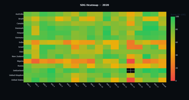
Suggested exploration: Run the heatmap for the same set of countries at two different years (e.g., 2015 and 2022) to observe which scores have improved, deteriorated, or remained stable.
╌╌╌╌ SDG 17 ╌╌╌╌
(Partnerships enables all layers)
┌─────────────────────┐
│ ECONOMY │ SDGs 8, 9, 10, 12
│ (built on Society) │
┌───┴─────────────────────┴───┐
│ SOCIETY │ SDGs 1–7, 11, 16
│ (built on Biosphere) │
┌───┴─────────────────────────────┴───┐
│ BIOSPHERE │ SDGs 6, 13, 14, 15
│ (the foundation) │
└─────────────────────────────────────┘
The colour-coded score per layer (green/amber/red) combined with the time-series trend gives both a point-in-time snapshot and a multi-year trajectory in a single view.
BG = '#080c10'
LAYERS = [('Biosphere', 'SDGRMQ', 8.0), ('Society', 'SDGCRD', 5.5), ('Economy', 'SDGVQH', 3.5)]
PARTNER_CODE = 'SDGSQK'
LAYER_COLORS = ['#00d4aa', '#3b82f6', '#a855f7']
# Derive country → 2-letter code from Excel (first 2 chars of any symbol per market)
COUNTRIES = df.groupby('Market')['Symbol'].first().str[:2].to_dict()
def score_color(s):
return '#22c55e' if s >= 70 else ('#eab308' if s >= 40 else '#ef4444')
w_country3 = w.Dropdown(options=sorted(COUNTRIES), value='United Kingdom' if 'United Kingdom' in COUNTRIES else sorted(COUNTRIES)[0],
description='Country:', style={'description_width': 'initial'}, layout=w.Layout(width='280px'))
w_year3 = w.Dropdown(options=list(range(2000, 2024)), value=2022, description='Year:')
w_btn3 = w.Button(description='Show Cake', button_style='primary')
out3 = w.Output()
def plot3(_):
cc, year = COUNTRIES[w_country3.value], w_year3.value
tickers = ','.join([f'{cc}{code}' for _, code, _ in LAYERS] + [f'{cc}{PARTNER_CODE}'])
with out3:
clear_output(wait=True)
snap = ds.get_data(tickers=tickers, start=f'{year}-01-01', kind=0)
ts = ds.get_data(tickers=tickers, start='2000-01-01', kind=1)
snap_vals = {r['Instrument']: float(r['Value']) for _, r in snap.iterrows()
if str(r.get('Value', '')) not in ('', 'NA', 'None')}
ts.index = pd.to_datetime(ts.index).year
ts.columns = ts.columns.get_level_values(0)
layer_scores = [snap_vals.get(f'{cc}{code}', 50) for _, code, _ in LAYERS]
partner_score = snap_vals.get(f'{cc}{PARTNER_CODE}', 50)
fig, (ax_cake, ax_ts) = plt.subplots(1, 2, figsize=(14, 7), facecolor=BG,
gridspec_kw={'width_ratios': [1, 1.6]})
ax_cake.set_facecolor(BG); ax_cake.axis('off')
ax_cake.set_xlim(-6, 6); ax_cake.set_ylim(-1.5, 13)
y = 0
for (name, code, base_w), score in zip(LAYERS, layer_scores):
h = max(1.0, score / 100 * 3.8)
top_w = base_w * 0.6
ax_cake.add_patch(plt.Polygon(
[(-base_w/2, y), (base_w/2, y), (top_w/2, y+h), (-top_w/2, y+h)],
fc=score_color(score), ec='white', lw=0.8, alpha=0.88
))
ax_cake.text(0, y + h/2, f'{name} · {score:.0f} / 100',
ha='center', va='center', color='white', fontsize=9, fontweight='bold')
y += h + 0.25
ax_cake.add_patch(mpatches.Ellipse((0, y/2 - 0.3), 13, y + 2.2,
fill=False, ec='#eab308', lw=1.5, ls='--', alpha=0.7))
ax_cake.text(0, y + 0.9, f'SDG 17 · Partnerships {partner_score:.0f} / 100',
ha='center', color='#eab308', fontsize=8.5)
ax_cake.set_title(f'{w_country3.value} · {year}', color='white', fontsize=12, fontweight='bold', pad=10)
ax_cake.legend(handles=[
mpatches.Patch(color='#22c55e', label='≥ 70 Strong'),
mpatches.Patch(color='#eab308', label='40–69 Moderate'),
mpatches.Patch(color='#ef4444', label='< 40 Weak'),
], loc='lower center', bbox_to_anchor=(0.5, -0.04),
facecolor='#0d1318', edgecolor='none', labelcolor='white', fontsize=8, ncol=3)
ax_ts.set_facecolor(BG)
for (name, code, _), lc in zip(LAYERS, LAYER_COLORS):
col = f'{cc}{code}'
if col in ts.columns:
s = ts[col].dropna()
ax_ts.plot(s.index, s.values, lw=2.2, label=name, color=lc)
ax_ts.fill_between(s.index, s.values, alpha=0.07, color=lc)
ax_ts.axhline(70, color='#22c55e', ls=':', lw=1, alpha=0.5, label='Strong threshold (70)')
ax_ts.axhline(40, color='#ef4444', ls=':', lw=1, alpha=0.5, label='Weak threshold (40)')
ax_ts.axvline(year, color='white', ls='--', lw=1, alpha=0.25)
ax_ts.set_ylim(0, 105); ax_ts.set_xlim(2000, 2023)
ax_ts.tick_params(colors='#8b949e')
for sp in ax_ts.spines.values(): sp.set_edgecolor('#1a2332')
ax_ts.set_xlabel('Year', color='#8b949e')
ax_ts.set_ylabel('Score (0–100)', color='#8b949e')
ax_ts.set_title('Layer Scores Over Time', color='white', fontsize=12, fontweight='bold')
ax_ts.legend(facecolor='#0d1318', labelcolor='white', edgecolor='none', fontsize=9)
plt.tight_layout(pad=2)
plt.show()
w_btn3.on_click(plot3)
display(w.VBox([w.HBox([w_country3, w.HBox([w_year3, w_btn3], layout=w.Layout(padding='0 0 0 20px'))]), out3]))
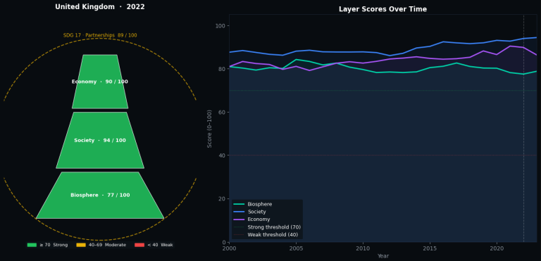
What to observe: The relative ordering and trend of the three layers. An economy layer that is rising while the biosphere layer declines may indicate that current growth patterns are drawing on natural capital a configuration worth monitoring over time.
from lseg.data.content import news
ld.open_session()
sdg_news = news.headlines.Definition(
query="Topic:MCE AND LEN",
date_from="2020-01-13",
date_to="2026-04-14",
count=100,
).get_data()
display(sdg_news.data.df['headline'].to_list())
ld.close_session()
Customization options:
- Replace LEN with a specific language code to change the article language
- MCE stands for Economic News - Use Topic codes available on Workspace's TOPICS app.
- Adjust date_from / date_to and count to control the result window
Part V: Analytical Patterns
The following patterns illustrate how the dataset's features can be applied in practice.
1. Wealth-Adjusted Underperformance
Signal: High GDP/capita combined with a persistently negative wealth-adjusted gap (Percentage metric < 0) over 3+ consecutive years.
Reading: The country has the economic capacity but is not converting it into proportional SDG outcomes. This pattern may warrant closer examination of institutional or policy factors. Use the Animated Trend Chart with the Percentage unit to track this over time.
2. Layer Divergence
Signal: In the Wedding Cake view, the Economy layer score is stable or rising while the Biosphere layer score is declining.
Reading: This configuration suggests that economic performance may be drawing on environmental resources at a rate that could become material over a longer horizon. The trend chart panel helps distinguish temporary dips from sustained divergence.
3. Score Convergence
Signal: A country with SDG scores 15–25 points below its peer group average, but with a positive 5-year trajectory (scores improving 2+ points/year).
Reading: Improvement at this rate, if sustained, suggests meaningful structural reform. Comparing the absolute score with the wealth-adjusted gap helps distinguish genuine progress from baseline effects.
4. Institutional Decay
Signal: SDG 16 (Peace, Justice & Strong Institutions) declining below 40 while other scores remain moderate.
Reading: SDG 16 is often correlated with a country's capacity to maintain progress across other goals. A sustained decline here may precede broader deterioration though the relationship varies by region and context.
5. Regional Clustering
Signal: In the heatmap, a single SDG column appears consistently weak (red) across multiple countries in a geographic region.
Reading: Shared vulnerability often environmental (SDG 13, 14, 15) or infrastructural (SDG 9). This pattern is relevant for geographic allocation decisions and cross-border risk assessment.
reqs = [ds.post_user_request(tickers=syms, start=date, kind=0)
for syms in symbol_batches]
results = ds.get_bundle_data(bundleRequest=reqs)
This consolidates multiple queries into fewer round-trips, improving throughput and respecting API rate limits.
Data Freshness
- SDG scores are updated annually
- The latest available year is typically T-1 or T-2 relative to the current calendar year
- The Percentage (wealth-adjusted) metric may have slightly different coverage windows than the absolute Indicator
Conclusion
LSEG's SDG Factor-In dataset provides 17 dimensions of structured, comparable, longitudinal data across 190+ countries. The wealth-adjusted gap adds a layer of context that transforms absolute scores into relative performance signals distinguishing countries that are performing well given their resources from those that have capacity but are not delivering proportional outcomes.
This article demonstrated how to access and visualize the dataset through four complementary views trend, radar, heatmap, and layered model each designed to operate at a different level of granularity. Together with the news integration, they provide a starting point for incorporating sovereign sustainability data into analytical workflows.
The companion notebook is available for download on GitHub to run interactively with your own Datastream credentials.
Further Resources
- LSEG Sovereign Sustainability Solutions
- LSEG: How SDG Sovereign Indices Impact Investing
- Official UN SDG Indicators & Metadata
- Datastream Navigator
- LSEG Data Library for Python Developer Documentation
- Stockholm Resilience Centre The SDGs Wedding Cake