

Last Update: March 2025
This article is an update version of my old Plotting Financial Data Chart with Plotly Python article because that library is outdated. This updated article aims to use the strategic LSEG Data Library for Python (aka Data Library version 2) with the Workspace platform.
With the rise of Data Scientists, Financial coders, or Traders (aka Citizen Developers), data visualization is a big part of how to present data, information, and its context to the readers (Financial team, Marketing team, etc.). The good data analysis itself cannot be used with a good graph representation.
The Matplotlib Pyplot is a de-facto library for making interactive plot and data visualization in the Python and Data Scientists world. However, the Matplotlib is a huge library that contains several interfaces, capabilities, and 1000+ pages of documents.
There are a lot of others alternative Plotting libraries such as Seaborn (which is a high-level interface of Matplotlib), Spotify's Chartify, Bokeh, Plotly Python, etc.
This example project demonstrates how to use the Plotly Python library to plot various types of graphs. The demo application uses data from LSEG Workspace platform via the LSEG Data Library for Python (Data Library version 2) as an example dataset.
Introduction to Plotly Python
Plotly Python is a free and open source interactive graphing library for Python. The library is built on top of plotly.js JavaScript library (GitHub). Both Plotly Python and Plotly JavaScript are part of Plotly's Dash and Chart Studio applications suites which provide interactively, scientific data visualization libraries/solutions for Data Scientists and Enterprise.
This article is focusing on Plotly Python open-source library versions 6.0.1 and 5.4.0 (on CodeBook).
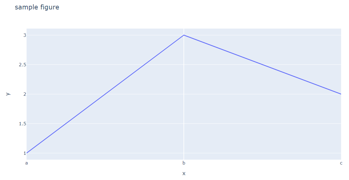
import plotly.express as px
fig = px.line(x=["a","b","c"], y=[1,3,2], title="sample figure")
fig.show()
Introduction to the Data Library for Python
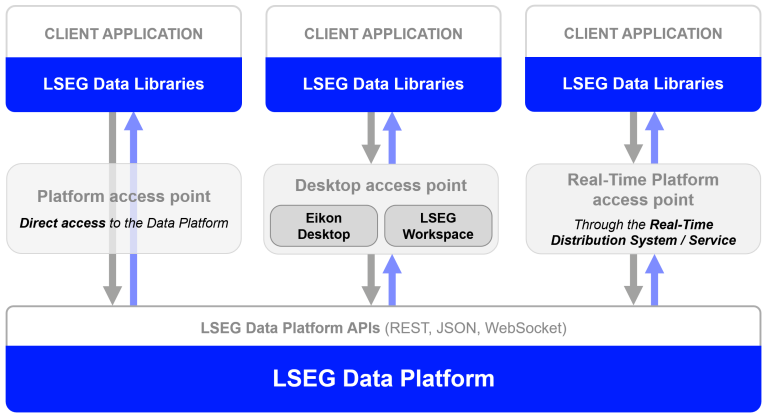
The LSEG Data Library for Python (aka Data Library version 2) provides a set of ease-of-use interfaces offering coders uniform access to the breadth and depth of financial data and services available on the Workspace, RDP, and Real-Time Platforms. The API is designed to provide consistent access through multiple access channels and target both Professional Developers and Financial Coders. Developers can choose to access content from the desktop, through their deployed streaming services, or directly to the cloud. With the Data Library, the same Python code can be used to retrieve data regardless of which access point you choose to connect to the platform.
The Data Library are available in the following programming languages:
For more deep detail regarding the Data Library for Python, please refer to the following articles and tutorials:
Disclaimer
This project is based on Data Library Python versions 2.0.1 using the Desktop Session only.
Prerequisite
Let’s start with the prerequisite to set up your AWS EC2 instance. The following accounts and software are required to run this quick start guide:
- LSEG Workspace application with access to Data Library.
- Python version 3.10 or 3.11 (Command or MiniConda distribution/package manager can be used as well).
- JupyterLab application.
- Internet connection.
Please contact your LSEG's representative to help you to access Workspace credentials. You can generate/manage the AppKey by follow the steps in Data Library for Python Quick Start page.
Code Walkthrough
Please note that the Workspace desktop application integrates a Data API proxy that acts as an interface between the Python library and the Workspace Platform. For this reason, the Workspace application must be running when you use the Data library.
Data Library Configuration File Set Up
The Data library automatic loads configuration file name lseg-data.config.json for developers. You need to input the Workspace App-Key in this file before initial the session.
{
"logs": {
"level": "debug",
"transports": {
"console": {
"enabled": false
},
"file": {
"enabled": false,
"name": "lseg-data-lib.log"
}
}
},
"sessions": {
"default": "desktop.workspace",
"desktop": {
"workspace": {
"app-key": "YOUR APP KEY GOES HERE!"
}
}
}
}
That’s all I have to say about the configuration and account setting.
Import Data Library
Let start with the first step, importing lseg.data and plotly.express libraries to the Notebook application.
import lseg.data as ld
import plotly.express as px
import pandas as pd
Initiate and Getting Data from Data Library
The Data Library lets an application consume data from the following platforms:
- DesktopSession (Workspace desktop application)
- PlatformSession (RDP, Real-Time Optimized)
- DeployedPlatformSession (deployed Real-Time/ADS)
This article only focuses on the DesktopSession.
Next, use the Data Library open_session() method to load configuration file and initial Session.
# Open Desktop Session
ld.open_session(config_name='./lseg-data.config.json')
# Result: <lseg.data.session.Definition object at xxxx {name='workspace'}>
# For CodeBook
# ld.open_session()
Now our Jupyter Notebook is ready to get data from the Workspace platform.
Data Preparation
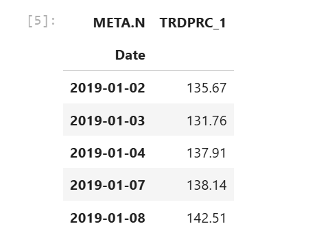
Now we come to the request data stage. I am demonstrating with META (RIC Code: META.N) or aka, Facebook trade price values as an example data set.
I am using the Library get_history() method to request historical data.
RIC = 'META.N'
df = ld.get_history(
universe=RIC,
fields=['TRDPRC_1'],
start='2019-01-01',
end='2025-02-14')
df.head()
Plotting Graph with Plotly Python
Like Matplotlib library, Plotly also provides various low-level, high-level, helpers interfaces to create, manipulate and render graphical figures such as charts, plots, maps, diagrams, etc based on developer preference.
The Plotly Python figures are represented by tree-like data structures which are automatically serialized to JSON for rendering by the Plotly.js JavaScript library. Plotly provides the Graph Object as the low-level interface that wraps figures into a Python class and Plotly Express as the high-level interface for creating graphs.
Plotly Express
The Plotly Express package is the recommend entry-point to the Plotly Python library. It is the high-level interface for data visualization. The plotly.express module (usually imported as px) contains functions that can create entire figures at once and is referred to as Plotly Express or PX. Plotly Express is a built-in part of the plotly library and is the recommended starting point for creating the most common figures.
Plotly Express provides more than 30 functions for creating different types of figures. The API for these functions was carefully designed to be as consistent and easy to learn as possible.
I am starting with the Line Graph interface.
Line Plot with Plotly Express
The Line Plot interface is the easy-to-use function to create a 2D line graph using px.line() method.
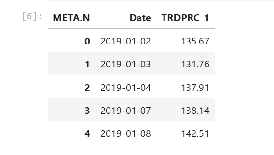
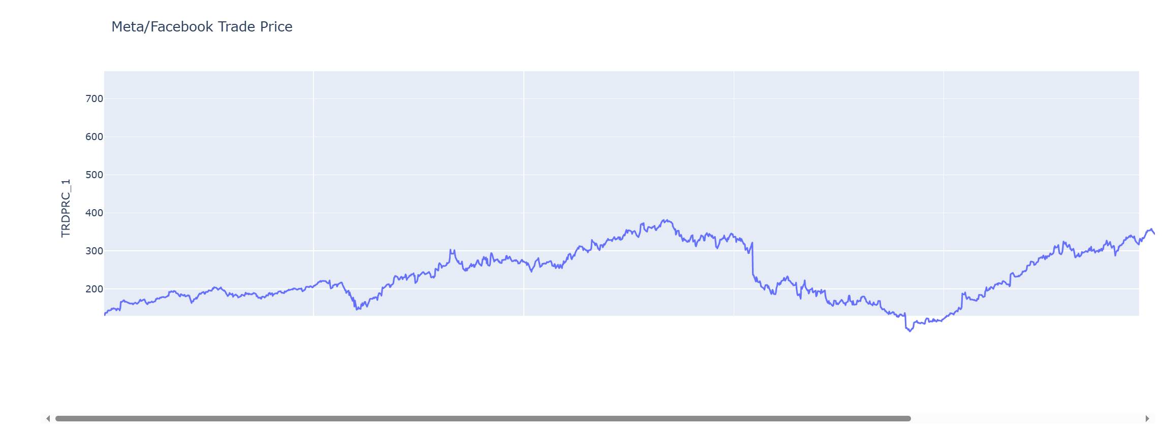
We will plot a single line graph of META trade price historical data with Date value as an X-axis and TRDPRC_1 field as the y-axis. We need to re-structure the Pandas Dataframe to include the Date index as a data column instead.
df.reset_index(level=0, inplace= True)
df.head()
To plot a line graph, I create a Plotly Figure object for the line chart with Plotly Express px.line() method, and pass the following information to a method:
- Date column as x-axis
- TRDPRC_1 column as y-axis
- the chart title information
Next, I use the Figure update_traces() method to update figure traces such as line color and update_yaxes() method to update a figure's y-axes information.
Finally, call the Figure show() method to draw a chart on Jupyter Notebook.
fig = px.line(df, x= 'Date', y = 'TRDPRC_1', title= 'Meta/Facebook Trade Price')
fig.update_yaxes(title='TRDPRC_1')
fig.show()
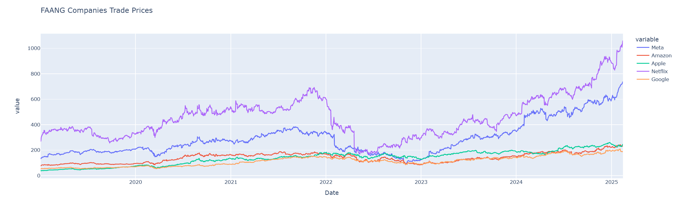
rics = ['META.N','AMZN.O','AAPL.O','NFLX.O','GOOG.O']
df_faang = ld.get_history(universe=rics, fields=['TRDPRC_1'],start='2019-01-01', end='2025-02-14')
df_faang.head()
The current column names are the RIC names (META.N, NFLX.O, etc.) which are hard to read, so I rename the column names to be readable Company names.
df_faang.rename(
columns= {'META.N':'Meta', 'AMZN.O':'Amazon','AAPL.O':'Apple','NFLX.O':'Netflix','GOOG.O':'Google'},
inplace= True
)
df_faang.head()
Then I reset the Dataframe index to include the Date as a data column and exclude some NA values
df_faang.reset_index(level=0, inplace=True)
df_faang.dropna(inplace=True)
To plot multiple lines graph, I call the px.line() function by passing a list of column names as y-axis values.
fig2 = px.line(df_faang,
x = 'Date',
y = ['Meta', 'Amazon','Apple','Netflix','Google'],
title= 'FAANG Companies Trade Prices'
)
fig2.show()
Please see more detail regarding the Plotly Express Line chart in the following resources:
- Line Charts in Python page.
- Plotly Express Line API reference page.
- Creating and Updating Figures in Python page.
- Plotly Figure API reference page.
Pie Chart with Plotly Express
The Pie Chart interface is the easy-to-use method to create a circular statistical chart using px.pie() method.
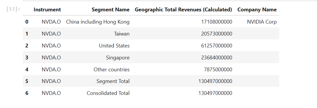
I am using Nvidia (RIC Code: NVDA.O) Geographic Sale Data (See Getting Fundamentals Company Geographic Sales Breakdown from Workspace with Data Library article) as an example data set and plot data as a Pie Chart.
df_nvidia = ld.get_data(
universe = 'NVDA.O',
fields=['TR.BGS.GeoTotalRevenue.segmentName', 'TR.BGS.GeoTotalRevenue','TR.CompanyName']
)
df_nvidia
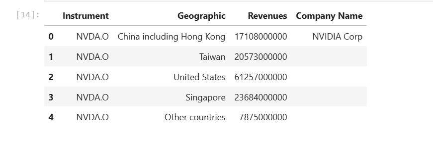
The second step is to rename Segment Name and Geographic Total Revenues (Calculated) columns to be more readable names like Geographic and Revenue.
df_nvidia.rename(
columns= {
'Segment Name':'Geographic',
'Geographic Total Revenues (Calculated)':'Revenues'
},
inplace= True
)
df_nvidia.head()
Then we get the Company name and consolidate total revenue information from Dataframe object.
total_sale = df_nvidia.iloc[df_nvidia.shape[0] - 1]['Revenues']
company_name = df_nvidia.iloc[0]['Company Name']
And the last thing on this phase is to remove the Total Sale Revenue rows from the Dataframe, we will display the consolidated revenue information as a graph footer instead.
df_nvidia = df_nvidia[df_nvidia['Geographic'] != 'Segment Total']
df_nvidia = df_nvidia[df_nvidia['Geographic'] != 'Consolidated Total']
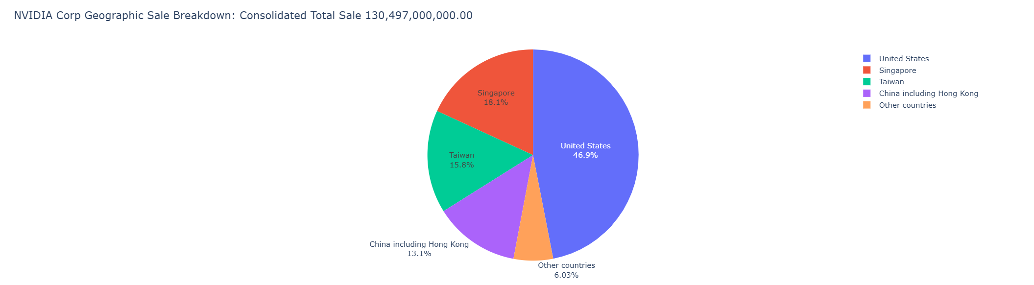
Finally, we call px.pie() method to create a figure object for a pie chart with the value of Revenues field and Geographic column name. For this pie chart, we use the Figure update_traces() method to update text display format on a figure.
fig = px.pie(df_nvidia,
values= 'Revenues',
names= 'Geographic',
title= f'{company_name} Geographic Sale Breakdown: Consolidated Total Sale {total_sale:,.2f}',
hover_data=['Geographic'],
labels={'Geographic':'from'}
)
fig.update_traces(textposition='auto', textinfo='percent+label')
fig.show()
Please see more detail regarding the Plotly Express Pie chart in the following resources:
Plotly Graph Object
The Plotly Graph Object (plotly.graph_objects, typically imported as go) is the low-level interface that lets developers interact with Plotly Figure and IPYWidgets compatible for plotting graphs and manage data in detail. While the Plotly Express provides a simple way to create and customize graphs, the Plotly Graph Object lets developers create and customize more advanced graphs such as Group Bar Chart, Candlestick, Subplot of different types, etc.
"Exploded" Pie Chart with Plotly Graph Object
The pie chart above has some sections that hard to read, so we will re-create that pie chart with Plotly Graph Object to pull out some sectors from the chart.
import plotly.graph_objects as go
fig = go.Figure(data = [ go.Pie(
labels=df_nvidia['Geographic'],
values=df_nvidia['Revenues'],
pull=[0, 0.2, 0, 0,0.2] #pull only some of the sectors
)])
fig.update_traces(textposition='auto', textinfo='percent+label')
fig.update_layout(title = f'{company_name} Geographic Sale Breakdown: Consolidated Total Sale {total_sale:,.2f}') # Set Title
fig.show()
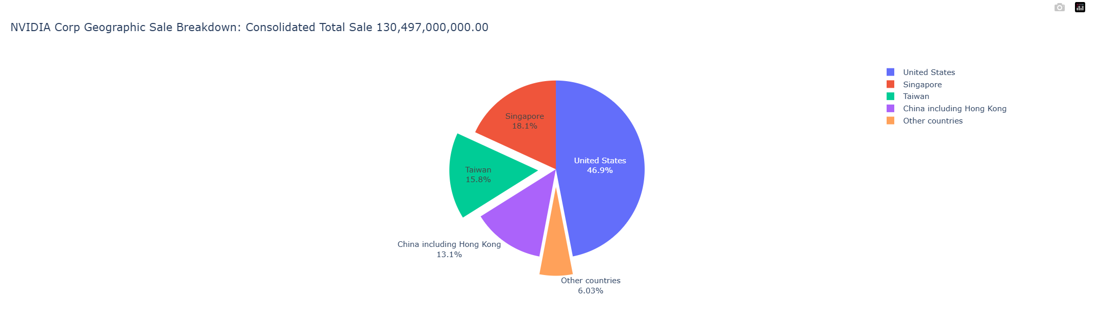
Please notice that you can set the chart title via the title property of fig.update_layout function when using the Graph Object.
Please see more detail regarding Plotly Graph Object Bar Chart in the following resources:
Bar Chart with Plotly Graph Object
We will use the Environmental, social and corporate governance (ESG) data of the Telecommunication companies as an example data for the Bar Chart example.
The ESG Data is available in Workspace desktop application by a query for <Company name> ESG in the menu.
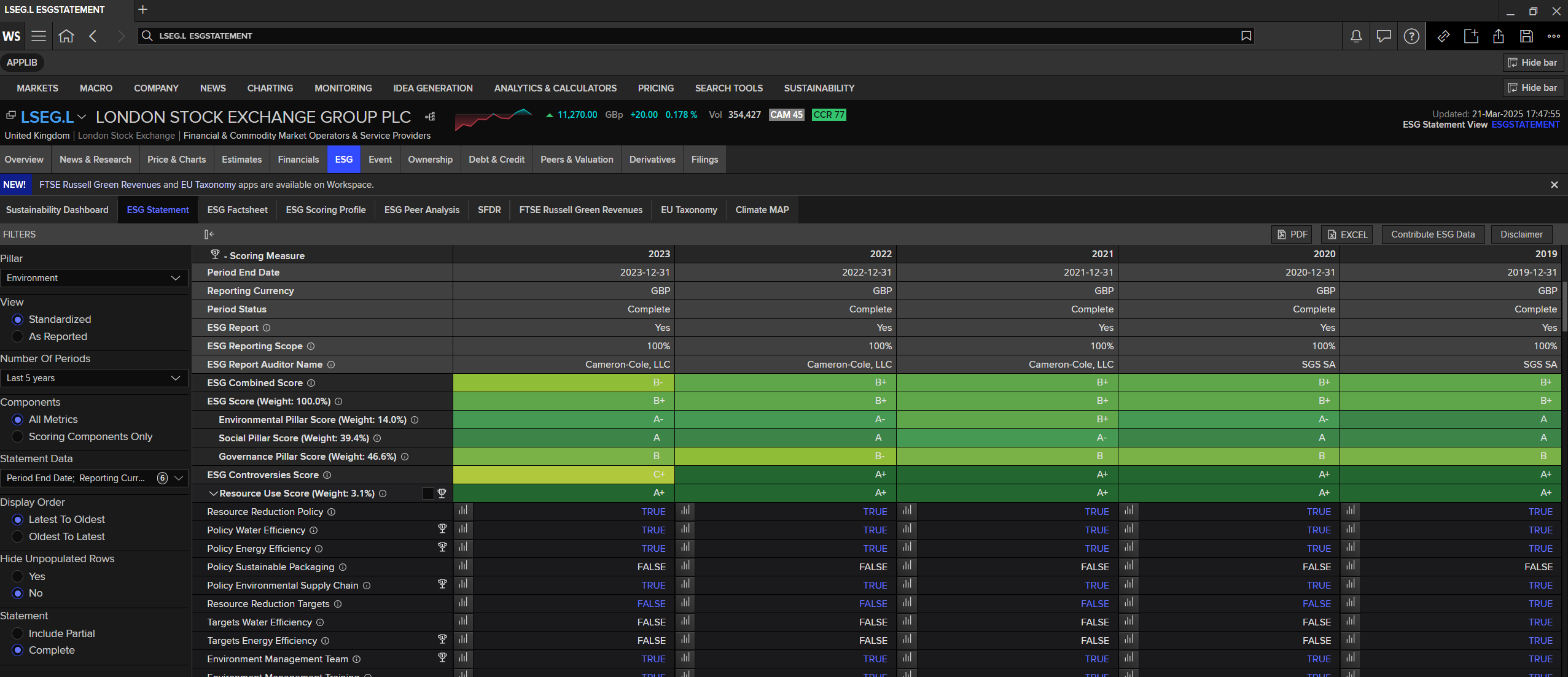
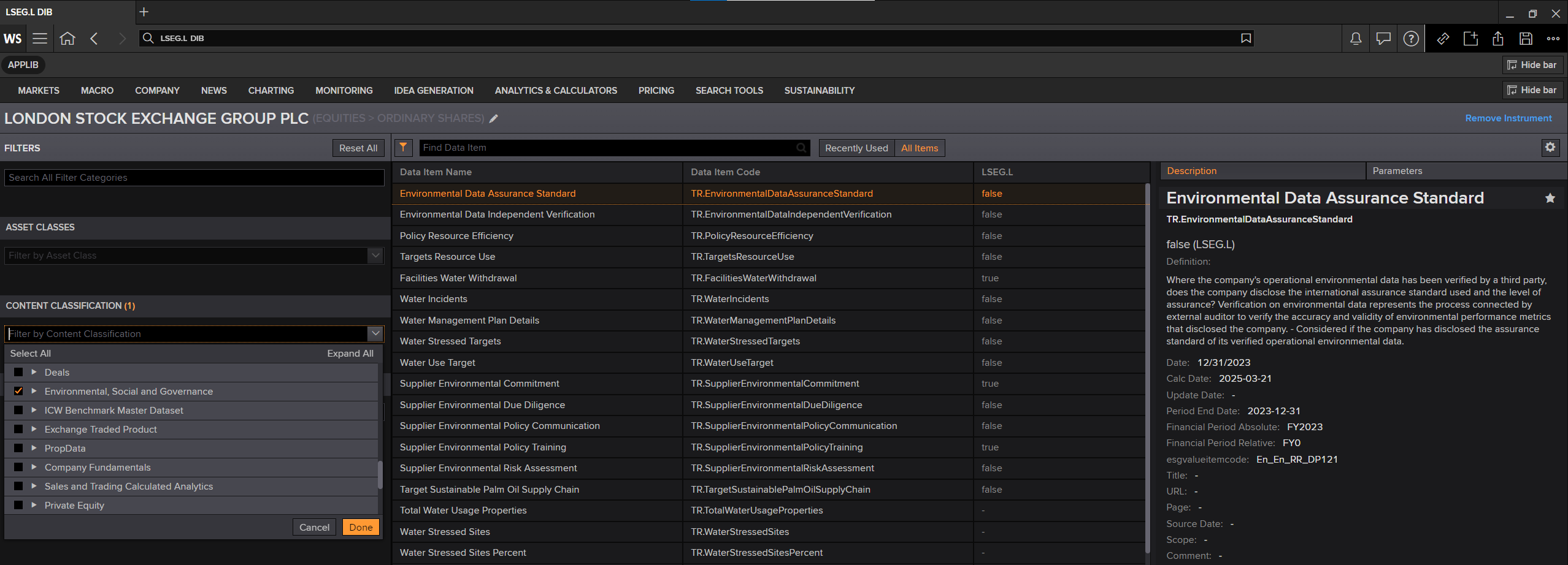
You can find ESG data fields from Workspace Data Item Browser ("DIB") application and then choosing "Environmental, social and corporate governance" content classification.
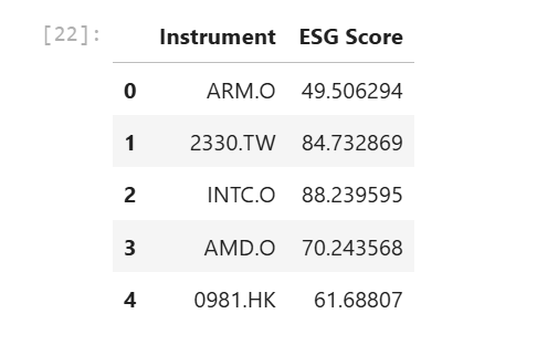
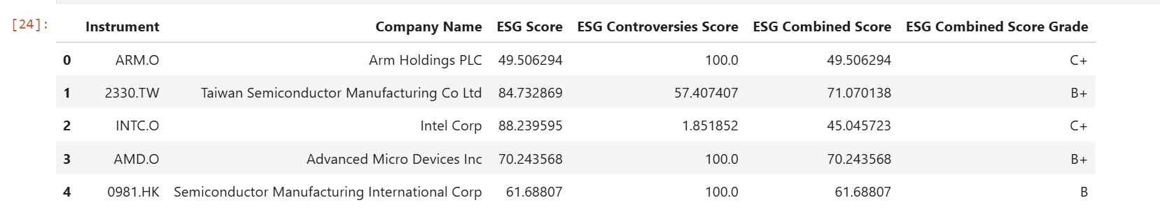
universe = ['ARM.O','2330.TW','INTC.O','AMD.O','0981.HK']
df_esg = ld.get_data(universe=universe, fields= ['TR.TRESGScore'])
df_esg
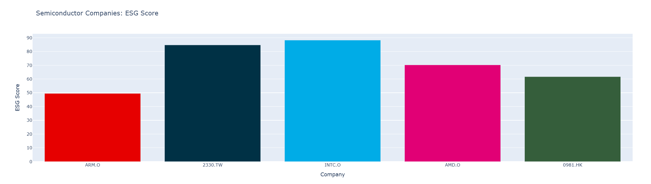
Then we create a Plotly Figure for the bar chart with go.Figure interface and go.Bar() class, then pass DataFrame Instrument column as the x-axis and ESG Score column as the y-axis.
Please notice that now we use the Figure update_layout() method to update figure's layout for the chart title.
colors = ['#E60000','#003145','#00ACE7','#E10075','#355E3B']
fig = go.Figure(go.Bar(x=df_esg['Instrument'],
y=df_esg['ESG Score'],
marker_color = colors
)) # Create Figure
fig.update_xaxes(title_text='Company') # Set X-Axis title
fig.update_yaxes(title_text='ESG Score') # Set &-Axis title
fig.update_layout(title = 'Semiconductor Companies: ESG Score')
fig.show()
However, the ESG Score data alone cannot be used without comparing it with the EST Controversies Score (field TR.TRESGCControversiesScore) and ESG Combined Score (field TR.TRESGCScore). We will request the Company Name (TR.CompanyName), the ESG Scores to plot a group bar chart.
df_esg = ld.get_data(universe, fields =['TR.CompanyName',
'TR.TRESGScore',
'TR.TRESGCControversiesScore',
'TR.TRESGCScore',
'TR.TRESGCScoreGrade'])
df_esg
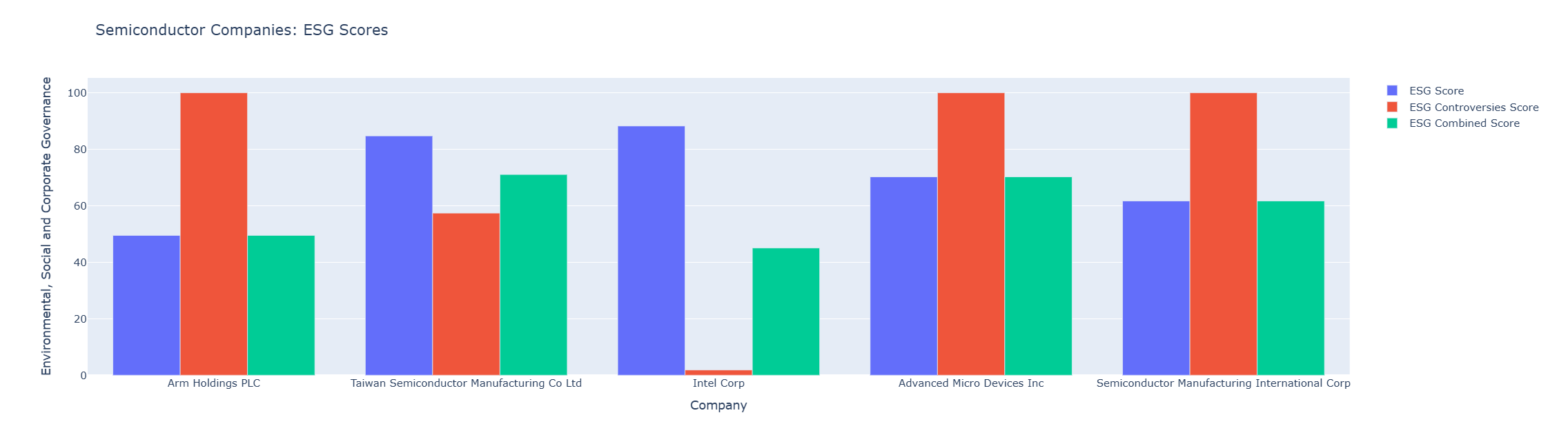
Then we create multiple go.Bar objects for each ESG score and pass it to go.Figure. Please notice that we need to set the layout to be a group bar chart via fig.update_layout(barmode='group') statement.
fig = go.Figure(data=[
go.Bar(name='ESG Score', x=df_esg['Company Name'], y=df_esg['ESG Score']),
go.Bar(name='ESG Controversies Score', x=df_esg['Company Name'], y=df_esg['ESG Controversies Score']),
go.Bar(name='ESG Combined Score', x=df_esg['Company Name'], y=df_esg['ESG Combined Score'])
])
fig.update_layout(barmode='group') # Change the bar mode
fig.update_xaxes(title_text='Company')
fig.update_yaxes(title_text='Environmental, Social and Corporate Governance')
fig.update_layout(title = 'Semiconductor Companies: ESG Scores')
fig.show()
The result is as follows:
Please see more detail regarding Plotly Graph Object Bar Chart in the following resources:
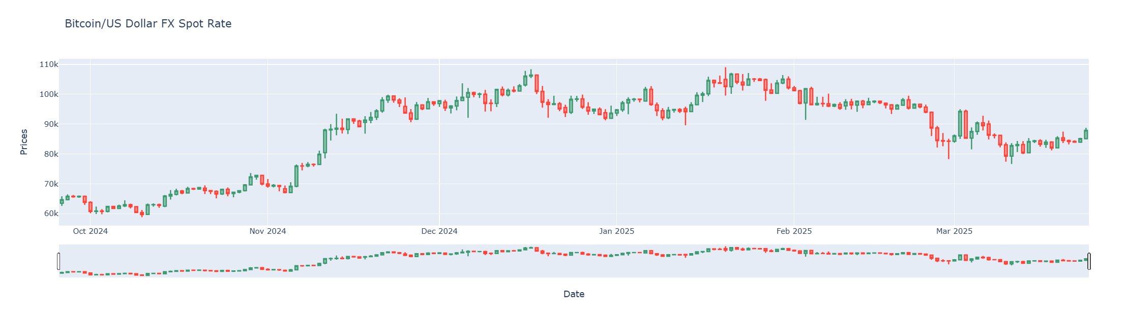
Candlestick Chart with Plotly Graph Object
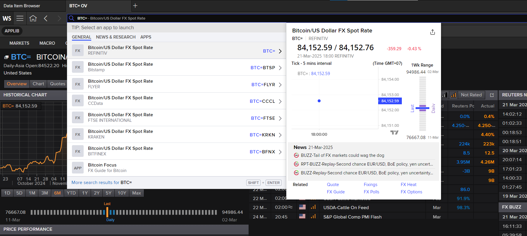
The last example is the Candlestick charts using Plotly Graph Object. We will use Bitcoin/US Dollar FX Spot Rate as an example dataset that is suitable for the candlestick chart.
The Bitcoin/US Dollar FX Spot Rate data is available in Workspace and Real-Time platform as BTC= instrument name.
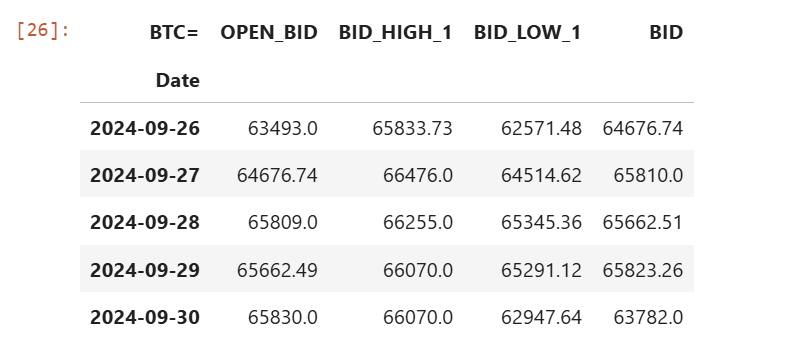
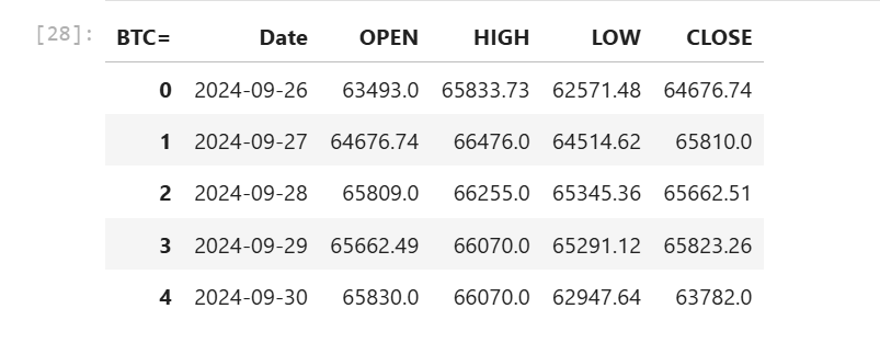
We request 180 daily historical data of BTC= via Data Library get_history method. Please be noticed that I am choosing the BID related fields as our OHLC fields.
df_bitcoin = ld.get_history(
universe= 'BTC=',
fields= ['OPEN_BID','BID_HIGH_1','BID_LOW_1','BID'],
interval='daily',
count=180)
df_bitcoin.head()
Then we re-structure the DataFrame index to change the Date column from an index column to a data column, and rename columns to be more readable.
df_bitcoin.reset_index(level=0, inplace=True)
df_bitcoin.rename(
columns= {
'OPEN_BID':'OPEN',
'BID_HIGH_1':'HIGH',
'BID_LOW_1':'LOW',
'BID': 'CLOSE'
},
inplace= True
)
df_bitcoin.head()
Finally, we use the go.Candlestick object to create the candlestick chart from Dataframe, and pass it to go.Figure to create a Plotly Figure object to plot a gra
fig = go.Figure(data=[go.Candlestick(x=df_bitcoin['Date'],
open=df_bitcoin['OPEN'],
high=df_bitcoin['HIGH'],
low=df_bitcoin['LOW'],
close=df_bitcoin['CLOSE'])])
fig.update_xaxes(title_text='Date')
fig.update_yaxes(title_text='Prices')
fig.update_layout(xaxis_rangeslider_visible=True, # Set Range Slider Bar
title = 'Bitcoin/US Dollar FX Spot Rate') # Set Title
fig.show()
Please see more detail regarding Plotly Graph Object Candlestick Chart in the following resources:
- Candlestick Charts in Python page.
- Candlestick Charts API reference page.
- Plotly Graph Object Figure API reference page.
Before I am ending this article, let's close the Data Library session to clean up process.
ld.close_session()
Conclusion
Data visualization is the first impression of data analysis for the readers. Data Scientists, Financial coders, and Developers take time on the data visualization process longer than the time they use for getting the data. It means the data visualization/chart library need to be easy to use, flexible and have a good document.
Plotly Python provides both ease-of-use/high-level and low-level interface for supporting a wide range of Developers' skills. Developers can pick the Plotly Chart object (line, bar, scatter, candlestick, etc) that match their requirements, check the Plotly example code and community page to create a nice chart with readable and easy to maintain source code.
When compare to the Matplotlib Pyplot (which is the main player in the Charting library), the Plotly advantages and disadvantages are the following:
Pros
- Use a few lines of code to create and customize the graph.
- Provide more than 30 ease-of-use various chart object types for Developers.
- Experience Developers can use the low-level chart object types to create a more powerful and flexible chart.
- Simplify documents and example code.
- Provide a dedicated paid support program for both individual and corporate developers.
Cons
- Some API Interface and installation processes for Classic Jupyter Notebook and Jupyter Lab are different.
- Matplotlib-Pyplot has larger users based on developer community websites (such as StackOverflow). It means a lot of Pyplot questions, problems will be easy to find the answers or solutions than Plotly.
- Matplotlib-Pyplot has larger documents, tutorials, step-by-step guide resources from both official and user-based websites.
At the same time, the LSEG Data Library for Python (aka Data Library version 2) lets developers rapidly access Workspace data and our latest platform capabilities with a few lines of code that easy to understand and maintain.
References
You can find more detail regarding the Plotly, Data Libary, and related technologies from the following resources:
- LSEG Data Library for Python on the LSEG Developer Community website.
- Essential Guide to the Data Libraries - Generations of Python library (EDAPI, RDP, RD, LD) article.
- Upgrade from using Eikon Data API to the Data library article.
- The Data Library for Python - Quick Reference Guide (Access layer) article.
- LSEG Data Library for Python and its Configuration Process article.
- Plotly Official page.
- Plotly Python page.
- Plotly GitHub page
- Plotly Express page
- Plotly Graph Objects page
- Creating and Updating Figures in Python page
- Plotly Figure API reference page
- 4 Reasons Why I’m Choosing Plotly as My Main Visualization Library
- Getting Fundamentals Company Geographic Sales Breakdown from Workspace with Data Library
For any question related to this example or Data Library, please use the Developers Community Q&A Forum.