

Overview
Last Update: March 2025
This article is an update version of my old How to get Fundamentals Company Geographic Sales Breakdown with Eikon Data APIs article because that library is outdated. This updated article aims to use the strategic LSEG Data Library for Python with the Workspace platform.
This article shows how to use LSEG Data Library for Python (aka Data Library version 2) to consume company geographic sale data from Workspace Fundamentals, then breakdown and display each region revenue in readable graph format in the Jupyter Lab application.
Fundamentals Data Overview
Let’s start with an introduction to Fundamentals data. Workspace platform's Fundamentals has over 35 years of experience in collecting and delivering the most timely and highest quality fundamentals data in the industry, including an unmatched depth and breadth of primary financial statements, footnote items, segment data, industry specific operating metrics, financial ratios, and much more.
The Fundamentals data standardized and As Reported financial statement data – both interim and annual – along with per-share data, calculated financial ratios, company profile information, security data, Officers & Directors and market content for over 90,000 issuers.
That covers an overview of Fundamentals Data.
Introduction to the Data Library for Python
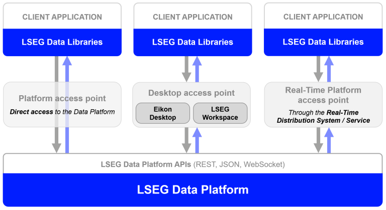
My next point is what is the Data Library. The Data Library for Python provides a set of ease-of-use interfaces offering coders uniform access to the breadth and depth of financial data and services available on the Workspace, RDP, and Real-Time Platforms. The API is designed to provide consistent access through multiple access channels and target both Professional Developers and Financial Coders. Developers can choose to access content from the desktop, through their deployed streaming services, or directly to the cloud. With the Data Library, the same Python code can be used to retrieve data regardless of which access point you choose to connect to the platform.
The Data Library are available in the following programming languages:
For more deep detail regarding the Data Library for Python, please refer to the following articles and tutorials:
Disclaimer
This article is based on Data Library Python versions 2.0.1 using the Desktop Session only.
Prerequisite
This article example application requires the following dependencies softwares and libraries.
- LSEG Workspace desktop application with access to Data Library for Python.
- Python (Ananconda or MiniConda distribution/package manager also compatible -- see Conda - Managing environments document).
- Jupyter Lab application.
Note:
- If you are not familiar with Jupyter Lab application, the following tutorial created by DataCamp may help you.
Code Walkthrough
Now we come to coding part. There are three main steps to get and display company's geographic sale data.
- Get the Company Geographic Sale Data.
- Restructure Company Geographic Sale Data Dataframe object that returned from the Data Library.
- Plotting the graph.
Please note that the Workspace desktop application integrates a Data API proxy that acts as an interface between the Python library and the Workspace Platform. For this reason, the Workspace application must be running when you use the Data library.
Data Library Configuration File Set Up
The Data library automatic loads configuration file name lseg-data.config.json for developers. You need to input the Workspace App-Key in this file before initial the session.
{
"logs": {
"level": "debug",
"transports": {
"console": {
"enabled": false
},
"file": {
"enabled": false,
"name": "lseg-data-lib.log"
}
}
},
"sessions": {
"default": "desktop.workspace",
"desktop": {
"workspace": {
"app-key": "YOUR APP KEY GOES HERE!"
}
}
}
}
That’s all I have to say about the configuration and account setting.
Import Data Library
Let start with the first step, importing lseg.data and matplotlib libraries to the Notebook application.
import lseg.data as ld
import matplotlib.pyplot as plt
from matplotlib.ticker import FuncFormatter
Initiate and Getting Data from Data Library
The Data Library lets an application consume data from the following platforms:
- DesktopSession (Workspace desktop application)
- PlatformSession (RDP, Real-Time Optimized)
- DeployedPlatformSession (deployed Real-Time/ADS)
This article only focuses on the DesktopSession.
Next, use the Data Library open_session() method to load configuration file and initial Session.
# Open Desktop Session
ld.open_session(config_name='./lseg-data.config.json')
# Result: <lseg.data.session.Definition object at xxxx {name='workspace'}>
Now our Jupyter Notebook is ready to get data from the Workspace platform.
Get Company Geographic Sale Data
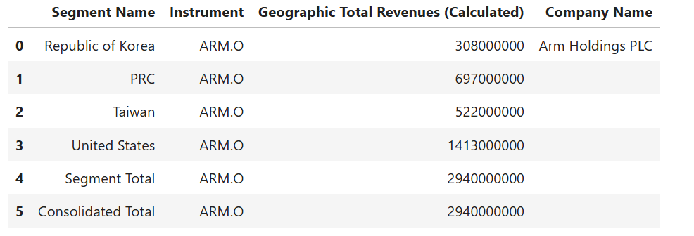
Firstly, the Notebook application uses Data Library get_data method to request the company fundamentals via following fields:
- TR.BGS.GeoTotalRevenue.segmentName: Segment (Geographic) data
- TR.BGS.GeoTotalRevenue: Each segment revenue value
- TR.CompanyName
I am demonstrating with Arm Holdings (RIC Code: ARM.O) as an example data set.
df = ld.get_data(universe = ric,
fields=['TR.BGS.GeoTotalRevenue.segmentName', 'TR.BGS.GeoTotalRevenue','TR.CompanyName'])
df
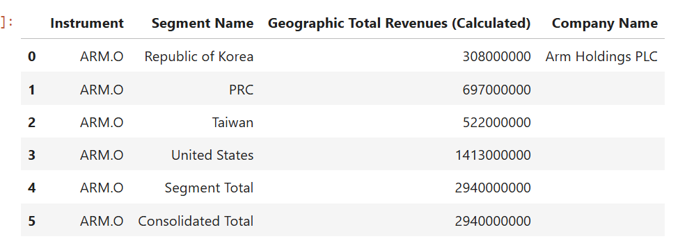
This get_data function returns data as Pandas Dataframe object by default.
Plotting A Graph, First Try
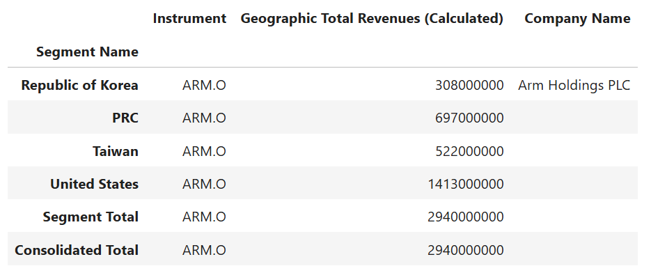
So, now let’s look at what if I plot this data. The first step is changing the Segment Name column to be an index.
df.set_index('Segment Name', drop= True, inplace=True)
df
Then, I plot a bar graph with this DataFrame object.
fig = plt.figure()
df.plot(kind='barh', ax=fig.gca())
plt.show()
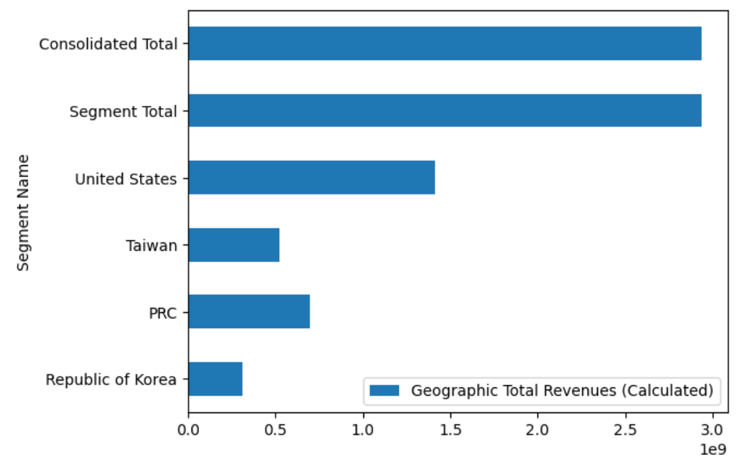
You see that the graph above is hard to read and analysis the sale revenue values at all.
Restructure Company Geographic Sale Data Dataframe object
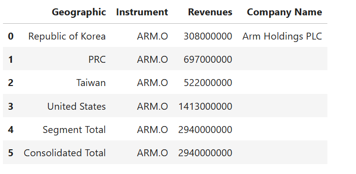
I need to restructure the Dataframe and make data easier to read before plotting a graph. The first step is to reindex from Segment Name to be a data column.
df_graph = df.copy()
df_graph.reset_index(level=0, inplace=True)
df_graph
Moving on to the next step, renaming Segment Name and Geographic Total Revenues (Calculated) columns to be more readable names like Geographic and Revenue.
df_graph.rename(
columns= {
'Segment Name':'Geographic',
'Geographic Total Revenues (Calculated)':'Revenues'
},
inplace= True
)
df_graph
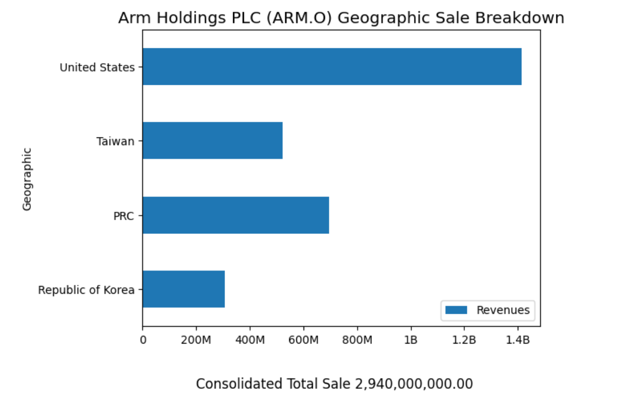
Then we get the Company name and consolidate total revenue information from Dataframe object.
total_sale = df_graph.iloc[df_graph.shape[0] - 1]['Revenues']
company_name = df_graph.iloc[0]['Company Name']
And the last thing on this phase is to remove the Total Sale Revenue rows from the Dataframe, we will display the consolidated revenue information as a graph footer instead.
df_graph = df_graph[df_graph['Geographic'] != 'Segment Total']
df_graph = df_graph[df_graph['Geographic'] != 'Consolidated Total']
That covers a data transformation phase.
Plotting A Graph, Second Try
That brings us to plot a graph with the data that already transformed to match this purpose.
Firstly, I create a Python method format_revenues_number to reformat large revenue numbers into a readable numbers in trillions, billions or millions unit. This method source code is based on Dan Friedman's How to Format Large Tick Values tutorial source code via GitHub.
def format_revenues_number(tick_val, pos):
"""
Turns large tick values (in the trillions, billions, millions and thousands) such as 4500 into 4.5K
and also appropriately turns 4000 into 4K (no zero after the decimal).
"""
if tick_val >= 1000000000000: # Add support for trillions
val = round(tick_val/1000000000000, 1)
new_tick_format = '{:}T'.format(val)
elif tick_val >= 1000000000:
val = round(tick_val/1000000000, 1)
new_tick_format = '{:}B'.format(val)
elif tick_val >= 1000000:
val = round(tick_val/1000000, 1)
new_tick_format = '{:}M'.format(val)
elif tick_val >= 1000:
val = round(tick_val/1000, 1)
new_tick_format = '{:}K'.format(val)
elif tick_val < 1000:
new_tick_format = round(tick_val, 1)
else:
new_tick_format = tick_val
# make new_tick_format into a string value
new_tick_format = str(new_tick_format)
"""
code below will keep 4.5M as is but change values such as 4.0M to 4M since that
zero after the decimal isn't needed
"""
index_of_decimal = new_tick_format.find(".")
if index_of_decimal != -1:
value_after_decimal = new_tick_format[index_of_decimal+1]
if value_after_decimal == "0":
# remove the 0 after the decimal point since it's not needed
new_tick_format = new_tick_format[0:index_of_decimal] + new_tick_format[index_of_decimal+2:]
return new_tick_format
Then I use Python matplotlib.pyplot library to plot a bar graph that represent each region revenue from restructured Dataframe object in Jupyter Notebook.
# Plotting a Graph
df_graph.set_index('Geographic',drop=True,inplace=True)
fig = plt.figure()
#Format Total Sale display unit as a graph footer.
fig.text(.5, -.05, 'Consolidated Total Sale %s' %(f'{total_sale:,.2f}'), ha='center',fontsize='large')
# Create graph title from Company and RIC names dynamically.
plt.ticklabel_format(style = 'plain')
plt.title('%s (%s) Geographic Sale Breakdown' % (company_name, ric), color='black',fontsize='x-large')
ax = fig.gca()
#Apply Sale data into millions function.
formatter = FuncFormatter(format_revenues_number)
ax.xaxis.set_major_formatter(formatter)
df_graph.plot(kind='barh', ax = fig.gca())
plt.show()
The result is as follows:
That’s all I have to say about the example application implementation detail.
Conclusion
Workspace platform provides a wide range of Fundamentals data for your investment decisions including company geographic sale information. This information helps you analysis the revenue from each geographic region of your interested company in both panel data and graph formats.
That covers all I wanted to say today.
References
You can find more detail regarding the Data Library and related technologies for this Notebook from the following resources:
- LSEG Data Library for Python on the LSEG Developer Community
- Data Library for Python - Reference Guide
- The Data Library for Python - Quick Reference Guide (Access layer) article.
- Essential Guide to the Data Libraries - Generations of Python library (EDAPI, RDP, RD, LD) article.
- Upgrade from using Eikon Data API to the Data library article.
- Data Library for Python Examples on GitHub repository.
- Dan Friedman's Python programming, data analysis, data visualizations tutorials.
- Pandas API Reference.
- Pyplot Graph API Reference.
For any question related to this example or Data Library, please use the Developers Community Q&A Forum.