
AUTHOR:

Overview
In today's rapidly evolving financial landscape, staying ahead of the curve requires access to real-time data and powerful visualization tools. As I can see the importance of equipping individual traders with cutting-edge solutions. In this article, we'll explore the seamless integration of Microsoft Power BI with the Eikon Data API, enabling you to effortlessly visualize financial data. By the end of this article, you'll be able to create captivating visualizations that empower you to make data-driven decisions and gain a competitive edge.
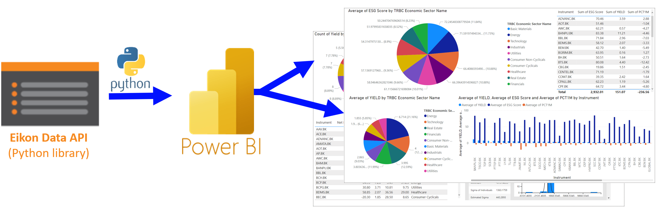
In this article, we're going to create a visualization board to visualize the financial data retrieved from Eikon Data API, the two panels below are used to demonstrate.
- The first one is the simple one, we're going to retrieve the ESG Score and yield data with the TRBC (Thomson Reuters Business Classification) Economic Sector name using pie charts and clustered column chart
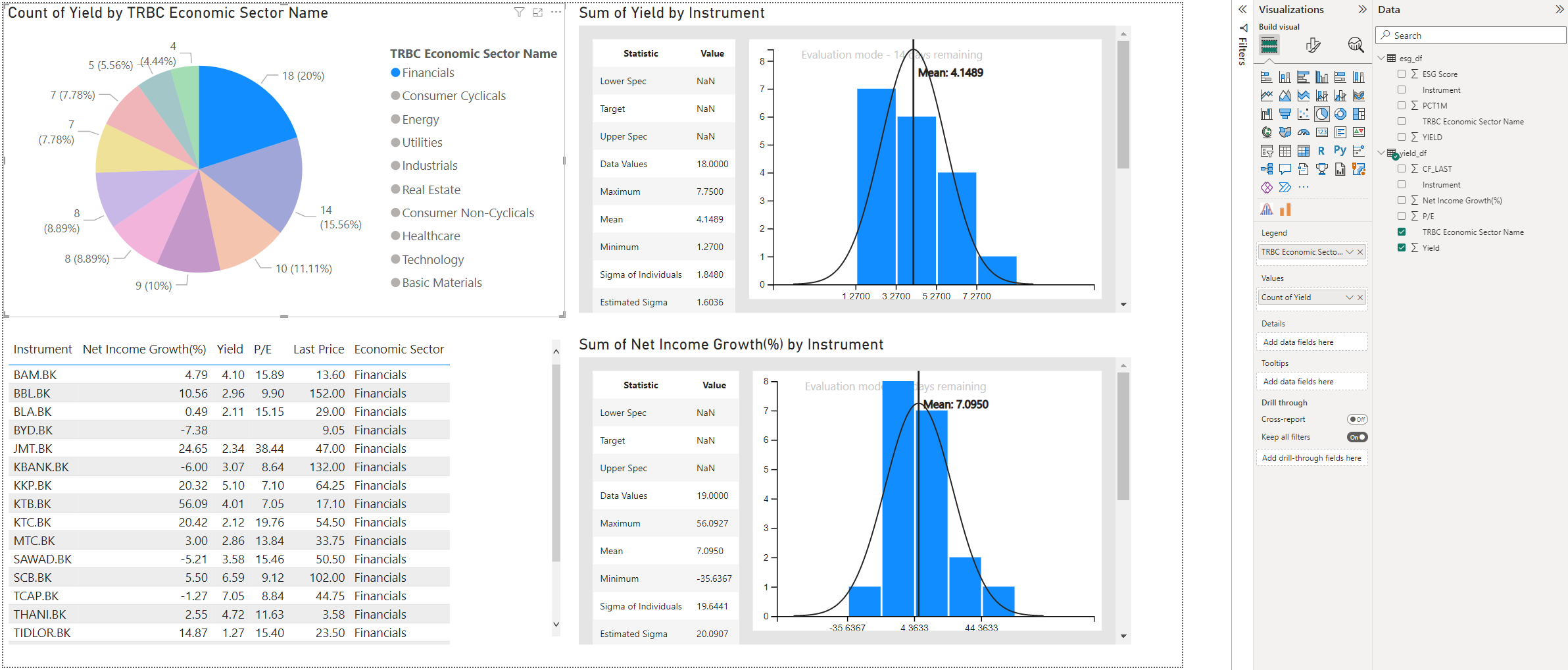
- The second one is retrieving the Yield by the TRBC Economic Sector name as a pie chart and table, and the histogram of summarize of yield and net income growth percentage, broken down by instrument.
Let's get to know the tools used here, which are Eikon Data API and Microsoft Power BI
Eikon Data API - Python
Ease of use Python library, which is a part of the Eikon suite, provides simple access to Eikon data. Any Eikon end user, where the data doesn’t leave the desktop, can use this API to access their Eikon data more flexibly. (if you want more than that, i.e. beyond single applications on one desktop, and you want data to leave your desktop, our Refinitiv Data Platform is the right solution for you. Learn more here.)
To get started, All you need is Eikon. Simply follow the Quick Start instructions (users must be running Eikon Desktop Version 4.0.36 or higher)
Microsoft Power BI
Microsoft Power BI is a user-friendly and powerful tool for visualizing data and gaining insights. It helps to make sense of complex information by turning it into interactive reports and visually appealing dashboards. With Power BI, you can connect to different data sources (in this article, we'll retrieve the data from Eikon Data API using Python code) then transform data into meaningful formats and create the visualizations without needing advanced coding skills. Whether you're a business analyst, data enthusiast, or individual trader, Power BI makes it easy to explore data, spot patterns, and make informed decisions. It's enabling anyone to unlock the value of their data and uncover valuable insights.
Prerequisite
This example requires the following dependencies software and libraries.
- Refinitiv Eikon or Refinitiv Workspace application with access to Eikon Data APIs.
- Python environment with Eikon Python library (Python version 3.9.12 and Eikon Python library 1.1.16 are used here)
- Microsoft Power BI Application
- Internet connection.
Please contact your Refinitiv account representative to help you to access Refinitiv Workspace/Eikon credentials. You can generate/manage the AppKey by following the steps in the Eikon Data API Quick Start page.
Retrieving Financial Data with Python:
The code below is used to retrieve the data from Eikon Data API. You can test by executing the code in your preferred code editor to make sure it works fine before putting the code in the Microsoft Power BI application to retrieve the data. In this article, we're going to do two pages of Power BI from two dataframes retrieved from Eikon Data API. Let's check the step for each dataframe below.
First page, ESG score data: Retrieve data with Python script.
Second page, Yield data: Retrieve data with Power BI query, including Python script and a code to manage imported data.
First page, ESG score data
Let's get started! After having a Python code for the data retrieving and making sure that it could run properly, this code is ready to be put in the Power BI.
import eikon as ek
ek.set_app_key('## YOUR EIKON APP KEY ##')
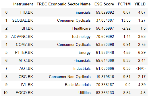
df,e = ek.get_data('0#.SET50',['TR.TRBCEconomicSector','TR.TRESGScore','PCT1M','YIELD'])
Below is the result of the code execution in Jupyter Notebook.
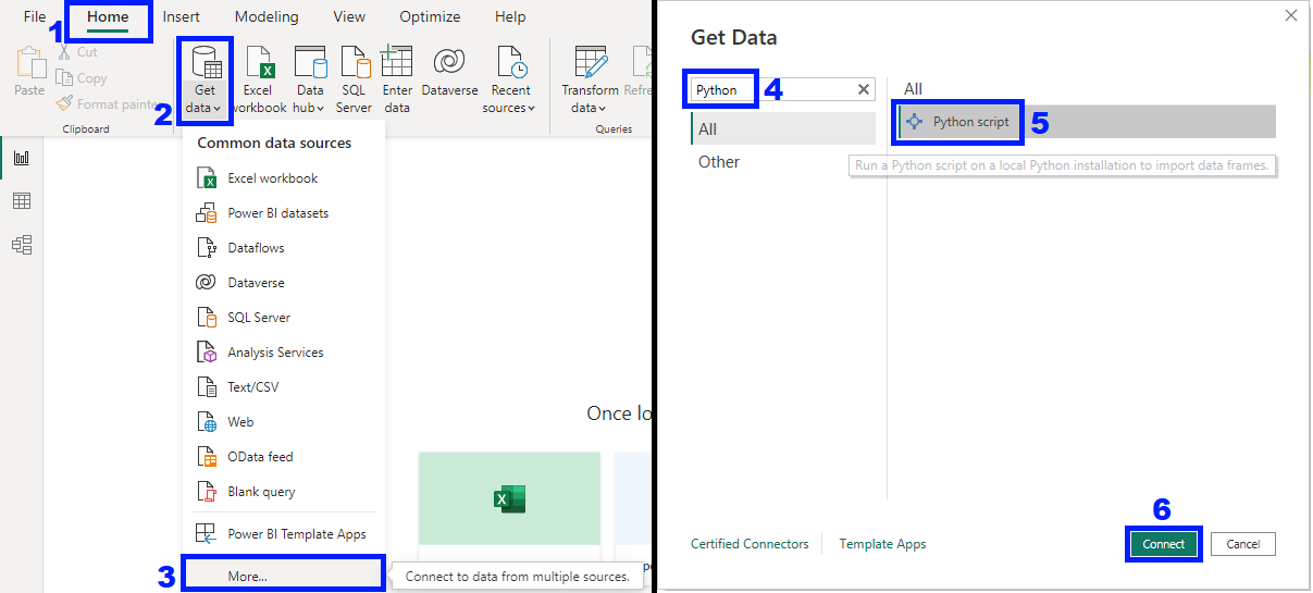
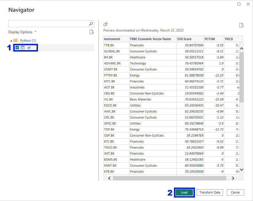
In Microsoft Power BI, Select the Home tab > Click Get data dropdown > Click More, the Get Data Pop-up will be shown with the options that can be used to retrieve the data. Search for Python script, select it, then click Connect
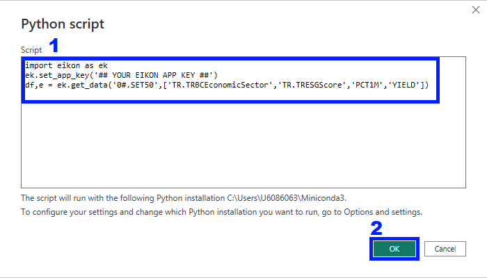
The Python script Pop-up will be shown, paste the Python script here, replace the ## YOUR EIKON APP KEY ## with your valid Eikon application key, then click OK
The Power BI is getting the data with the Python script, selects the df output dataframe (as named in the script), then verifies if the data is imported properly (data type is correctly defined as numeric, String, etc.) click Load to load the data into Power BI (You can click Transform Data in case the data format isn't correct)
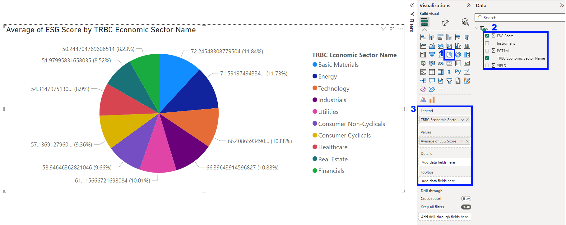
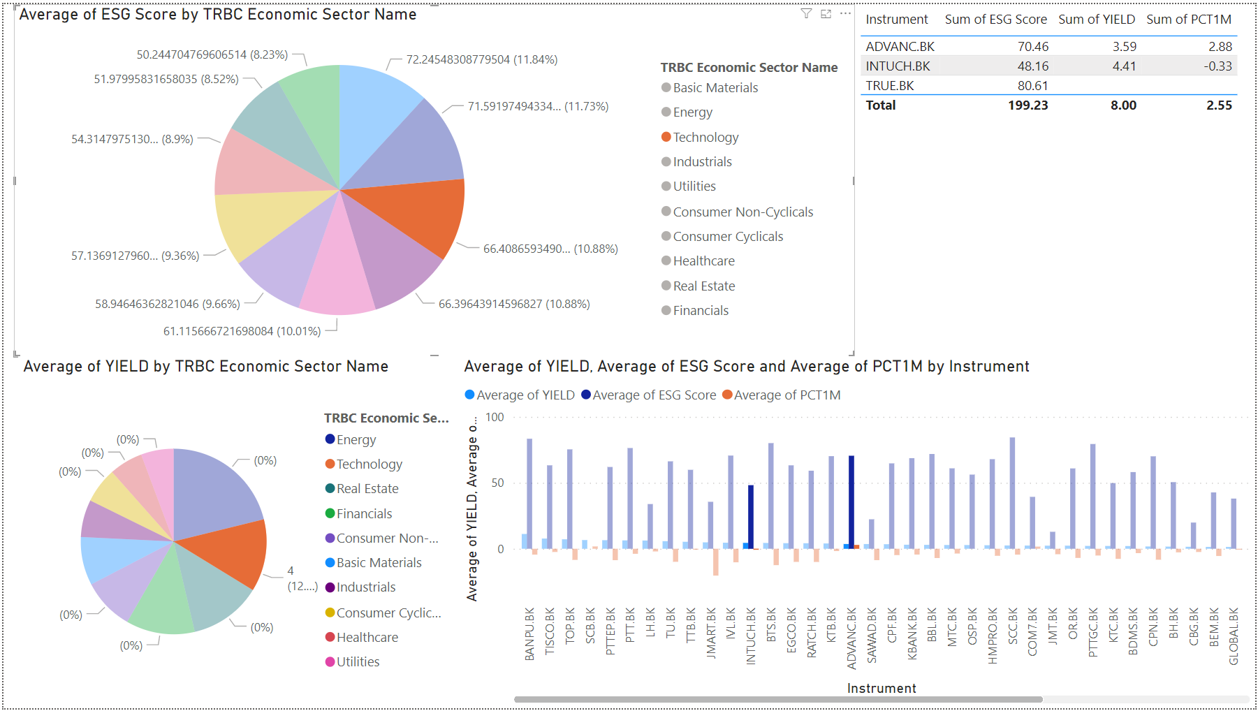
First, let's make the pie chart! Click on the blank space in the working space > on the right section, Visualizations, Click on the Pie Chart > On the imported df data and select the fields that you'd like to visualize, here I select ESG Score and TRBC Economic Sector Name > The Power BI is going to put selected fields into the proper Legend and Values, or you can adjust it according to your need. The generated pie chart will be shown in the working space.
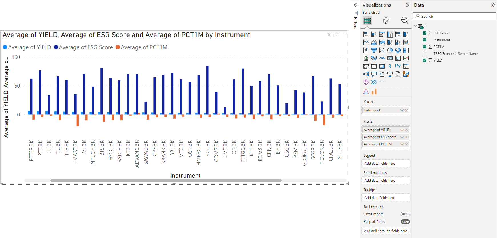
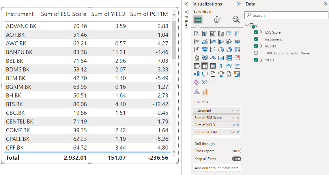
Do the same with other visualization types, such as Clustered Column Chart and Table as below.
Here's the final result, including multiple visualizations that we've created. On this page, we can select specific data to see the insight of it in other charts as well. For example, Technology TRBC Economic Sector Name is selected here.
For the second page, I'm going to tweak the Python code below to be the Power BI query which includes Python code and a code to manage imported data.
import eikon as ek
ek.set_app_key('## YOUR EIKON APP KEY ##')
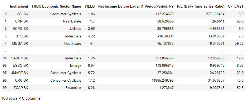
yield_df,e = ek.get_data('0#.SET100',['TR.TRBCEconomicSector','YIELD','TR.NetIncomeBefExtrapctPrdtoPrd','TR.PE','CF_LAST'])
Below is the result of the code execution in Jupyter Notebook.
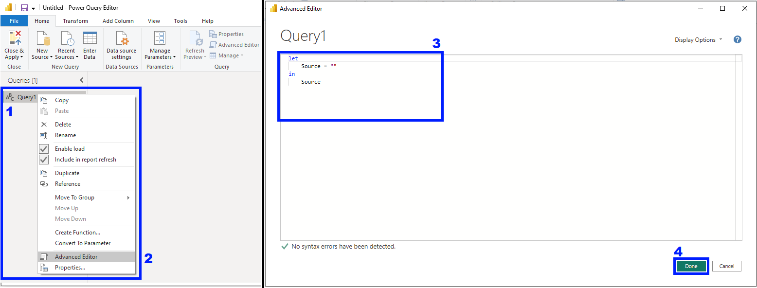
To get data using Power BI query, select Get data dropdown > Blank query

The Power Query Editor window will pop up, right click on the Query > Advanced Editor. In the Advanced Editor, put the Power BI query, you can check if there's an error in the syntax at the bottom-left of the window, then after finishing the query, click Done.
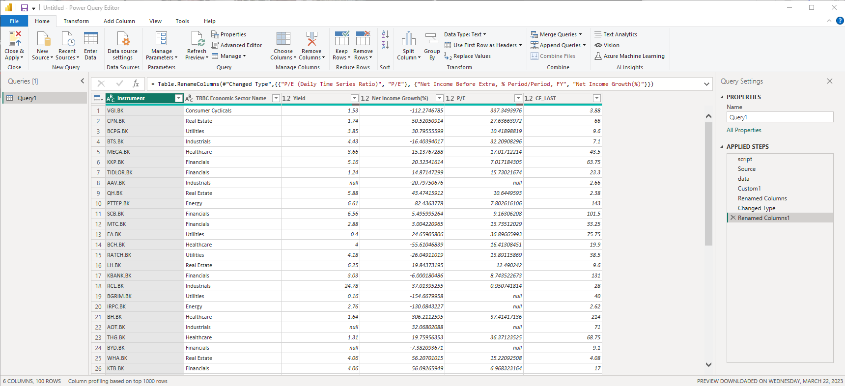
Below is the tweaked Power BI Query from the Python script above. this query includes Python script, Renamed Columns, and Changed Type of columns to manage imported data
let
script = Text.Combine({"import eikon as ek#(lf)ek.set_app_key('## YOUR EIKON APP KEY ##')#(lf)yield_df,e = ek.get_data('0#.SET100',['TR.TRBCEconomicSector','YIELD','TR.NetIncomeBefExtrapctPrdtoPrd','TR.PE','CF_LAST'])"}),
Source = Python.Execute(script),
data = Source{[Name="yield_df"]}[Value],
Custom1 = data,
#"Renamed Columns" = Table.RenameColumns(Custom1,{{"YIELD", "Yield"}}),
#"Changed Type" = Table.TransformColumnTypes(#"Renamed Columns",{{"Yield", type number}, {"Net Income Before Extra, % Period/Period, FY", type number}, {"P/E (Daily Time Series Ratio)", type number}, {"CF_LAST", type number}}),
#"Renamed Columns1" = Table.RenameColumns(#"Changed Type",{{"P/E (Daily Time Series Ratio)", "P/E"}, {"Net Income Before Extra, % Period/Period, FY", "Net Income Growth(%)"}})
in
#"Renamed Columns1"
The imported data will be shown, if you're ok with this, click the Close & Apply button on the top-left to import the data into the Power BI workspace.
From this data, repeat the same step as the first page, I use Pie chart, Table, and Histogram charts to visualize the data. Here's the final result with the selection of Financial TRBC Economic Sector Name to see the insight in all related charts.
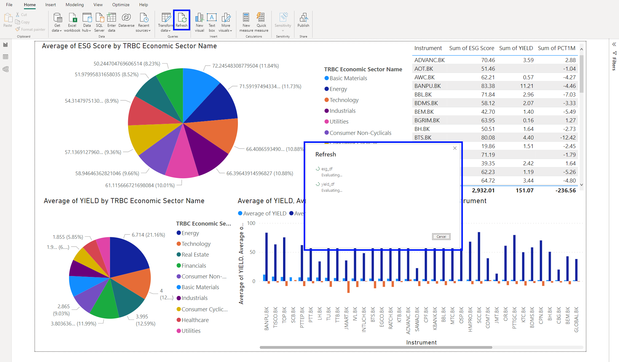
One thing I'd love to represent is, in Power BI, you can click the Refresh button to refresh the data, Power BI is going to reload the data using the get data script and show the latest data retrieved.
Conclusion
In this article, we explored how to visualize the data retrieved from the Eikon Data API using Microsoft Power BI which can empower individual traders to visualize and analyze financial data effectively by using the power of Power BI's visualizations including pie charts, clustered column charts, histograms, tables, and others can gain valuable insights that aid in making informed investment decisions. With this knowledge, you can now easily see the trend of both overview and in-depth of financial data and unlock the potential for increased profitability and success in the dynamic world of finance.
If you have any questions regarding our API usage, feel free to check our Q&A Forum or post the question there to get in touch. Hope you have fun with this article!
- Register or Log in to applaud this article
- Let the author know how much this article helped you