Element Framework
Quickly build web UIs that align with LSEG Workspace standards for user experience, performance and visual design.
Part of the LSEG Workspace SDK, the Element Framework (EF) is a collection of common, reusable UX components that adhere to framework-less web standards which apply across all major web browsers.
Users
|
Associated Building Blocks
|
How can you leverage this API?
The Element Framework (EF) can be installed via public npm.
- EF comprises over 40 Web Component elements.
- The library is cross-platform and framework agnostic. For example, it can be used with vanilla JS, React, Angular and Vue.
- The Framework is utilised in various LSEG digital product channels including LSEG Workspace and RDP.
- The library is readily available to LSEG Workspace partners and offers clear documentation with easy-to-use tooling and processes.
- Internationalisation capabilities are built in (i18n aware).
- Colours can be changed, and text uses the ICU message format.
- The components have been packaged in small file sizes (ES6 modules) and can easily be bundled together.
- Components themselves are written in TypeScript.
- The newest library has 10x faster rendering and 2x faster loading than previous versions.
- Automated QA covers much of the code.
- All elements are documented and supported.
How to get started
Simply follow the Quick Start instructions in our online documentation!
What is the Element Framework built upon?
Every year, LSEG delivers hundreds of new UX workflows and applications. This is made possible via the repeated use of standardised core components, which helps avoid re-builds and ensures consistency in the look and feel of applications.
The Element Framework (EF) is a library of reusable web components that can be easily utilised with minimal configuration and code changes. Hence, they make web application development within the LSEG Workspace ecosystem much quicker and more productive. The elements and components adhere to LSEG Workspace's Halo Product Design System, which ensures that the theme / look-and-feel / branding / UX of application workflows remains consistent. In addition, support for internationalisation and accessibility is built in and the web components have been fine-tuned for fast performance and rendering.
The Element Framework web components are built using TypeScript. They are explicitly intended to be reusable building blocks for all UX development and can be utilised in any web application delivery regardless of channel.
Web components enable us to create truly encapsulated bits of UI that can be wrapped in a single tag and dropped onto a page without concern about conflicts with other elements and styles in the rest of your code. We provide specifications that leverage a low-level set of APIs to extend a browser’s built-in set of HTML tags, covering:
- A common method for creating a component (using standard DOM APIs)
- A common way of receiving and sending data (using properties / events)
The elements built cover the following functional types:
- Basic UI elements – e.g. buttons, dialog, icons, inputs, lists
- Data visualisation – e.g. bars, charts, sparklines, gauges
- Notifications – e.g. appstate bars, notifications, loaders
- Advanced elements – e.g. grids, autosuggest, pagination, colour dialog, layouts
- Typography & styling
- Language support
- Framework integrations – vanilla JS, Angular, React, Vue
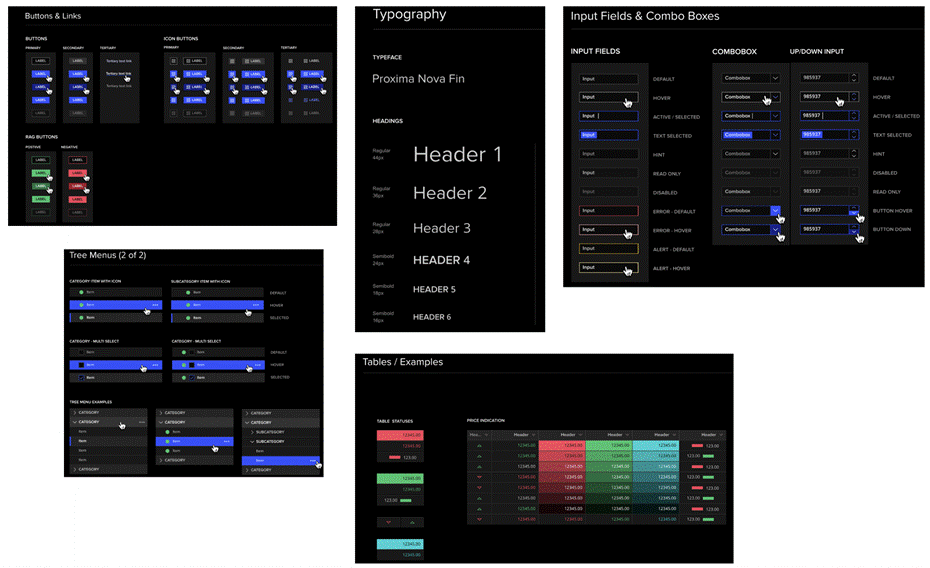
Design System - Halo
Halo is the main design system for LSEG digital products. It is an adaptable system of guidelines, Figma libraries and design tools that support the best practices of user interface design for LSEG's products and services. Halo covers:
- Themes (Dark / Light)
- Standardised UI controls and components
- Responsive design – one code base supporting UI on different sized devices
- Built-in accessibility
- UI templates for fast prototyping
Example components from the Halo Design System

