The coronavirus (COVID-19) outbreak has been labelled a pandemic by the World Health Organization (WHO). The spread number has been changed day by day across various regions/countries. The historical number of cummulative cases are available on Refinitiv DataStream Web Service. The data can be used to create interactive choropleth map providing more visibility and trend of the spread.
Introduction
Datastream is the world’s leading time series database, enabling strategists, economists and research communities’ access to the most comprehensive financial information available. With histories back to the 1950’s, you can explore relationships between data series; perform correlation analysis, test investment and trading ideas and research countries, regions and industries.
The Datastream database has over 35 million individual instruments or indicators across major asset classes. You can directly invoke the web service methods from your own applications by using metadata information we publish.
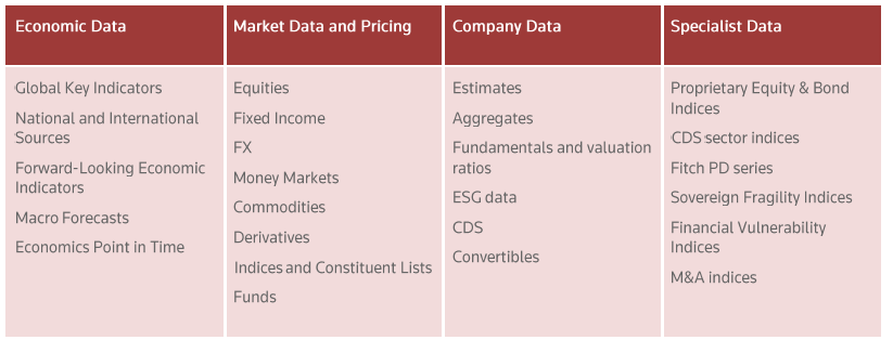
The Datastream Web Service allows direct access to historical financial time series content listed below.
This article demonstrates how to use the DataStream Web Service to retrieve time series of Covid-19 Cumulative cases in various countries around the world, and display data in Geographical Map.
For visualization part, I follow the instructions in the useful article: A Complete Guide to an Interactive Geographical Map using Python.
Prerequisite
- The following packages are required to install in Anaconda environment.
- To ensure that DataStream account and DataStream API works properly, you can try the Getting Start with Python first.
Creating Jupyter Notebook application
The Jupyter Notebook and all data files are available on Github.
Step1: Prepare Shape data to generate maps of countries.
Application needs to loads shape data from shape file using geopandas.read_file(). The shape file can be downloaded from “Download countries” on 1:110m Cultural Vectors. Antarctica has been dropped from the map because it covers large area in the map.
import geopandas as gpd
shapefile = 'data/ne_110m_admin_0_countries/ne_110m_admin_0_countries.shp'
#Read shapefile using Geopandas
gdf = gpd.read_file(shapefile)[['ADMIN', 'ADM0_A3', 'geometry']]
#Rename columns.
gdf.columns = ['country', 'country_code', 'geometry']
gdf
print(gdf[gdf['country'] == 'Antarctica'])
#Drop row corresponding to 'Antarctica'
gdf = gdf.drop(gdf.index[159])
Step2: Getting Instrument list for DataStream
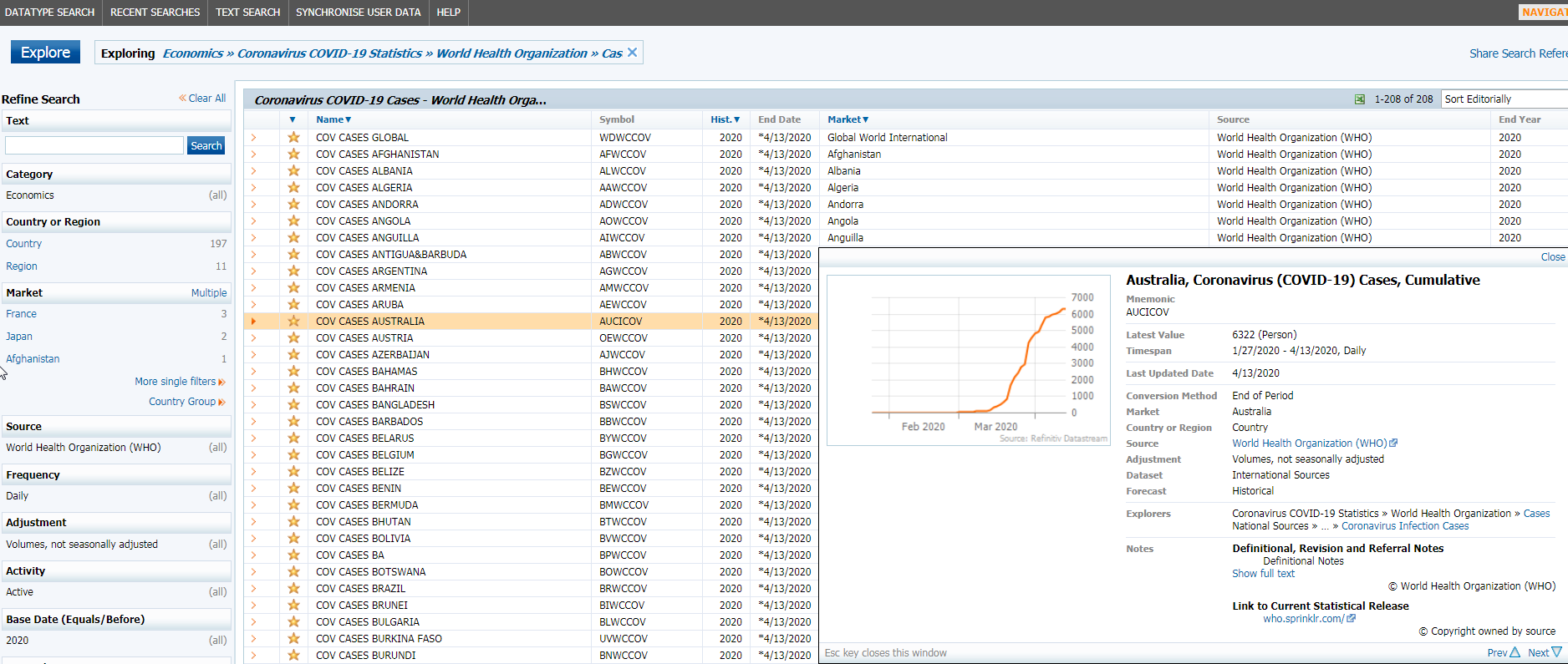
DataStream user can use the DataStream Navigator to search for available data including instrument, fields to be retrieved. The search result can be filtered with Source, Market, Frequency, etc. In this article, I get the instrument list of WHO source using the exploring path: Economics » Coronavirus COVID-19 Statistics » World Health Organization » Cases, and select only cumulative cases. Other source such as Reuters can be used as alternative source.
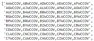
Below is the sample of the list.
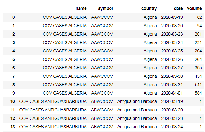
I, then, use the list to create a CSV file for Symbol and country (Market) mapping. Below is the sample of data. The file is in /data folder of the code.
Please note that country names can be mismatch between Market name of DataStream and Country name in Sharpe data used. I have modified the Symbol file to make it identical.
Step3: Using DataStream to retrieve data
First, I load the Instrument list from the CSV file to DataFrame. I separate symbol list to multiple groups of five to be requested in an API call.
symbolList = []
symbolString=''
count=0
for symbol in df['symbol'].tolist():
if symbolString=='':
symbolString = symbol
else:
symbolString = symbolString + ',' + symbol
count=count+1
if (count==5):
symbolList.append(symbolString)
symbolString=''
count=0
if symbolString!='':
symbolList.append(symbolString)
symbolList
Next, I import datastreamDSWS package and login with Datastream username and password. Then, get latest 10 days of time series data using the get_data() function. Each request contains a batch of 5 symbols. After that, application combine responses from all requests to a DataFrame object.
At this step, the application receives time series data for all instruments.
import DatastreamDSWS as DSWS
ds = DSWS.Datastream(username ="<username>", password ="<password>")
data = pd.DataFrame()
for symbolStr in symbolList:
dat = ds.get_data(tickers=symbolStr, start='-9D')
if data.empty:
data = dat
else:
data = data.join(dat)
data
Step4: Transform data
The DataFrame object returned from DataStream API is in multi-level column structure and instrument’s data is separated by column, so I convert it to a new DataFrame object which is easier to combine with Shape GeoDataFrame object by dropping level of column and changing data structure.
#Drop level of column
dat = data.columns.droplevel(level=1)
data.columns = dat
transformedDf = pd.DataFrame(columns=['symbol', 'date','volume'])
ind = 0
for (columnName, columnData) in data.iteritems():
for n in range(0,len(columnData.index)):
transformedDf.loc[ind] = [columnName,columnData.index[n],columnData.values[n]]
ind = ind+1
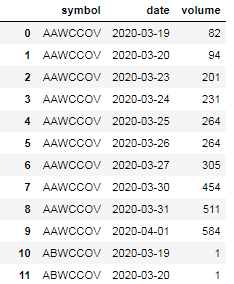
transformedDf
Since the DataStream data used Instrument name instead of country, I then merge both data together to get relation between retrieved data and country.
#Merge DataStream and Country dataFrames
merged_symbol = df.merge(transformedDf, on=['symbol'], how='left')
merged_symbol
Step5: Generate static choropleth map
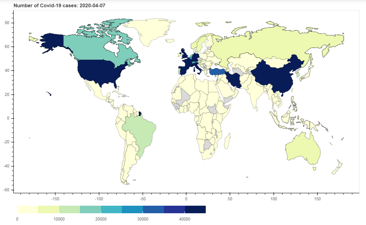
Next, I will generate static choropleth map for the latest date. First, I filter only the latest date of DataFrame data to be displayed in a static choropleth map, and then merge the data with Shape GeoDataFrame object. I also replace NaN value to “No data” string, because this merged dataframe will be converted to GeoJSON later but NaN is not valid for JSON.
#Filter data for only latest date.
df_latest = merged_symbol[merged_symbol['date'] == array_index[-1]]
merged = gdf.merge(df_latest, on = 'country', how = 'left')
#Fill 'No data' for any NaN value on 'volume column
merged.fillna({'volume':'No data'}, inplace = True)
merged
After that, I convert the GeoDataFrame object to GeoJSON data, and use Bokeh package to generate static map using pathches() function. Number values in the ‘volume’ column are mapped into a range of 10 shards representing values between 0 and 45000.
import json
#Read data to json
merged_json = json.loads(merged.to_json())
#Convert to str like object
json_data = json.dumps(merged_json)
from bokeh.io import output_notebook, show, output_file
from bokeh.plotting import figure
from bokeh.models import GeoJSONDataSource, LinearColorMapper, ColorBar
from bokeh.palettes import brewer
#Input GeoJSON source that contains features for plotting.
geosource = GeoJSONDataSource(geojson = json_data)
#Define a sequential multi-hue color palette.
palette = brewer['YlGnBu'][9]
#Reverse color order so that dark blue is highest obesity.
palette = palette[::-1]
#Instantiate LinearColorMapper that linearly maps numbers in a range, into a sequence of colors.
color_mapper = LinearColorMapper(palette = palette, low = 0, high = 45000, nan_color = '#d9d9d9')
#Define custom tick labels for color bar.
tick_labels = {'45000': '>45000'}
#Create color bar.
color_bar = ColorBar(color_mapper=color_mapper, label_standoff=8,width = 500, height = 20,
border_line_color=None,location = (0,0), orientation = 'horizontal', major_label_overrides = tick_labels)
#Create figure object.
p = figure(title = 'Number of Covid-19 cases: %s' %array_index[-1], plot_height = 600 , plot_width = 950, toolbar_location = None)
p.xgrid.grid_line_color = None
p.ygrid.grid_line_color = None
#Add patch renderer to figure.
p.patches('xs','ys', source = geosource,fill_color = {'field' :'volume', 'transform' : color_mapper},
line_color = 'black', line_width = 0.25, fill_alpha = 1)
#Specify figure layout.
p.add_layout(color_bar, 'below')
#Display figure inline in Jupyter Notebook.
output_notebook()
#Display figure.
show(p)
Step6: Create Interactive choropleth map
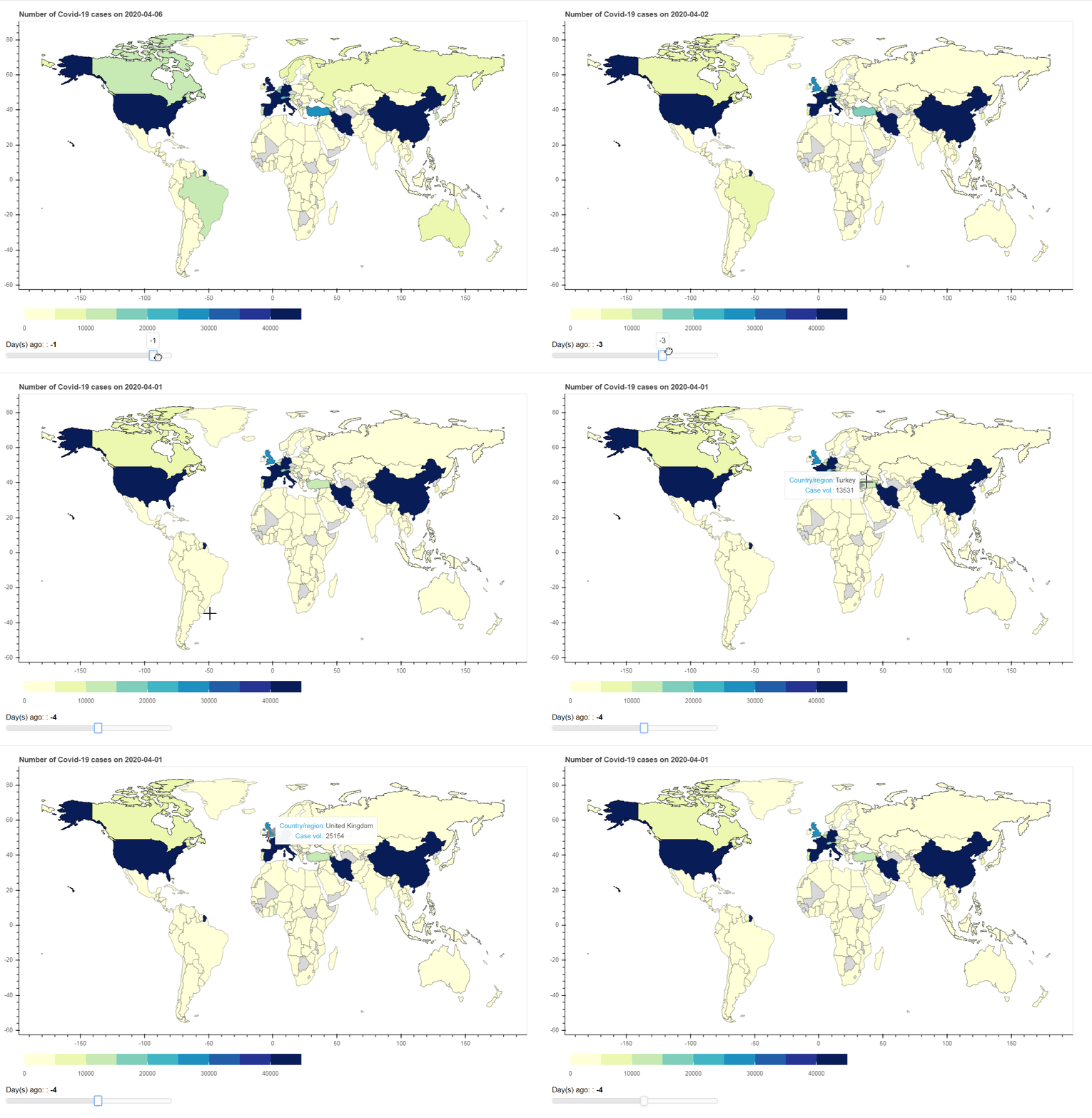
Next, I add interactivity to our visualization using Slider Widget. Once the data on the Slider is changed, it generates event in a Python Callback function, update_plot(). The function will filter the selected date from the existing GeoDataFrame object, and then update the GeoDataSource object used for visualization.
from bokeh.io import curdoc, output_notebook
from bokeh.models import HoverTool
from bokeh.models.widgets import Slider
from bokeh.layouts import widgetbox, row, column
#Define function that returns json_data for year selected by user.
def json_data(selectedDate):
p.title.text = 'Number of Covid-19 cases on %s' %selectedDate
dt = selectedDate
df_dt = merged_symbol[merged_symbol['date'] == dt]
merged = gdf.merge(df_dt, on = 'country', how = 'left')
#Fill 'No data' for any NaN value on 'volume column
merged.fillna({'volume':'No data'}, inplace = True)
merged_json = json.loads(merged.to_json())
json_data = json.dumps(merged_json)
return json_data
# Define the callback function: update_plot
def update_plot(attr, old, new):
ts = array_index[int(slider.value)+9]
new_data = json_data(ts)
geosource.geojson = new_data
#Input GeoJSON source that contains features for plotting.
geosource = GeoJSONDataSource(geojson = json_data(array_index[0]))
#Define a sequential multi-hue color palette.
palette = brewer['YlGnBu'][8]
#Reverse color order so that dark blue is highest obesity.
palette = palette[::-1]
#Instantiate LinearColorMapper that linearly maps numbers in a range, into a sequence of colors. Input nan_color.
color_mapper = LinearColorMapper(palette = palette, low = 0, high = 5000, nan_color = '#d9d9d9')
#Define custom tick labels for color bar.
tick_labels = {'5000': '>5000'}
#Add hover tool
hover = HoverTool(tooltips = [ ('Country/region','@country'),('Case vol.', '@volume')])
#Create color bar.
color_bar = ColorBar(color_mapper=color_mapper, label_standoff=8,width = 500, height = 20,
border_line_color=None,location = (0,0), orientation = 'horizontal', major_label_overrides = tick_labels)
#Create figure object.
p = figure(title = 'Number of Covid-19 cases', plot_height = 600 , plot_width = 950, toolbar_location = None, tools = [hover])
p.xgrid.grid_line_color = None
p.ygrid.grid_line_color = None
#Add patch renderer to figure.
p.patches('xs','ys', source = geosource,fill_color = {'field' :'volume', 'transform' : color_mapper},
line_color = 'black', line_width = 0.25, fill_alpha = 1)
#Specify layout
p.add_layout(color_bar, 'below')
# Make a slider object: slider
slider = Slider(title="Day(s) ago: ", start=-9, end=0, value=0)
slider.on_change('value', update_plot)
# Make a column layout of widgetbox(slider) and plot, and add it to the current document
layout = column(p,widgetbox(slider))
curdoc().add_root(layout)
#Display plot inline in Jupyter notebook
output_notebook()
#Display plot
show(layout)
As the Python callback the application used requires Bokeh Server to automatically push server-side updates to the UI (i.e. widgets or plots in a browser), you need to run this notebook in the Bokeh server. Below is the sample command in Conda command line.
bokeh serve --show COV_GeographicalMap.ipynb
In conclusion, this article demonstrates how to find instrument in DataStream Navigator, retrieve and transform data and create static and interactive visualization.
