

Imagine you hear that a company just got added to the S&P 500. Your first thought might be: "They must be doing something right — maybe I should take a closer look before everyone else does." And if a stock gets removed? "What went wrong? Maybe I should get out while the price is still reasonable." That instinct — the urge to act on the signal — is natural, and you wouldn't be alone in feeling it.
But here's what makes this really interesting: your instinct is only the surface layer. Beneath it, a much larger force is at work. Hundreds of ETFs, index mutual funds, and institutional accounts are built to hold exactly the same stocks as the S&P 500 — and "hold" means they own real shares. When the roster changes, these funds can't just update a label in a spreadsheet. They have to go into the market and actually buy shares of the new stock — and actually sell shares of the one leaving. Every one of them. At roughly the same time. Not because they want to, but because their rules say they must. No deliberation, no discretion, just execution.
To put a face on it: when Safeway was removed from the S&P 500 in January 2015 (following its acquisition), daily trading volume jumped from around 300,000 shares to over 22 million on the effective date — roughly 60 times normal.
Researchers have been studying this pattern — known as the reconstitution effect — since the 1980s. You can look up the full history of S&P 500 joiners and leavers in LSEG Workspace — it keeps records going back to 1994. What Workspace doesn't do is connect those 2,000+ individual events to price and volume data, measure the impact across all of them, and distill the result into a single composite picture. That's computation — and that's what a notebook is built for.
This notebook retrieves years of S&P 500 membership changes, measures the price and volume impact around each one, and aggregates the results into a composite picture of the "average" joiner and the "average" leaver. If the pattern holds up, it then uses current market data to identify the most likely candidates for the next round of changes — turning a historical insight into something you can act on ahead of time.
Setup
This notebook uses the LSEG Data Library for Python to retrieve index constituent change history, daily pricing, and fundamental data. It is designed for LSEG Workspace desktop users.
The event study logic — computing market-adjusted abnormal returns and abnormal volume — lives in a companion file, index_rebalance_utils.py, which should sit in the same directory as this notebook.
Additional packages:
- pandas / numpy for data manipulation
- plotly for interactive visualization
- scipy for statistical testing
import lseg.data as ld
import pandas as pd
import numpy as np
import plotly.express as px
import plotly.graph_objects as go
from plotly.subplots import make_subplots
from scipy import stats
from IPython.display import display, HTML
import warnings
warnings.filterwarnings("ignore", category=FutureWarning)
from index_rebalance_utils import compute_market_adjusted_car, compute_abnormal_volume, aggregate_events
pd.set_option("display.max_colwidth", 80)
pd.set_option("display.max_columns", 20)
pd.set_option("display.float_format", "{:.4f}".format)
display(HTML("<style>.dataframe td { white-space: nowrap; }</style>"))
# Establish communication with our LSEG data environment.
# Initialize the session - Desktop mode (Workspace)
ld.open_session()
Configuration
All the settings that control this analysis live here. The defaults target the S&P 500 — the most widely followed index in the world — but you can swap in any index by changing a couple of values.
Two settings that shape the analysis are worth understanding:
- Event window (-30 to +30 trading days) — the period around each index change where we measure what happened to the stock's price and volume. Think of it as looking one and a half months before and after the change date.
- Volume baseline (-150 to -31 trading days) — a longer period before the event window. We use this stretch of "normal" trading to learn what each stock's typical daily volume looks like, so we can measure how much the rebalancing inflated it. This window deliberately doesn't overlap with the event window — we don't want the index change itself to contaminate our baseline.
# --- Configuration ---
# Index to analyze
INDEX_RIC = ".SPX" # S&P 500
INDEX_CHAIN = "0#.SPX" # Chain RIC for current constituents
INDEX_NAME = "S&P 500"
BENCHMARK_RIC = ".SPX" # Market benchmark for abnormal return calculation
# Event study windows (in trading days)
EVENT_WINDOW = (-30, 30) # Days around the effective date
VOLUME_BASELINE = (-150, -31) # Pre-event window for normal volume comparison
# Historical lookback for constituent changes
CHANGES_START = "2018-01-01"
CHANGES_END = "2025-12-31"
# Prediction: how far around the threshold to search for candidates
MCAP_BUFFER_PCT = 0.20 # Within 20% of the smallest current constituent
# Display
TOP_N = 20 # Number of candidates to show in watchlist
print(f"Index: {INDEX_NAME} ({INDEX_RIC})")
print(f"Event window: [{EVENT_WINDOW[0]}, +{EVENT_WINDOW[1]}] trading days")
print(f"Volume baseline: [{VOLUME_BASELINE[0]}, {VOLUME_BASELINE[1]}] trading days")
print(f"Constituent changes: {CHANGES_START} to {CHANGES_END}")
Index: S&P 500 (.SPX)
Event window: [-30, +30] trading days
Volume baseline: [-150, -31] trading days
Constituent changes: 2018-01-01 to 2025-12-31
1. Which Stocks Were Added or Removed?
What we're doing: Pulling the historical record of every stock that joined or left the S&P 500 over the past several years.
Why it matters: Each of these changes is a natural experiment. Something happened to the stock — it got added or removed — and we can look at what its price and trading volume did in response. One event by itself doesn't tell us much (maybe the stock was already moving for other reasons), but when we stack dozens of them together, the noise cancels out and any systematic pattern becomes visible. The more events we collect, the more confident we can be in the result.
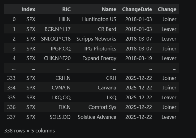
A couple of things to note about this data: changes don't follow a neat schedule. Some cluster around the quarterly rebalancing dates (March, June, September, December), when the index committee conducts its routine review. Others happen mid-month because a corporate event — an acquisition, a bankruptcy, or a spin-off — forces the committee to swap a constituent outside the regular schedule. You'll also notice that some removed stocks have RICs with a ^ character (like SWY.N^A15), which marks them as retired instruments. These are companies that no longer trade independently — usually because they were acquired. Their historical price data is still available, so we can include them in the analysis.
# Retrieve historical index constituent changes
changes_df = ld.get_data(
universe=INDEX_RIC,
fields=[
"TR.IndexJLConstituentRIC",
"TR.IndexJLConstituentName",
"TR.IndexJLConstituentChangeDate",
"TR.IndexJLConstituentituentChange",
],
parameters={
"SDate": CHANGES_START,
"EDate": CHANGES_END,
"IC": "B",
},
)
changes_df.columns = ["Index", "RIC", "Name", "ChangeDate", "Change"]
print(f"Raw constituent changes retrieved: {len(changes_df)} events")
changes_df
Raw constituent changes retrieved: 338 events
# Clean the changes data
changes_df["ChangeDate"] = pd.to_datetime(changes_df["ChangeDate"], errors="coerce")
changes_df = changes_df.dropna(subset=["RIC", "ChangeDate"]).copy()
# Summary
joiners = changes_df[changes_df["Change"] == "Joiner"]
leavers = changes_df[changes_df["Change"] == "Leaver"]
print(f"Clean events: {len(changes_df)}")
print(f" Joiners: {len(joiners)}")
print(f" Leavers: {len(leavers)}")
print(f" Date range: {changes_df['ChangeDate'].min().date()} to {changes_df['ChangeDate'].max().date()}")
print(f"\nEvents by year:")
events_by_year = changes_df.groupby([changes_df["ChangeDate"].dt.year, "Change"]).size().unstack(fill_value=0)
events_by_year.columns = ["Joiners", "Leavers"]
events_by_year
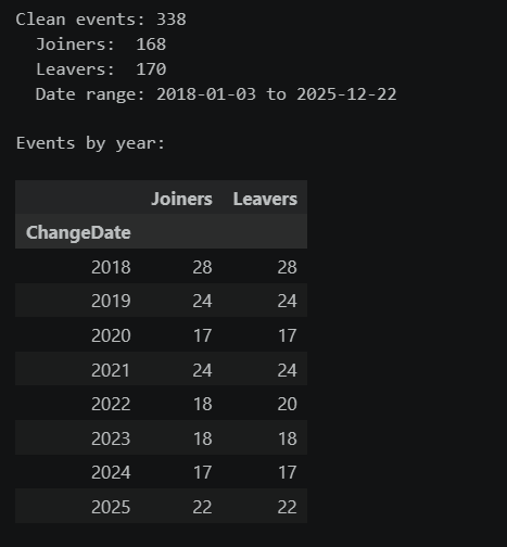
The table confirms we have a healthy sample to work with. Notice that joiners and leavers roughly balance out — when a stock joins the S&P 500, another typically leaves to keep the count at ~500. The distribution of changes across years is fairly consistent, giving us a broad set of data points from different market conditions to learn from.
2. Collecting Price and Volume Data
What we're doing: For every stock that was added or removed, we're pulling its daily price and trading volume over a window that extends well before and after the change date. We also pull the overall S&P 500 index as a reference point.
Why it matters: We don't just want to know whether a stock went up or down — the whole market might have moved that day. By pulling the benchmark index alongside each stock, we can subtract out the market's move on each day and isolate the part of the stock's performance that was specific to the index change. We also need enough volume history before the event to establish what "normal" trading looks like for each stock, so the volume spike — if there is one — stands out clearly.
# Determine the overall date range needed for price data
earliest_event = changes_df["ChangeDate"].min()
latest_event = changes_df["ChangeDate"].max()
# Add buffer for volume baseline (150 trading days ~ 7 months) and event window (30 days ~ 6 weeks)
price_start = (earliest_event - pd.DateOffset(months=8)).strftime("%Y-%m-%d")
price_end = (latest_event + pd.DateOffset(months=2)).strftime("%Y-%m-%d")
print(f"Price data range (derived from event/baseline windows): {price_start} to {price_end}")
# Get all unique stock RICs involved in events
event_rics = changes_df["RIC"].unique().tolist()
print(f"Unique stocks in events: {len(event_rics)}")
# Retrieve benchmark index price
print(f"\nRetrieving benchmark ({BENCHMARK_RIC})...")
benchmark_prices = ld.get_history(
universe=BENCHMARK_RIC,
fields="TRDPRC_1",
interval="daily",
start=price_start,
end=price_end
)
# Flatten benchmark if needed
if isinstance(benchmark_prices.columns, pd.MultiIndex):
benchmark_prices = benchmark_prices.droplevel(0, axis=1)
benchmark_close = benchmark_prices["TRDPRC_1"].dropna()
benchmark_returns = benchmark_close.pct_change().dropna()
print(f"Benchmark data: {len(benchmark_close)} trading days")
# Retrieve stock price & volume data in batches to stay within API limits
print(f"\nRetrieving price & volume for {len(event_rics)} stocks...")
BATCH_SIZE = 40
all_batches = []
for i in range(0, len(event_rics), BATCH_SIZE):
batch = event_rics[i:i + BATCH_SIZE]
batch_num = i // BATCH_SIZE + 1
total_batches = (len(event_rics) + BATCH_SIZE - 1) // BATCH_SIZE
print(f" Batch {batch_num}/{total_batches}: retrieving {len(batch)} instruments...")
try:
df = ld.get_history(
universe=batch,
fields=["TRDPRC_1", "ACVOL_UNS"],
interval="daily",
start=price_start,
end=price_end
)
if df is not None and len(df) > 0:
all_batches.append(df)
except Exception as e:
print(f" Warning: batch {batch_num} failed — {e}")
stock_data = pd.concat(all_batches, axis=1) if all_batches else pd.DataFrame()
print(f"\nStock data shape: {stock_data.shape}")
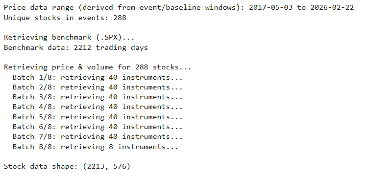
We now have two datasets loaded into memory: benchmark_returns, the daily return series for the S&P 500 index itself, and stock_data, a wide table containing daily closing prices and trading volumes for every stock involved in a constituent change. Together these cover the full date range we need — from well before the earliest event through 30 trading days after the last one. The next step is to use this raw data to measure how each stock performed relative to the market around its index change.
3. Separating the Signal from the Noise
What we're doing: For each index change, calculating how the stock performed relative to the broader market — then stacking all those results together to find the pattern.
The idea in plain terms: On any given day, the entire market might go up 1% or down 2%. We don't want that general market movement mixed in with the effect we're trying to measure. So for each day in the event window, we subtract the market's return from the stock's return. What's left — the abnormal return — is the part that the market alone can't explain.
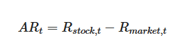
By adding up these daily abnormal returns over time, we get the cumulative abnormal return (CAR): a running total of how much extra the stock gained or lost, day by day, relative to the market. When we average the CAR across all joiners (or all leavers), individual noise washes out and the systematic pattern — if one exists — becomes clear.
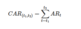
If index fund buying pressure genuinely pushes joiner prices up, the average joiner CAR should climb around the effective date. If forced selling hammers leavers, their average CAR should drop. And after the rebalancing is done, the lines should flatten as the stock resumes normal behavior relative to the market.
# Compute event studies for all events
joiner_cars = []
leaver_cars = []
joiner_volumes = []
leaver_volumes = []
# Keep metadata aligned to successful CAR events for downstream hover labels
joiner_car_rics = []
leaver_car_rics = []
joiner_car_names = []
leaver_car_names = []
joiner_car_dates = []
leaver_car_dates = []
failed_events = []
skipped_car = {"Joiner": 0, "Leaver": 0}
skipped_vol = {"Joiner": 0, "Leaver": 0}
for _, event in changes_df.iterrows():
ric = event["RIC"]
event_date = event["ChangeDate"]
change = event["Change"]
name = event.get("Name", "")
try:
# Extract stock price and volume
if isinstance(stock_data.columns, pd.MultiIndex):
if ric not in stock_data.columns.get_level_values(0):
failed_events.append((ric, "no price data"))
continue
close = stock_data[(ric, "TRDPRC_1")].dropna()
volume = stock_data[(ric, "ACVOL_UNS")].dropna()
else:
failed_events.append((ric, "unexpected data format"))
continue
stock_returns = close.pct_change().dropna()
# Market-adjusted abnormal returns (no estimation window needed)
car_result = compute_market_adjusted_car(
stock_returns, benchmark_returns, event_date,
event_window=EVENT_WINDOW
)
# Abnormal volume (uses pre-event baseline for comparison)
vol_result = compute_abnormal_volume(
volume, event_date,
event_window=EVENT_WINDOW,
baseline_window=VOLUME_BASELINE
)
if change == "Joiner":
if car_result is not None:
joiner_cars.append(car_result)
joiner_car_rics.append(ric)
joiner_car_names.append(name)
joiner_car_dates.append(event_date)
else:
skipped_car["Joiner"] += 1
if vol_result is not None:
joiner_volumes.append(vol_result)
else:
skipped_vol["Joiner"] += 1
else:
if car_result is not None:
leaver_cars.append(car_result)
leaver_car_rics.append(ric)
leaver_car_names.append(name)
leaver_car_dates.append(event_date)
else:
skipped_car["Leaver"] += 1
if vol_result is not None:
leaver_volumes.append(vol_result)
else:
skipped_vol["Leaver"] += 1
except Exception as e:
failed_events.append((ric, str(e)))
continue
total_joiners = len(joiners)
total_leavers = len(leavers)
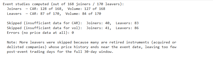
print(f"Event studies computed (out of {total_joiners} joiners / {total_leavers} leavers):")
print(f" Joiners — CAR: {len(joiner_cars)} of {total_joiners}, Volume: {len(joiner_volumes)} of {total_joiners}")
print(f" Leavers — CAR: {len(leaver_cars)} of {total_leavers}, Volume: {len(leaver_volumes)} of {total_leavers}")
print(f"\n Skipped (insufficient data for CAR): Joiners: {skipped_car['Joiner']}, Leavers: {skipped_car['Leaver']}")
print(f" Skipped (insufficient data for vol): Joiners: {skipped_vol['Joiner']}, Leavers: {skipped_vol['Leaver']}")
print(f" Errors (no price data at all): {len(failed_events)}")
if skipped_car["Leaver"] > skipped_car["Joiner"]:
print(f"\n Note: More leavers were skipped because many are retired instruments (acquired or")
print(f" delisted companies) whose price history ends near the event date, leaving too few")
print(f" post-event trading days for the full {EVENT_WINDOW[1]}-day window.")
if failed_events:
print(f"\nSample errors (first 5):")
for ric, reason in failed_events[:5]:
print(f" {ric}: {reason}")
4. The Price Impact: How Do Stocks React to Being Added or Removed?
What we're doing: Combining all the individual event studies into a single composite view — the "average joiner" and the "average leaver." This is the chart that answers the central question of the notebook.
What the research suggests we'll see: Studies going back decades have found that joiners tend to outperform the market around the effective date, while leavers tend to underperform. What remains debated is how large the effect is, how long it lasts, and whether it has weakened over time as more investors have learned to anticipate it.
# Aggregate CAR across all events
agg_joiner_car = aggregate_events(joiner_cars, "CAR")
agg_leaver_car = aggregate_events(leaver_cars, "CAR")
# Convert to percentage for readability
for df in [agg_joiner_car, agg_leaver_car]:
if len(df) > 0:
for col in ["mean", "median", "ci_upper", "ci_lower", "q25", "q75"]:
if col in df.columns:
df[col] = df[col] * 100
fig = make_subplots(rows=1, cols=1)
# Joiners
if len(agg_joiner_car) > 0:
fig.add_trace(go.Scatter(
x=agg_joiner_car["relative_day"], y=agg_joiner_car["ci_upper"],
mode="lines", line=dict(width=0), showlegend=False, hoverinfo="skip"
))
fig.add_trace(go.Scatter(
x=agg_joiner_car["relative_day"], y=agg_joiner_car["ci_lower"],
mode="lines", line=dict(width=0), fill="tonexty",
fillcolor="rgba(0,150,0,0.1)", showlegend=False, hoverinfo="skip"
))
fig.add_trace(go.Scatter(
x=agg_joiner_car["relative_day"], y=agg_joiner_car["mean"],
mode="lines", name=f"Joiners (n={len(joiner_cars)})",
line=dict(color="green", width=2.5),
hovertemplate="Day %{x}: %{y:.2f}%<extra>Joiners</extra>"
))
# Leavers
if len(agg_leaver_car) > 0:
fig.add_trace(go.Scatter(
x=agg_leaver_car["relative_day"], y=agg_leaver_car["ci_upper"],
mode="lines", line=dict(width=0), showlegend=False, hoverinfo="skip"
))
fig.add_trace(go.Scatter(
x=agg_leaver_car["relative_day"], y=agg_leaver_car["ci_lower"],
mode="lines", line=dict(width=0), fill="tonexty",
fillcolor="rgba(200,0,0,0.1)", showlegend=False, hoverinfo="skip"
))
fig.add_trace(go.Scatter(
x=agg_leaver_car["relative_day"], y=agg_leaver_car["mean"],
mode="lines", name=f"Leavers (n={len(leaver_cars)})",
line=dict(color="red", width=2.5),
hovertemplate="Day %{x}: %{y:.2f}%<extra>Leavers</extra>"
))
# Reference lines
fig.add_vline(x=0, line_dash="dash", line_color="gray", annotation_text="Effective Date")
fig.add_hline(y=0, line_dash="dot", line_color="lightgray")
fig.update_layout(
title=f"Average Cumulative Abnormal Returns Around {INDEX_NAME} Reconstitution Events",
xaxis_title="Trading Days Relative to Effective Date",
yaxis_title="Cumulative Abnormal Return (%)",
template="plotly_white",
width=900,
height=550,
legend=dict(yanchor="top", y=0.99, xanchor="left", x=0.01)
)
fig.show()
# Statistical summary at key points
if len(agg_joiner_car) > 0:
day0_join = agg_joiner_car[agg_joiner_car["relative_day"] == 0]
day_end = agg_joiner_car[agg_joiner_car["relative_day"] == agg_joiner_car["relative_day"].max()]
if len(day0_join) > 0:
print(f"\nJoiners — CAR at effective date (day 0): {day0_join['mean'].values[0]:.2f}%")
if len(day_end) > 0:
print(f"Joiners — CAR at day +{EVENT_WINDOW[1]}: {day_end['mean'].values[0]:.2f}%")
if len(agg_leaver_car) > 0:
day0_leave = agg_leaver_car[agg_leaver_car["relative_day"] == 0]
day_end = agg_leaver_car[agg_leaver_car["relative_day"] == agg_leaver_car["relative_day"].max()]
if len(day0_leave) > 0:
print(f"Leavers — CAR at effective date (day 0): {day0_leave['mean'].values[0]:.2f}%")
if len(day_end) > 0:
print(f"Leavers — CAR at day +{EVENT_WINDOW[1]}: {day_end['mean'].values[0]:.2f}%")
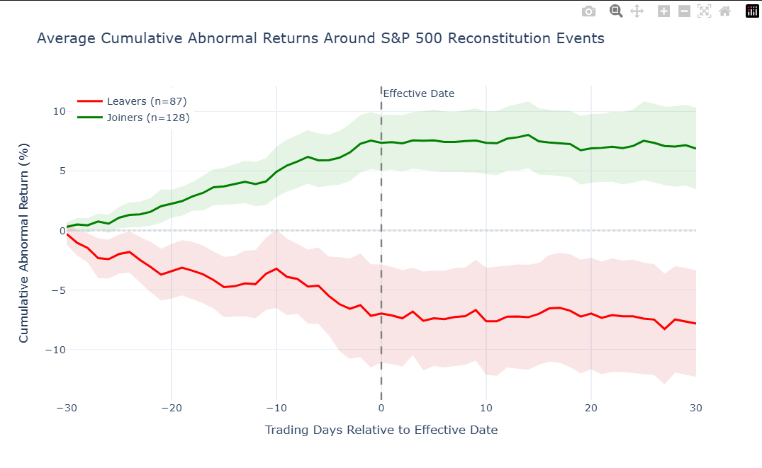
Joiners — CAR at effective date (day 0): 7.35%
Joiners — CAR at day +30: 6.88%
Leavers — CAR at effective date (day 0): -6.98%
Leavers — CAR at day +30: -7.82%
How to read this chart: The green line traces the average price path for joiners; the red line shows leavers. Day 0 is the effective date — the day the change officially takes place. The shaded bands show how much individual events vary around that average (tighter bands = more consistent pattern).
A few things to look for:
- Does the green line start rising before day 0? That would mean the market is anticipating the addition before it takes effect — perhaps from pre-announcements or speculation. The earlier the rise starts, the more efficiently the market is pricing in the expected buying pressure.
- Does the green line hold its gains after day 0, or does it fade? If it holds, the index change may have permanently increased demand for the stock (more funds now hold it, more analysts cover it). If it fades, the price boost was likely just temporary pressure from funds buying their required shares — once the rebalancing is done, the extra demand disappears and the price drifts back.
- Is the red line a mirror image of the green? Leavers often show a steeper drop, because selling under a hard deadline tends to create more price impact than gradual buying. Funds must exit by the effective date, which compresses the selling into a narrower window.
- How wide are the confidence bands? Narrow bands mean the pattern was remarkably consistent across different events and time periods. Wide bands mean the average is real but individual outcomes varied a lot — important context if you're thinking about any single upcoming event.
5. Following the Money: The Volume Spike
What we're doing: Looking at how much each stock was traded around the index change, compared to its normal level of activity.
Why it matters: Price tells you which direction things moved, but volume tells you how much force was behind it. When hundreds of index-tracking funds all need to buy (or sell) the same stock on the same day, trading volume can surge to several times its normal level. This is the most direct evidence of the mechanical rebalancing at work — it's not speculation or sentiment, it's funds executing trades they're contractually obligated to make.
A volume ratio of 3.0 means three times the stock's usual daily trading. For the S&P 500, that's common. For smaller indices like the Russell 2000, where the affected stocks are less liquid to begin with, volume spikes of 5–10x have been documented.
# Aggregate abnormal volume across events
agg_joiner_vol = aggregate_events(joiner_volumes, "abnormal_volume")
agg_leaver_vol = aggregate_events(leaver_volumes, "abnormal_volume")
fig = make_subplots(rows=1, cols=1)
# Joiners volume
if len(agg_joiner_vol) > 0:
fig.add_trace(go.Scatter(
x=agg_joiner_vol["relative_day"], y=agg_joiner_vol["q75"],
mode="lines", line=dict(width=0), showlegend=False, hoverinfo="skip"
))
fig.add_trace(go.Scatter(
x=agg_joiner_vol["relative_day"], y=agg_joiner_vol["q25"],
mode="lines", line=dict(width=0), fill="tonexty",
fillcolor="rgba(0,150,0,0.1)", showlegend=False, hoverinfo="skip"
))
fig.add_trace(go.Scatter(
x=agg_joiner_vol["relative_day"], y=agg_joiner_vol["mean"],
mode="lines", name=f"Joiners (n={len(joiner_volumes)})",
line=dict(color="green", width=2.5),
hovertemplate="Day %{x}: %{y:.2f}x<extra>Joiners</extra>"
))
# Leavers volume
if len(agg_leaver_vol) > 0:
fig.add_trace(go.Scatter(
x=agg_leaver_vol["relative_day"], y=agg_leaver_vol["q75"],
mode="lines", line=dict(width=0), showlegend=False, hoverinfo="skip"
))
fig.add_trace(go.Scatter(
x=agg_leaver_vol["relative_day"], y=agg_leaver_vol["q25"],
mode="lines", line=dict(width=0), fill="tonexty",
fillcolor="rgba(200,0,0,0.1)", showlegend=False, hoverinfo="skip"
))
fig.add_trace(go.Scatter(
x=agg_leaver_vol["relative_day"], y=agg_leaver_vol["mean"],
mode="lines", name=f"Leavers (n={len(leaver_volumes)})",
line=dict(color="red", width=2.5),
hovertemplate="Day %{x}: %{y:.2f}x<extra>Leavers</extra>"
))
# Reference lines
fig.add_vline(x=0, line_dash="dash", line_color="gray", annotation_text="Effective Date")
fig.add_hline(
y=1.0,
line_dash="dot",
line_color="black",
line_width=1.5,
annotation_text="Normal Volume (1.0x)"
)
fig.update_layout(
title=f"Average Abnormal Volume Around {INDEX_NAME} Reconstitution Events",
xaxis_title="Trading Days Relative to Effective Date",
yaxis_title="Volume Multiple vs Baseline (1.0 = Normal)",
template="plotly_white",
width=900,
height=500,
legend=dict(yanchor="top", y=0.99, xanchor="left", x=0.01)
)
fig.show()
# Peak volume statistics
for label, agg in [("Joiners", agg_joiner_vol), ("Leavers", agg_leaver_vol)]:
if len(agg) > 0:
peak_row = agg.loc[agg["mean"].idxmax()]
print(f"{label} — peak volume at day {peak_row['relative_day']:.0f}: "
f"{peak_row['mean']:.1f}x normal (median: {peak_row['median']:.1f}x)")
print("\nInterpretation note: 1.0x is normal baseline volume. Values above 1.0x indicate elevated trading volume.")
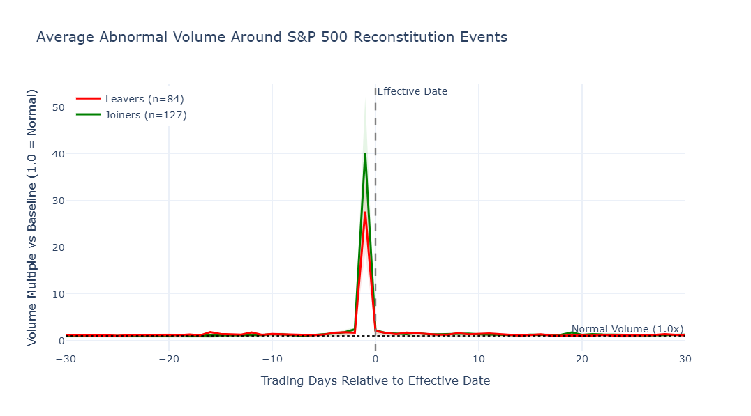
Joiners — peak volume at day -1: 40.2x normal (median: 36.9x)
Leavers — peak volume at day -1: 27.6x normal (median: 26.0x)
Interpretation note: 1.0x is normal baseline volume. Values above 1.0x indicate elevated trading volume.
How to read this chart: The y-axis shows trading volume as a multiple of each stock's normal daily average. 1.0x = normal baseline volume; values above 1.0x are elevated, and 0.0 would mean no trading at all. The shaded bands show the range across individual events (25th to 75th percentile).
A few things to notice:
- The spike at day 0 is the fingerprint of index fund rebalancing. This is the day the change officially takes effect, and funds that track the index need to have completed their trades.
- Activity before day 0 suggests that some investors are trading ahead of the rebalancing — either anticipating the price impact or front-running the known deadline.
- How quickly does volume return to normal? A sharp spike that drops off immediately means the rebalancing was a one-day event. If elevated volume lingers, the trade was large enough that it took multiple days to absorb.
- Which side spikes harder — joiners or leavers? Forced selling (leavers) is often more intense, because funds liquidating a position under a deadline face more urgency than funds gradually accumulating a new one.
6. How Consistent Is the Pattern? Looking at Individual Events
What we're doing: The charts above showed the average effect across all events. But averages can hide a lot of variation. Here we look at each event individually to see how spread out the outcomes really are.
Why it matters: If every joiner gained roughly 5% and every leaver lost roughly 5%, the pattern would be extremely reliable. But if individual outcomes range from -10% to +20%, then even though the average is positive, any single event is far less predictable. This section answers the question: Is this a pattern you can count on, or just a tendency that plays out more often than not?
# Extract the CAR at the effective date (day 0) for each individual event
def get_car_at_day(car_results, day=0):
"""Extract CAR at a specific relative day for each event."""
values = []
for i, df in enumerate(car_results):
if df is not None and len(df) > 0:
row = df[df["relative_day"] == day]
if len(row) > 0:
values.append({"event_id": i, "CAR_at_day": row["CAR"].values[0] * 100})
return pd.DataFrame(values)
# Also extract the full-window CAR (day +30 or max available)
def get_car_at_end(car_results):
"""Extract final CAR for each event."""
values = []
for i, df in enumerate(car_results):
if df is not None and len(df) > 0:
final_car = df["CAR"].iloc[-1] * 100
values.append({"event_id": i, "CAR_final": final_car})
return pd.DataFrame(values)
joiner_day0 = get_car_at_day(joiner_cars, day=0)
leaver_day0 = get_car_at_day(leaver_cars, day=0)
joiner_final = get_car_at_end(joiner_cars)
leaver_final = get_car_at_end(leaver_cars)
# Combine for plotting
joiner_scatter = joiner_day0.merge(joiner_final, on="event_id")
joiner_scatter["Change"] = "Joiner"
leaver_scatter = leaver_day0.merge(leaver_final, on="event_id")
leaver_scatter["Change"] = "Leaver"
# Attach instrument metadata if available from Section 3
if "joiner_car_rics" in globals() and len(joiner_car_rics) == len(joiner_scatter):
joiner_scatter["RIC"] = [joiner_car_rics[i] for i in joiner_scatter["event_id"]]
else:
joiner_scatter["RIC"] = "N/A"
if "leaver_car_rics" in globals() and len(leaver_car_rics) == len(leaver_scatter):
leaver_scatter["RIC"] = [leaver_car_rics[i] for i in leaver_scatter["event_id"]]
else:
leaver_scatter["RIC"] = "N/A"
if "joiner_car_names" in globals() and len(joiner_car_names) == len(joiner_scatter):
joiner_scatter["Company"] = [joiner_car_names[i] for i in joiner_scatter["event_id"]]
else:
joiner_scatter["Company"] = ""
if "leaver_car_names" in globals() and len(leaver_car_names) == len(leaver_scatter):
leaver_scatter["Company"] = [leaver_car_names[i] for i in leaver_scatter["event_id"]]
else:
leaver_scatter["Company"] = ""
if "joiner_car_dates" in globals() and len(joiner_car_dates) == len(joiner_scatter):
joiner_scatter["Effective Date"] = [pd.to_datetime(joiner_car_dates[i]).strftime("%Y-%m-%d") for i in joiner_scatter["event_id"]]
else:
joiner_scatter["Effective Date"] = ""
if "leaver_car_dates" in globals() and len(leaver_car_dates) == len(leaver_scatter):
leaver_scatter["Effective Date"] = [pd.to_datetime(leaver_car_dates[i]).strftime("%Y-%m-%d") for i in leaver_scatter["event_id"]]
else:
leaver_scatter["Effective Date"] = ""
scatter_df = pd.concat([joiner_scatter, leaver_scatter], ignore_index=True)
# Scatter: CAR at day 0 vs final CAR
fig = px.scatter(
scatter_df,
x="CAR_at_day",
y="CAR_final",
color="Change",
color_discrete_map={"Joiner": "green", "Leaver": "red"},
title=f"Individual Event Outcomes — CAR at Effective Date vs. End of Window ({INDEX_NAME})",
labels={
"CAR_at_day": "CAR at Effective Date (%)",
"CAR_final": f"CAR at Day +{EVENT_WINDOW[1]} (%)"
},
hover_name="RIC",
hover_data={
"Company": True,
"Effective Date": True,
"CAR_at_day": ":.2f",
"CAR_final": ":.2f",
"event_id": False
},
opacity=0.7
)
# Reference lines
fig.add_hline(y=0, line_dash="dot", line_color="lightgray")
fig.add_vline(x=0, line_dash="dot", line_color="lightgray")
# Diagonal (no change after effective date)
fig.add_trace(go.Scatter(
x=[-30, 30], y=[-30, 30],
mode="lines", line=dict(dash="dash", color="gray", width=1),
showlegend=False, hoverinfo="skip"
))
fig.update_layout(template="plotly_white", width=800, height=600)
fig.show()
# Prepare summary table for the hit-rate subsection below
summary_rows = []
for label, data in [("Joiners", joiner_final), ("Leavers", leaver_final)]:
if len(data) > 0:
mean_car = data["CAR_final"].mean()
median_car = data["CAR_final"].median()
std_car = data["CAR_final"].std()
min_car = data["CAR_final"].min()
max_car = data["CAR_final"].max()
positive_pct = (data["CAR_final"] > 0).mean() * 100
summary_rows.append({
"Group": label,
"n": len(data),
"Mean final CAR": f"{mean_car:.2f}%",
"Median final CAR": f"{median_car:.2f}%",
"Std dev": f"{std_car:.2f}%",
"Range": f"[{min_car:.2f}%, {max_car:.2f}%]",
"Positive outcomes": f"{positive_pct:.0f}%",
})
summary_df = pd.DataFrame(summary_rows)
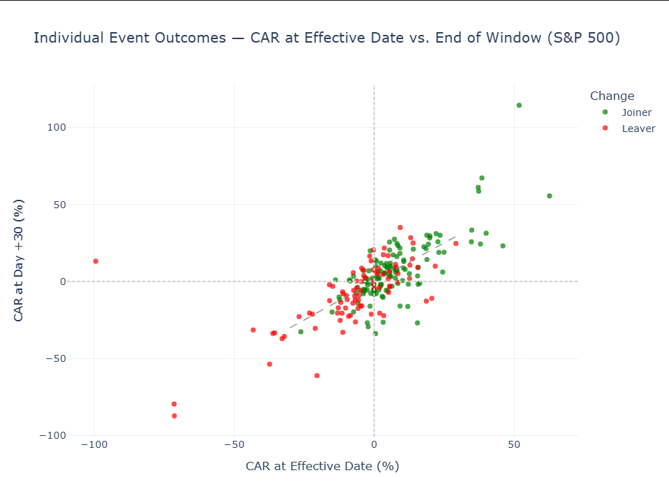
How to read this chart: Each dot represents a single index change. Green dots are joiners, red are leavers. The x-axis shows how the stock had performed by the effective date; the y-axis shows where it ended up 30 trading days later.
The diagonal dashed line is the "nothing changed after the effective date" reference. Dots on the line had all their movement before day 0 and then held steady. Dots above it continued gaining. Dots below gave back some of their move.
Distance from the dashed line matters: the farther a dot is from the line, the larger the post-effective-date reassessment. In practical terms, that often signals a stronger initial overreaction, hype, or market misread that was later corrected (or, in some cases, a delayed realization that the first reaction was too conservative).
| Where the dot sits | What it means |
|---|---|
| Upper-right (green) | Joiner that gained and kept gaining — the textbook outcome |
| Lower-left (red) | Leaver that declined and stayed down — also the expected pattern |
| Lower-right (green) | Joiner that initially gained, but then the gain reversed — the buying pressure was temporary |
| Upper-left (red) | Leaver that initially declined, but then recovered — the selling pressure was overdone |
Hit rate
The hit rate is shown in the table below under Positive outcomes. It is the share of events that finished with the expected sign and serves as a quick reliability check for the pattern by group.
As a rule of thumb, values well above 50% suggest the pattern has been fairly consistent across events, while values near 50% suggest a weaker and less dependable edge.
# Hit-rate summary table
if len(summary_df) > 0:
display(summary_df)
else:
print("No summary statistics available.")

7. Looking Ahead: Which Stocks Might Be Next?
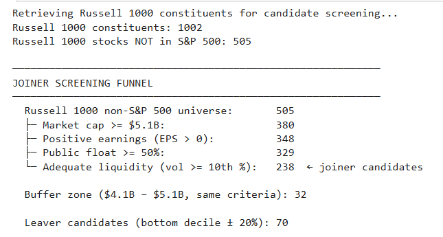
The S&P 500 typically adds only 17–28 stocks per year. Casting a wide net and calling every Russell 1000 stock above the minimum market cap a "candidate" would produce hundreds of names — far too many to be useful. So rather than screening on market cap alone, we apply the same eligibility criteria the S&P committee publishes:
- Market cap — at least as large as the smallest current constituent
- Positive earnings — the most recent EPS must be positive
- Public float ≥ 50% — adequate shares available for trading
- Adequate liquidity — average daily volume above the 10th percentile of current members
Each filter narrows the pool. What starts as hundreds of stocks that simply "exceed the minimum market cap" gets trimmed to a much shorter list — the subset that actually clears all the quantitative hurdles.
This still won't predict exact committee decisions (the S&P 500 is actively managed, not formula-driven, and the committee weighs qualitative factors like sector balance and corporate structure), but it surfaces stocks that currently meet every published criterion — a much sharper starting point than market cap alone.
# Current S&P 500 constituents with key metrics
print("Retrieving current S&P 500 constituents...")
current_spx = ld.get_data(
universe=INDEX_CHAIN,
fields=[
"TR.CompanyName",
"TR.CompanyMarketCap",
"TR.TRBCEconomicSector",
"TR.AvgDailyVolume20D",
"TR.FreeFloatPct", # Free float percentage
"TR.EPSActValue" # Most recent actual EPS (profitability check)
]
)
# Ensure Instrument is a column (API may return it as index or regular column)
if "Instrument" not in current_spx.columns:
current_spx = current_spx.reset_index()
# Rename using a dict so column order doesn't matter
current_spx = current_spx.rename(columns={
"Company Name": "Name",
"Company Market Cap": "MarketCap",
"TRBC Economic Sector Name": "Sector",
"Free Float (Percent)": "FreeFloat",
"Earnings Per Share - Actual": "EPS_Actual",
})
# Volume column display name may vary — match any column containing "volume"
vol_cols = [c for c in current_spx.columns if "volume" in c.lower()]
if vol_cols:
current_spx = current_spx.rename(columns={vol_cols[0]: "AvgVolume"})
# Clean — .astype(float) converts pd.NA to np.nan so dropna/formatting work
current_spx["MarketCap"] = pd.to_numeric(current_spx["MarketCap"], errors="coerce").astype(float)
current_spx["AvgVolume"] = pd.to_numeric(current_spx["AvgVolume"], errors="coerce").astype(float)
print(f"Current S&P 500 constituents: {len(current_spx)}")
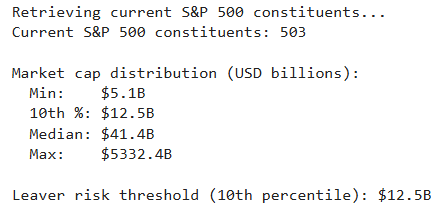
# Market cap distribution
mcap = current_spx["MarketCap"].dropna()
print(f"\nMarket cap distribution (USD billions):")
print(f" Min: ${mcap.min() / 1e9:.1f}B")
print(f" 10th %: ${mcap.quantile(0.10) / 1e9:.1f}B")
print(f" Median: ${mcap.median() / 1e9:.1f}B")
print(f" Max: ${mcap.max() / 1e9:.1f}B")
# The threshold for leaver risk: stocks in the bottom decile
leaver_threshold = mcap.quantile(0.10)
print(f"\nLeaver risk threshold (10th percentile): ${leaver_threshold / 1e9:.1f}B")
# Retrieve a broader universe to find joiner candidates
# Using Russell 1000 (0#.RUI) as the candidate pool for S&P 500 joiners
print("Retrieving Russell 1000 constituents for candidate screening...")
russell_1000 = ld.get_data(
universe="0#.RUI",
fields=[
"TR.CompanyName",
"TR.CompanyMarketCap",
"TR.TRBCEconomicSector",
"TR.AvgDailyVolume20D",
"TR.FreeFloatPct",
"TR.EPSActValue"
]
)
# Ensure Instrument is a column
if "Instrument" not in russell_1000.columns:
russell_1000 = russell_1000.reset_index()
russell_1000 = russell_1000.rename(columns={
"Company Name": "Name",
"Company Market Cap": "MarketCap",
"TRBC Economic Sector Name": "Sector",
"Free Float (Percent)": "FreeFloat",
"Earnings Per Share - Actual": "EPS_Actual",
})
vol_cols = [c for c in russell_1000.columns if "volume" in c.lower()]
if vol_cols:
russell_1000 = russell_1000.rename(columns={vol_cols[0]: "AvgVolume"})
russell_1000["MarketCap"] = pd.to_numeric(russell_1000["MarketCap"], errors="coerce").astype(float)
russell_1000["AvgVolume"] = pd.to_numeric(russell_1000["AvgVolume"], errors="coerce").astype(float)
russell_1000["EPS_Actual"] = pd.to_numeric(russell_1000["EPS_Actual"], errors="coerce").astype(float)
russell_1000["FreeFloat"] = pd.to_numeric(russell_1000["FreeFloat"], errors="coerce").astype(float)
print(f"Russell 1000 constituents: {len(russell_1000)}")
# Identify non-S&P 500 stocks in Russell 1000
spx_rics = set(current_spx["Instrument"].tolist())
non_spx = russell_1000[~russell_1000["Instrument"].isin(spx_rics)].copy()
print(f"Russell 1000 stocks NOT in S&P 500: {len(non_spx)}")
# --- JOINER CANDIDATES ---
# Apply the S&P 500's published eligibility criteria, not just market cap.
# The committee considers: market cap, positive earnings, public float,
# and adequate liquidity. We apply each filter and show how the pool narrows.
min_mcap = current_spx["MarketCap"].dropna().min()
joiner_threshold = min_mcap * (1 - MCAP_BUFFER_PCT)
# Calibrate thresholds from current S&P 500 members
spx_median_vol = current_spx["AvgVolume"].dropna().median()
spx_vol_floor = current_spx["AvgVolume"].dropna().quantile(0.10) # 10th %ile volume
# Step-by-step screening funnel
pool = non_spx.copy()
n_start = len(pool)
# 1. Market cap — at least as large as the smallest current member
pool = pool[pool["MarketCap"] >= min_mcap]
n_after_mcap = len(pool)
# 2. Positive earnings — S&P requires positive trailing earnings
pool = pool[pool["EPS_Actual"] > 0]
n_after_eps = len(pool)
# 3. Public float >= 50% — S&P requires adequate float
pool = pool[pool["FreeFloat"] >= 50]
n_after_float = len(pool)
# 4. Adequate liquidity — volume above the 10th percentile of current members
pool = pool[pool["AvgVolume"] >= spx_vol_floor]
n_after_vol = len(pool)
joiner_candidates = pool.copy()
joiner_candidates["MarketCap_B"] = joiner_candidates["MarketCap"] / 1e9
joiner_candidates = joiner_candidates.sort_values("MarketCap", ascending=False)
# Buffer zone: stocks within 20% below min_mcap, meeting the same quality filters
buffer_pool = non_spx[
(non_spx["MarketCap"] >= joiner_threshold) &
(non_spx["MarketCap"] < min_mcap) &
(non_spx["MarketCap"].notna()) &
(non_spx["EPS_Actual"] > 0) &
(non_spx["FreeFloat"] >= 50) &
(non_spx["AvgVolume"] >= spx_vol_floor)
].copy()
buffer_pool["MarketCap_B"] = buffer_pool["MarketCap"] / 1e9
buffer_zone = buffer_pool.sort_values("MarketCap", ascending=False)
# Screening funnel summary
print(f"\n{'─'*60}")
print(f"JOINER SCREENING FUNNEL")
print(f"{'─'*60}")
print(f" Russell 1000 non-S&P 500 universe: {n_start:>4}")
print(f" ├─ Market cap >= ${min_mcap / 1e9:.1f}B: {n_after_mcap:>4}")
print(f" ├─ Positive earnings (EPS > 0): {n_after_eps:>4}")
print(f" ├─ Public float >= 50%: {n_after_float:>4}")
print(f" └─ Adequate liquidity (vol >= 10th %): {n_after_vol:>4} ← joiner candidates")
print(f"\n Buffer zone (${joiner_threshold / 1e9:.1f}B – ${min_mcap / 1e9:.1f}B, same criteria): {len(buffer_zone)}")
# --- LEAVER CANDIDATES ---
# Current constituents with small or declining market cap
leaver_candidates = current_spx[
(current_spx["MarketCap"] <= leaver_threshold * (1 + MCAP_BUFFER_PCT)) &
(current_spx["MarketCap"].notna())
].copy()
leaver_candidates["MarketCap_B"] = leaver_candidates["MarketCap"] / 1e9
leaver_candidates = leaver_candidates.sort_values("MarketCap", ascending=True)
print(f"\n Leaver candidates (bottom decile ± {int(MCAP_BUFFER_PCT*100)}%): {len(leaver_candidates)}")
# Display the watchlist tables
print(f"{'='*90}")
print(f"JOINER WATCHLIST — Top {TOP_N} Candidates by Market Cap")
print(f"{'='*90}")
print(f"Russell 1000 stocks not in the {INDEX_NAME} that pass all S&P 500 eligibility screens:")
print(f"market cap, positive earnings, adequate float, and liquidity.\n")
joiner_display = joiner_candidates.head(TOP_N)[
["Instrument", "Name", "MarketCap_B", "Sector", "AvgVolume", "EPS_Actual"]
].reset_index(drop=True)
joiner_display.index = joiner_display.index + 1
joiner_display.index.name = "Rank"
joiner_display.columns = ["RIC", "Company", "MktCap ($B)", "Sector", "Avg Volume", "Last EPS"]
display(joiner_display)
print(f"\n{'='*90}")
print(f"LEAVER WATCHLIST — Smallest {INDEX_NAME} Constituents")
print(f"{'='*90}")
print(f"Current {INDEX_NAME} members with market caps near the bottom of the index.")
print(f"Ranked by market cap (ascending) — smallest first.\n")
leaver_display = leaver_candidates.head(TOP_N)[
["Instrument", "Name", "MarketCap_B", "Sector", "AvgVolume", "EPS_Actual"]
].reset_index(drop=True)
leaver_display.index.name = "Rank"
leaver_display.columns = ["RIC", "Company", "MktCap ($B)", "Sector", "Avg Volume", "Last EPS"]
display(leaver_display)
==========================================================================================
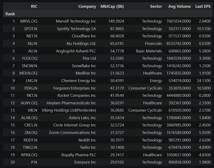
JOINER WATCHLIST — Top 20 Candidates by Market Cap
==========================================================================================
Russell 1000 stocks not in the S&P 500 that pass all S&P 500 eligibility screens:
market cap, positive earnings, adequate float, and liquidity.
==========================================================================================
LEAVER WATCHLIST — Smallest S&P 500 Constituents
==========================================================================================
Current S&P 500 members with market caps near the bottom of the index.
Ranked by market cap (ascending) — smallest first.
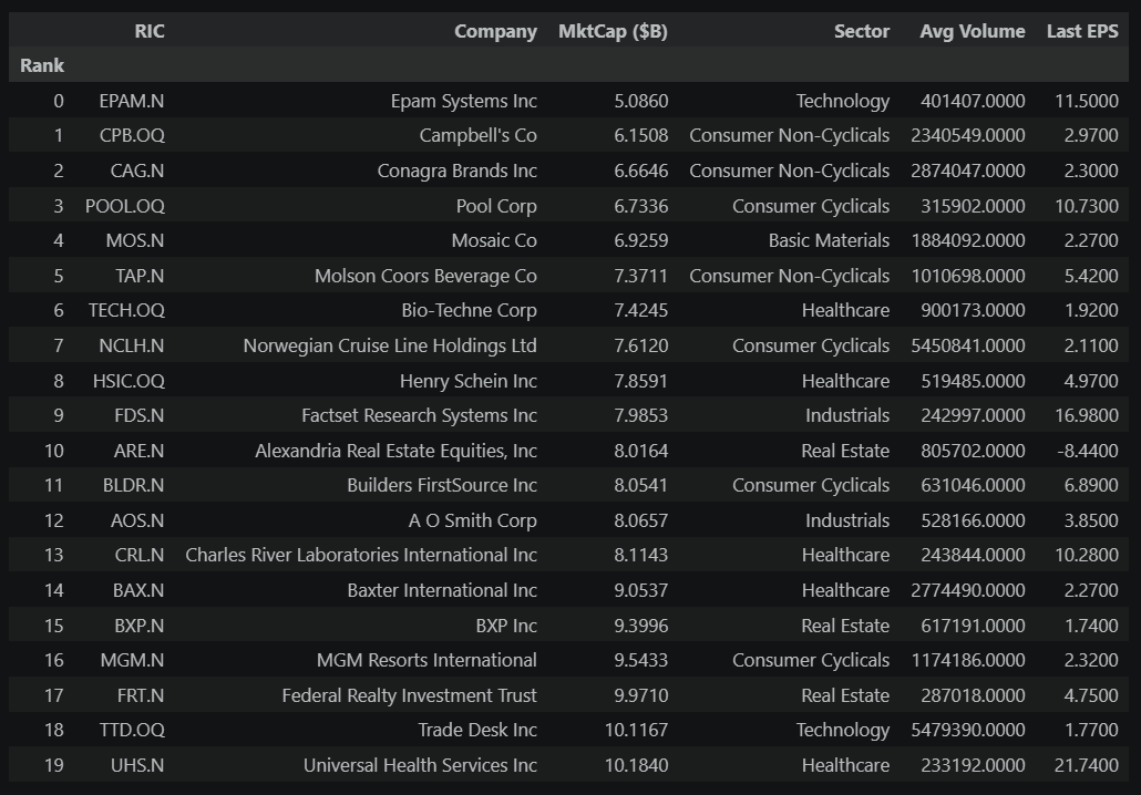
How to use these watchlists:
The joiner watchlist shows the top candidates after applying all four S&P 500 eligibility screens — not just market cap, but also positive earnings, adequate float, and liquidity. Stocks that pass all four are a much narrower pool than the hundreds that merely exceed the minimum market cap.
The leaver watchlist flags the smallest current members. Being small doesn't automatically trigger removal (there are buffer rules to avoid constant churn), but a stock that has shrunk significantly while larger alternatives sit outside the index is at elevated risk.
Practical next steps:
- Connect the dots — if the event study shows that joiners historically gained X% on average, and you spot a strong candidate early, you have a quantitative basis for evaluating the opportunity.
- Check the calendar — S&P 500 changes happen at quarterly rebalancing dates (March, June, September, December) or between those dates for corporate events like mergers, spin-offs, or bankruptcies.
- Dig deeper — open each candidate in Workspace. Read the latest news. Check for corporate actions (mergers, spin-offs) that might affect eligibility.
- Track over time — run this notebook monthly. Stocks that consistently appear on the watchlist are stronger candidates than those that show up once and disappear.
# Focused visual: top joiner candidates vs. smallest current members
# Side-by-side horizontal bars make the market cap mismatch obvious
CHART_N = 15 # show fewer than the full watchlist for readability
top_joiners = joiner_candidates.head(CHART_N).copy()
top_leavers = leaver_candidates.head(CHART_N).copy()
# Clean labels: company name only (RIC goes in hover)
top_joiners["Label"] = top_joiners["Name"].str[:35].str.strip()
top_leavers["Label"] = top_leavers["Name"].str[:35].str.strip()
fig = make_subplots(
rows=1, cols=2,
subplot_titles=[
f"Top {len(top_joiners)} Joiner Candidates",
f"Smallest {len(top_leavers)} Current Members",
],
shared_xaxes=True,
horizontal_spacing=0.18,
)
# --- Left panel: joiner candidates (green) ---
fig.add_trace(go.Bar(
y=top_joiners["Label"][::-1],
x=top_joiners["MarketCap_B"][::-1],
orientation="h",
marker_color="rgba(0,180,0,0.6)",
hovertemplate=(
"<b>%{y}</b> (%{customdata[0]})<br>"
"Market Cap: $%{x:.1f}B<br>"
"Sector: %{customdata[1]}<extra></extra>"
),
customdata=np.column_stack([
top_joiners["Instrument"][::-1],
top_joiners["Sector"].fillna("—")[::-1],
]),
showlegend=False,
), row=1, col=1)
# --- Right panel: leaver candidates (red) ---
fig.add_trace(go.Bar(
y=top_leavers["Label"][::-1],
x=top_leavers["MarketCap_B"][::-1],
orientation="h",
marker_color="rgba(200,0,0,0.6)",
hovertemplate=(
"<b>%{y}</b> (%{customdata[0]})<br>"
"Market Cap: $%{x:.1f}B<br>"
"Sector: %{customdata[1]}<extra></extra>"
),
customdata=np.column_stack([
top_leavers["Instrument"][::-1],
top_leavers["Sector"].fillna("—")[::-1],
]),
showlegend=False,
), row=1, col=2)
fig.update_layout(
title="Joiner Candidates vs. Leaver Candidates: Market Cap Comparison",
template="plotly_white",
width=1100,
height=max(500, CHART_N * 32 + 120),
xaxis_title="Market Cap (USD Billions)",
xaxis2_title="Market Cap (USD Billions)",
yaxis=dict(tickfont=dict(size=11)),
yaxis2=dict(tickfont=dict(size=11)),
)
fig.show()
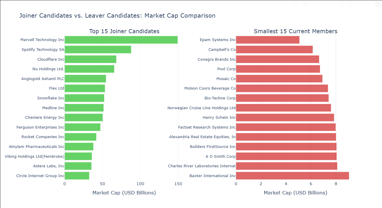
How to read this chart: The left panel shows the top joiner candidates ranked by market cap — the strongest contenders based on the screening funnel above. The right panel shows the smallest current S&P 500 members — the stocks most exposed to removal.
A few things to notice:
- How much bigger are the top joiner candidates than the smallest members? The larger the gap, the more glaring the mismatch — and the stronger the case that the committee will eventually act.
- Are any leavers significantly smaller than the rest? A single outlier on the right panel is more exposed than a cluster of similarly-sized stocks — the committee has a clearer target.
- Compare the two panels side by side. If the top joiners are 3–5x the size of the smallest members, the pressure to swap is substantial. If they're only marginally larger, the committee may wait.
8. Where to Go From Here
This notebook covers the core analysis, but there are many ways to extend it depending on what you're most interested in:
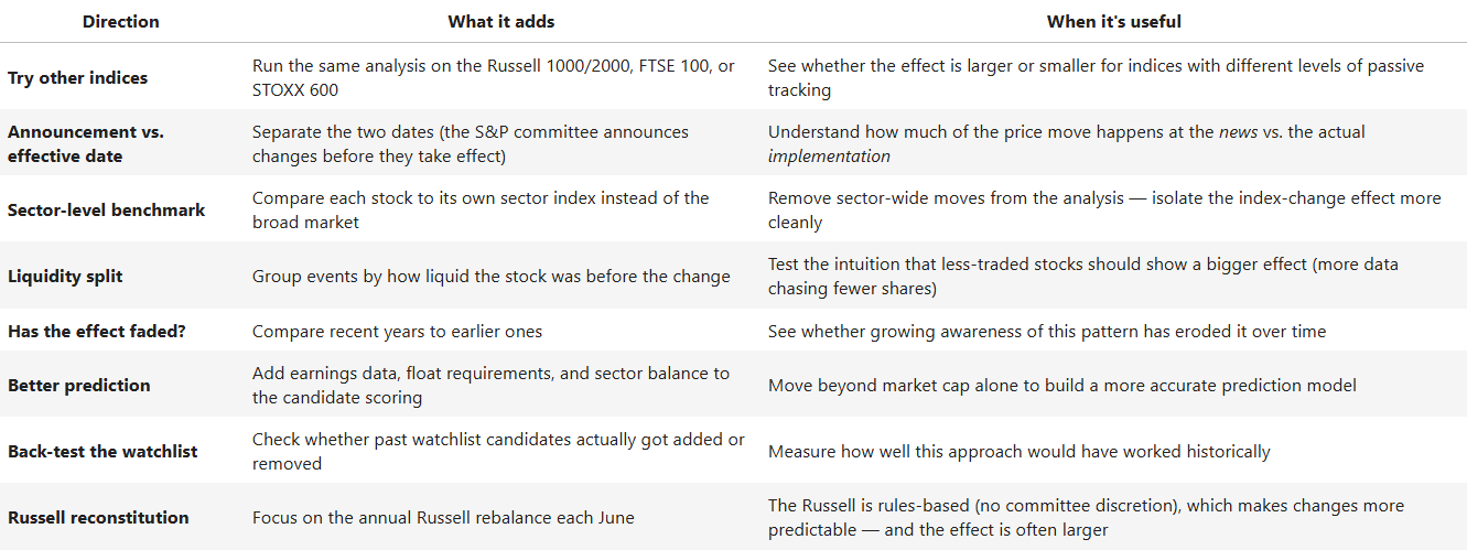
The same LSEG data and functions work across thousands of indices globally. Change INDEX_RIC and INDEX_CHAIN in the configuration section, and the entire analysis adapts.
In short: When the S&P 500 swaps its members, the stocks involved tend to move — not because of any change in the company's business, but because trillions of dollars in index-tracking funds are obligated to trade. This notebook measures how large and how consistent that effect has been, and identifies which stocks might be next. The analysis is designed to be re-run before each quarterly rebalancing so the results stay current. It's not a trading strategy — but it's the kind of evidence-based groundwork that a thoughtful strategy can be built on.
- Register or Log in to applaud this article
- Let the author know how much this article helped you
