

Earnings revision momentum is one of the most studied and persistent signals in quantitative finance. The premise is well established: when independent analysts across competing banks and brokerages revise their earnings forecasts in the same direction, stock prices tend to follow — but not immediately. Revisions trickle in one at a time over days and weeks, and the market is slow to price in what the cumulative pattern is saying. This phenomenon has been documented in academic literature since the late 1970s and remains a core component of many institutional investment models.
Knowing the concept and having a practical, configurable screen you can run on live data are two very different things. This notebook implements that screen end-to-end. It pulls real-time I/B/E/S consensus data across 500 stocks, scores revision activity, measures recent price momentum, and surfaces names where those two signals diverge. It then adds sector context, volume confirmation, and a final ranked weekly output so the result is usable as an ongoing research workflow rather than a one-off calculation.
More specifically, it asks three questions:
- Where are analysts raising or cutting their forecasts? (the revision signal)
- Has the stock price already moved to reflect that? (the momentum signal)
- Where do those two signals disagree? (the divergence — our main output)
A stock being upgraded by analysts while its price sits flat could be worth investigating. A stock rallying despite falling estimates could be vulnerable. Neither is a trade recommendation — but both deserve a closer look.
The notebook combines two data sets from the LSEG ecosystem:
- I/B/E/S Estimates — the industry-standard database of analyst forecasts, tracking who revised, when, and in which direction
- Price & Volume — daily market data showing how each stock has actually traded
The goal isn't to introduce a new idea — it's to provide a practical framework that demonstrates a well-known signal using live data. Every key parameter — the universe, revision window, momentum settings, and ranking logic — is exposed and editable, so you can adapt the workflow to your own process.
Setup
This notebook uses the LSEG Data Library for Python to retrieve I/B/E/S consensus estimates and historical pricing data. It is designed to run within LSEG Workspace (Desktop session), giving you access to the full depth of I/B/E/S coverage.
Additional packages used:
- pandas / numpy for data manipulation and scoring
- plotly for interactive visualization
- scipy for statistical computations
import lseg.data as ld
import pandas as pd
import numpy as np
import plotly.express as px
import plotly.graph_objects as go
from scipy import stats
from IPython.display import display, HTML
import warnings
warnings.filterwarnings("ignore", category=FutureWarning)
pd.set_option("display.max_colwidth", 80)
pd.set_option("display.max_columns", 20)
pd.set_option("display.float_format", "{:.4f}".format)
# Prevent data cells from wrapping (headers can still wrap)
display(HTML("<style>.dataframe td { white-space: nowrap; }</style>"))
# Establish communication with our LSEG data environment.
# Initialize the session - Desktop mode (Workspace)
ld.open_session()
Defining the Investment Universe
What we're doing: Defining the settings that control the entire analysis — which stocks to look at, how far back to look, and how sensitive the filters should be.
Why it matters: Keeping all the settings in one place means you can adapt the criteria to your needs without changing any of the logic below. Want to screen European stocks instead? Swap the universe. Want to look at a shorter revision window? Change one number.
The defaults below are set for a weekly Monday-morning review of S&P 500 stocks.
A few terms worth knowing:
- FY1 = the current fiscal year (i.e., what analysts think the company will earn this year)
- Window period (30d) = how far back to count analyst revisions (available: 1d, 3d, 7d, 14d, 30d, 60d, 90d, 180d)
- 20 days / 60 days = roughly 1 month and 3 months of trading days
# --- Screen Parameters ---
# Universe: S&P 500 constituents
UNIVERSE = "0#.SPX"
# Estimate revision lookback
REVISION_PERIOD = "FY1" # Current fiscal year estimates
REVISION_WINDOW = "30d" # Count revisions within this window (1d, 3d, 7d, 14d, 30d, 60d, 90d, 180d)
# Price momentum lookback
MOMENTUM_DAYS = 20 # ~1 month of trading days for short-term momentum
MOMENTUM_DAYS_LONG = 60 # ~3 months for medium-term momentum
# Display
TOP_N = 20 # Number of top divergences to display
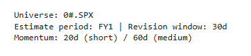
print(f"Universe: {UNIVERSE}")
print(f"Estimate period: {REVISION_PERIOD} | Revision window: {REVISION_WINDOW}")
print(f"Momentum: {MOMENTUM_DAYS}d (short) / {MOMENTUM_DAYS_LONG}d (medium)")
1. Retrieving Estimate Revision Data
What we're doing: Pulling the latest analyst earnings forecasts for every S&P 500 stock, along with how many analysts have revised their forecast — up or down — within a recent time window.
Why it matters: I/B/E/S (Institutional Brokers' Estimate System) is the standard database that institutional investors use to track what Wall Street analysts think a company will earn. It doesn't just store the current forecast — it records every time an analyst raises or lowers their number. That history of changes is what we care about.
The window period (WP) — what it controls: When we ask "how many analysts revised up?", the answer depends on how far back you look. That's what the window period sets. With WP=30d (our default), we count all revisions that happened in the last 30 calendar days. A shorter window like 14d catches only very recent activity — more timely but noisier. A longer window like 90d captures broader trends but may include stale revisions that are no longer relevant.
We set this to 30 days because it aligns naturally with a monthly review cadence: enough time for a meaningful number of analysts to act, but recent enough that the signal is still fresh. You can change it in the Parameters cell above.
Here's what we retrieve:
| Field | What it tells us |
|---|---|
| Mean Estimate | The average EPS forecast across all analysts covering the stock |
| Revisions Up / Down | Count of unique covering analysts classified by in-window direction (up vs. down), not a count of every revision event. If one analyst revises multiple times in the window, they are counted once in their final/net direction for that window. |
| Number of Estimates | How many analysts cover this stock (more = more reliable signal) |
| Standard Deviation | The spread (dispersion) of the actual EPS point estimates themselves — not about revision direction, but how far apart analysts' absolute EPS forecasts are. Low values (0.10–0.20) mean analysts have converged on a tight consensus. High values (0.50+) mean estimates are scattered across a wide range. Independent of whether those estimates are revising up or down. |
| Mean Estimate % Change | How much the consensus EPS forecast moved (as a percentage) within the window period |
From these, we compute a Revision Ratio: the number of upward revisions divided by total revisions. If 8 out of 10 analysts who revised went higher, the ratio is 0.8 — a strong positive signal. A ratio near 0.5 means analysts are split.
# Retrieve I/B/E/S estimate revision data for the universe
estimate_fields = [
"TR.EPSMean",
"TR.EPSMean.Date",
"TR.EPSNumOfEst",
"TR.EPSStdDev",
"TR.NumEstRevisingUp",
"TR.NumEstRevisingDown",
"TR.MeanPctChg"
]
estimate_params = {
"Period": REVISION_PERIOD,
"WP": REVISION_WINDOW
}
estimates_df = ld.get_data(
universe=UNIVERSE,
fields=estimate_fields,
parameters=estimate_params
)
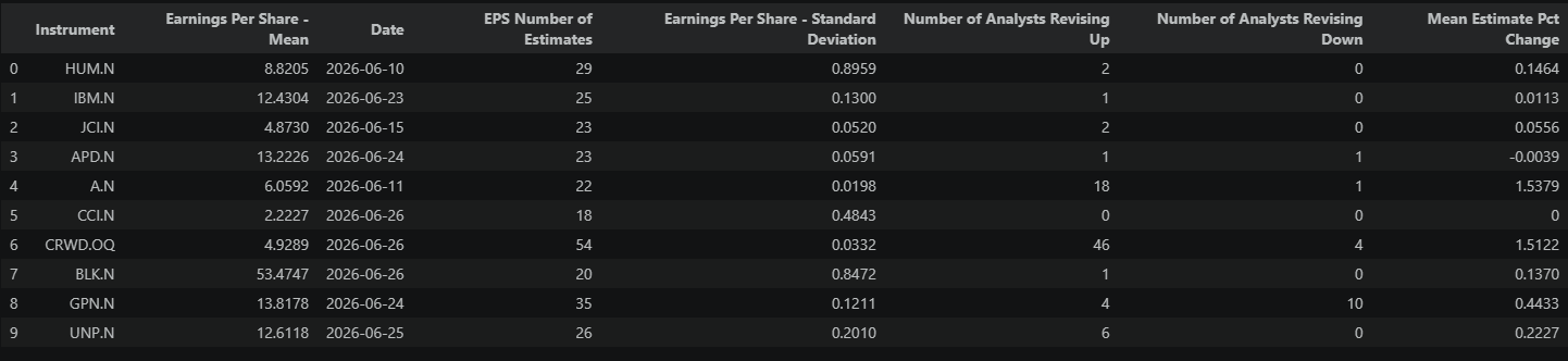
print(f"Estimates retrieved for {len(estimates_df)} instruments...sample of 10 rows:")
estimates_df.head(10)
Estimates retrieved for 503 instruments...sample of 10 rows:
# Clean and compute revision metrics
estimates_df.columns = ["Instrument", "EPS_Mean", "EPS_Date", "Num_Estimates",
"EPS_StdDev", "Rev_Up", "Rev_Down", "EPS_Change_Pct"]
# Drop rows with insufficient data
estimates_clean = estimates_df.dropna(subset=["EPS_Mean", "Rev_Up", "Rev_Down", "Num_Estimates"]).copy()
# Compute revision metrics
estimates_clean["Rev_Total"] = estimates_clean["Rev_Up"] + estimates_clean["Rev_Down"]
estimates_clean["Rev_Net"] = estimates_clean["Rev_Up"] - estimates_clean["Rev_Down"]
# Analyst Conviction Score: net revisions normalized by total analyst coverage
# Range: -1 (all analysts cut) to +1 (all analysts raise)
# Score of 0 = no net revision activity relative to coverage
estimates_clean["Analyst_Conviction"] = estimates_clean["Rev_Net"] / estimates_clean["Num_Estimates"].replace(0, np.nan)
# Coefficient of variation — dispersion relative to mean
estimates_clean["EPS_CV"] = estimates_clean["EPS_StdDev"] / estimates_clean["EPS_Mean"].abs().replace(0, np.nan)
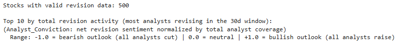
print(f"Stocks with valid revision data: {len(estimates_clean)}")
print(f"\nTop 10 by total revision activity (most analysts revising in the {REVISION_WINDOW} window):")
print(f"(Analyst_Conviction: net revision sentiment normalized by total analyst coverage)")
print(f" Range: -1.0 = bearish outlook (all analysts cut) | 0.0 = neutral | +1.0 = bullish outlook (all analysts raise)")
estimates_clean[["Instrument", "Num_Estimates", "Rev_Up", "Rev_Down", "Rev_Total", "Analyst_Conviction",
"EPS_Mean", "EPS_Change_Pct"]].nlargest(10, "Rev_Total")
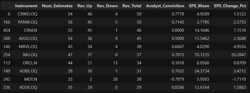
The table above shows each stock's raw revision activity — the two columns to focus on are Analyst_Conviction (net revision sentiment normalized by total analyst coverage, -1 to +1) and EPS_Change_Pct (how much the consensus actually moved). These numbers only become meaningful once we see how they compare across the full universe.
2. Visualizing the Revision Landscape
What we're doing: Putting the individual stock numbers from above into context — an Analyst_Conviction score of +0.80 means very different things depending on what's typical across the universe right now.
Why it matters: If everyone is being upgraded, then a single stock's upgrade is less special. We need to know the baseline to spot the true outliers.
# Histogram of analyst conviction across the universe
fig = px.histogram(
estimates_clean,
x="Analyst_Conviction",
nbins=30,
title="Distribution of Analyst Conviction Scores — S&P 500",
labels={"Analyst_Conviction": "Analyst Conviction"}
)
# Add reference lines: neutral baseline and median
median_conviction = estimates_clean["Analyst_Conviction"].median()
fig.add_vline(
x=0,
line_dash="dash",
line_color="gray",
annotation_text="Neutral (0)",
annotation_position="top"
)
fig.add_vline(
x=median_conviction,
line_dash="dot",
line_color="orange",
annotation_text=f"Median: {median_conviction:.3f}",
annotation_position="top"
)
fig.update_layout(
xaxis_title="Analyst Conviction: Bullish Outlook to Bearish Outlook\n(-1.0 = bearish, all analysts cut | 0.0 = neutral | +1.0 = bullish, all analysts raise)",
yaxis_title="Number of Stocks",
bargap=0.1
)
fig.show()
# Summary statistics
print(f"\nUniverse analyst conviction summary:")
print(f" Median conviction score: {median_conviction:.6f}")
print(f" Mean conviction score: {estimates_clean['Analyst_Conviction'].mean():.6f}")
print(f" Strongly bullish (> +0.50): {(estimates_clean['Analyst_Conviction'] > 0.50).sum()}")
print(f" Strongly bearish (< -0.50): {(estimates_clean['Analyst_Conviction'] < -0.50).sum()}")
print(f" Neutral (-0.20 to +0.20): {((estimates_clean['Analyst_Conviction'] >= -0.20) & (estimates_clean['Analyst_Conviction'] <= 0.20)).sum()}")
print(f" Stocks with zero net revisions: {(estimates_clean['Analyst_Conviction'] == 0.0).sum()}")
print(f" Stocks with no revisions: {estimates_clean['Analyst_Conviction'].isna().sum()}")
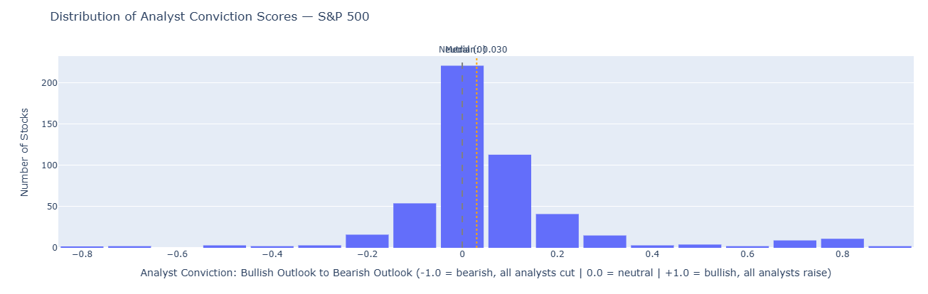
Reading the chart: If the histogram is bunched to the right (median above 0.5), the market is in a broad upgrade cycle — analysts are generally optimistic. If it's bunched to the left, estimates are being cut across the board. A flat or two-humped shape means the market is split — some sectors thriving, others struggling.
This context matters: a stock with 80% upward revisions is less remarkable when the whole market is being revised up than when the average stock is mixed.
3. Price Momentum: Measuring What the Market Already Knows
What we're doing: Checking how each stock has actually traded recently — did the price already move, or is it sitting still?
Why it matters: Knowing that analysts are upgrading a stock is only half the picture. If the stock already rallied 15% in anticipation, the "news" may already be in the price. We need to compare the revision signal against what the market has actually done.
We compute three things from daily price data:
- 1-month return (%) — has the stock moved in the short term?
- 3-month return (%) — is there a broader trend?
- Volume spike — is trading activity above normal? (This hints at whether big investors are acting on the same signal.)
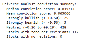
# Retrieve historical prices for the universe
instruments = estimates_clean["Instrument"].tolist()
price_history = ld.get_history(
universe=instruments,
fields=["TRDPRC_1", "ACVOL_UNS"],
interval="daily",
count=MOMENTUM_DAYS_LONG + 5 # A few extra days for buffer
)
print(f"Price history shape: {price_history.shape}")
price_history.head()
Price history shape: (65, 1004)
# Compute momentum metrics from price history
def compute_momentum(df, instrument_col="Instrument"):
"""Compute short and medium-term returns and volume metrics."""
results = []
# Handle multi-level column structure from get_history
if isinstance(df.columns, pd.MultiIndex):
instruments_in_data = df.columns.get_level_values(0).unique()
else:
instruments_in_data = [df.columns[0]] # Single instrument fallback
for inst in instruments_in_data:
try:
if isinstance(df.columns, pd.MultiIndex):
close = df[(inst, "TRDPRC_1")].dropna()
volume = df[(inst, "ACVOL_UNS")].dropna()
else:
close = df["TRDPRC_1"].dropna()
volume = df["ACVOL_UNS"].dropna()
if len(close) < MOMENTUM_DAYS:
continue
# Returns in percent terms
ret_short_pct = (close.iloc[-1] / close.iloc[-MOMENTUM_DAYS] - 1) * 100
ret_medium_pct = (close.iloc[-1] / close.iloc[0] - 1) * 100 if len(close) >= MOMENTUM_DAYS_LONG else np.nan
# Volume ratio: recent 5-day average vs immediately preceding baseline window.
# This avoids global drift bias that can occur with full-sample averages.
if len(volume) >= 10:
vol_recent = volume.iloc[-5:].mean()
baseline_window = volume.iloc[-(MOMENTUM_DAYS + 5):-5]
if len(baseline_window) >= 5:
vol_baseline = baseline_window.median()
else:
vol_baseline = volume.iloc[:-5].median() if len(volume.iloc[:-5]) > 0 else np.nan
vol_ratio = vol_recent / vol_baseline if pd.notna(vol_baseline) and vol_baseline > 0 else np.nan
else:
vol_ratio = np.nan
results.append({
"Instrument": inst,
"Return_Short_Pct": ret_short_pct,
"Return_Medium_Pct": ret_medium_pct,
"Volume_Ratio": vol_ratio,
"Last_Close": close.iloc[-1]
})
except (KeyError, IndexError):
continue
return pd.DataFrame(results)
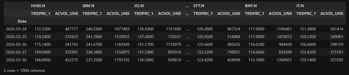
momentum_df = compute_momentum(price_history)
print(f"Momentum computed for {len(momentum_df)} instruments...looking at the top 10 rows:")
momentum_df.head(10)
Momentum computed for 502 instruments...looking at the top 10 rows:
The key columns here are Return_Short_Pct (1-month price move, in %) and Return_Medium_Pct (3-month price move, in %). Scan for extremes in both directions — a stock up 25% in a month has already moved aggressively, while one sitting near zero has been quiet despite whatever analysts may be saying. The Volume_Ratio indicates unusual trading activity: a value above 1.0 means recent volume is running hotter than normal. In the next section, we merge this with the revision data to find where the two stories don't match.
4. Combining Revisions and Momentum
What we're doing: Putting the analyst revision data and price data side by side for each stock, then measuring where they disagree.
Why it matters: The core idea behind this screen is simple: if analysts are upgrading a stock but the price hasn't moved yet, the market may not have caught up. That gap — between what analysts see and what the price reflects — is the opportunity we're trying to measure. The wider the gap, the bigger the potential disconnect.
The direction of the gap matters:
- A large positive divergence points toward a potential buy investigation — analysts are getting more bullish, but the price hasn't reacted. If they're right, the price should eventually catch up.
- A large negative divergence points toward a potential sell or reduce investigation — the stock is strong, but analysts are cutting numbers. If they're right, the price may be overextended.
In both cases, a high magnitude isn't a trade signal — it's a reason to look closer. The screen finds the disconnect; your job is to figure out whether the market is slow or right.
To compare revision activity and price movement fairly, we convert both into z-scores — a way of saying "how unusual is this stock compared to the rest of the universe?" A z-score of +2 means "well above average"; -2 means "well below." This puts revision strength and price strength on the same scale, even though one is measured in percentages and the other in analyst counts.
# Merge estimates and momentum
combined = estimates_clean.merge(momentum_df, on="Instrument", how="inner")
print(f"Combined dataset: {len(combined)} stocks with both estimate and price data")
print(f"Ranked by Divergence (Revision Score − Momentum Score) — full universe ({len(combined)} rows):")
# Standardize key metrics into z-scores
combined["Conviction_Z"] = stats.zscore(combined["Analyst_Conviction"].fillna(0))
combined["Return_Short_Z"] = stats.zscore(combined["Return_Short_Pct"].fillna(0))
combined["Return_Medium_Z"] = stats.zscore(combined["Return_Medium_Pct"].fillna(0))
# Revision score: how strongly is this stock being revised relative to peers?
combined["Revision_Score"] = combined["Conviction_Z"]
# Composite momentum score: blend of short and medium term
combined["Momentum_Score"] = (combined["Return_Short_Z"] * 0.6 + combined["Return_Medium_Z"] * 0.4)
# Divergence: revision signal minus price reaction
# Positive = estimates improving faster than price (potential opportunity)
# Negative = price running ahead of (or despite) estimate deterioration
combined["Divergence"] = combined["Revision_Score"] - combined["Momentum_Score"]
# Show how divergence scores are distributed across the universe
div = combined["Divergence"]
print(f"\nDivergence distribution ({len(combined)} stocks):")
print(f" > 2.0: {(div >= 2.0).sum():>3} (extreme positive)")
print(f" 1.0 to 2.0: {((div >= 1.0) & (div < 2.0)).sum():>3} (significant positive)")
print(f" 0.5 to 1.0: {((div >= 0.5) & (div < 1.0)).sum():>3} (moderate positive)")
print(f" -0.5 to 0.5: {((div >= -0.5) & (div < 0.5)).sum():>3} (minimal)")
print(f" -1.0 to -0.5: {((div >= -1.0) & (div < -0.5)).sum():>3} (moderate negative)")
print(f" -2.0 to -1.0: {((div >= -2.0) & (div < -1.0)).sum():>3} (significant negative)")
print(f" < -2.0: {(div < -2.0).sum():>3} (extreme negative)")
print(f"\nFull ranked table by Divergence:")
combined[["Instrument", "Analyst_Conviction", "EPS_Change_Pct", "Return_Short_Pct",
"Revision_Score", "Momentum_Score", "Divergence"]].sort_values(
"Divergence", ascending=False).reset_index(drop=True)
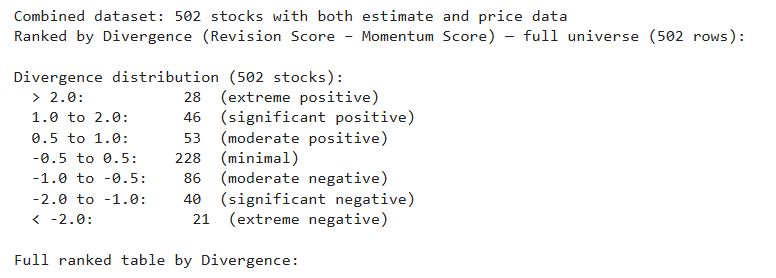
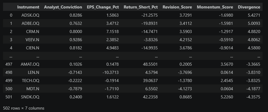
The Divergence column is the one to focus on. The sign tells you the direction; the magnitude tells you how wide the gap is:
| Divergence | Magnitude |
|---|---|
| < ±0.5 | Minimal — revisions and price roughly agree |
| ±0.5 to ±1.0 | Moderate — noticeable gap, but common |
| ±1.0 to ±2.0 | Significant — clear disagreement worth investigating |
| > ±2.0 | Extreme — among the largest mismatches in the universe |
Next, we plot the full universe to see where all 500 stocks land on this spectrum.
5. The Divergence Map
What we're doing: Plotting every stock on a chart where the x-axis is analyst revision stance (more bullish vs more bearish) and the y-axis is how much the price has moved. Stocks far from the diagonal are the mismatches.
How to read the chart:
Imagine a diagonal line from bottom-left to top-right. Stocks on that line are "in sync" — price movement is broadly aligned with analyst revisions. The interesting stocks are off that line:
| Position | What it means | Interpretation |
|---|---|---|
| Lower-right | Analysts upgrading, price flat/down | Key signal: bullish revisions, weak price response |
| Upper-left | Price rallying, estimates flat/down | Market may be ahead of itself — possible risk |
| Upper-right | Both positive | Strong confirming momentum |
| Lower-left | Both negative | Confirming downtrend |
# Scatter plot: Revision Score vs Momentum Score
fig = px.scatter(
combined,
x="Revision_Score",
y="Momentum_Score",
hover_name="Instrument",
hover_data=["Divergence", "Analyst_Conviction", "Return_Short_Pct"],
color="Divergence",
color_continuous_scale="RdYlGn",
color_continuous_midpoint=0,
title="Where Analyst Revisions and Price Momentum Disagree — S&P 500",
labels={
"Revision_Score": "Revision Score (z-scored)",
"Momentum_Score": "Momentum Score (z-scored)",
"Divergence": "Divergence"
}
)
# Custom hover template: clean, focused, 2 decimals
fig.update_traces(
hovertemplate="<b>%{hovertext}</b><br>" +
"Divergence: %{customdata[0]:.2f}<br>" +
"Analyst Conviction: %{customdata[1]:.2f}<br>" +
"Price Return (1mo): %{customdata[2]:.2f}%<br>" +
"<extra></extra>"
)
# Add diagonal reference line (no divergence)
axis_range = [-3, 3]
fig.add_trace(go.Scatter(
x=axis_range, y=axis_range,
mode="lines",
line=dict(dash="dash", color="gray", width=1),
showlegend=False,
hoverinfo="skip"
))
# Add quadrant lines
fig.add_hline(y=0, line_dash="dot", line_color="lightgray")
fig.add_vline(x=0, line_dash="dot", line_color="lightgray")
fig.update_layout(
template="plotly_white",
width=800,
height=650
)
fig.show()
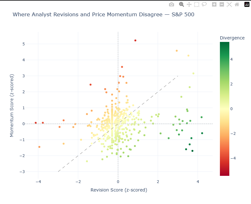
Core takeaway: This matrix chart is the visual representation of the Divergence score you ranked in the previous section. It compares analyst revision strength to price momentum and highlights where they disagree.
What each metric means:
- Revision_Score (x-axis): Positive = above the universe average revision score. Negative = below the universe average revision score.
- Momentum_Score (y-axis): Positive = above the universe average momentum score. Negative = below the universe average momentum score.
- Divergence: Revision_Score − Momentum_Score.
- Positive Divergence (green): analysts stronger than price action.
- Negative Divergence (red): price stronger than analyst revisions.
What to focus on first:
- Divergence magnitude (absolute value): farther from 0 = bigger disagreement.
- Position vs diagonal line: on the line = signals aligned; far off the line = mismatch.
- Quadrant context:
- Lower-right: bullish analysts, weak price (key signal)
- Upper-left: bearish analysts, strong price (risk signal)
Quick example:
If a stock shows Divergence = +2.1, analysts are materially more bullish than price momentum suggests. That is a high-priority item for follow-up research.
6. Surfacing Divergence Extremes
What we're doing: Pulling out the stocks with the largest mismatches — the strongest positive and negative divergence names.
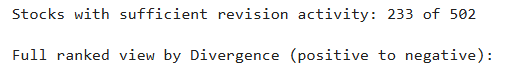
We then apply a quality filter to reduce noise:
- At least 5 analysts publish estimates for the stock (analyst coverage baseline).
- At least 3 analysts revised those estimates within the selected revision window.
In plain terms: a stock must have broad enough analyst coverage, and at least a meaningful subset of those analysts must have changed their forecasts recently.
# Filter for meaningful signals (avoid noise from low-revision-activity stocks)
actionable = combined[
(combined["Rev_Total"] >= 3) & # At least 3 revisions in the window
(combined["Num_Estimates"] >= 5) # Reasonable analyst coverage
].copy()
# Add sector context directly to Chapter 6 output
try:
sector_data = ld.get_data(
universe=actionable["Instrument"].tolist(),
fields=["TR.TRBCEconomicSector"]
)
sector_data.columns = ["Instrument", "Sector"]
actionable = actionable.merge(sector_data, on="Instrument", how="left")
except Exception:
actionable["Sector"] = pd.NA
print(f"Stocks with sufficient revision activity: {len(actionable)} of {len(combined)}")
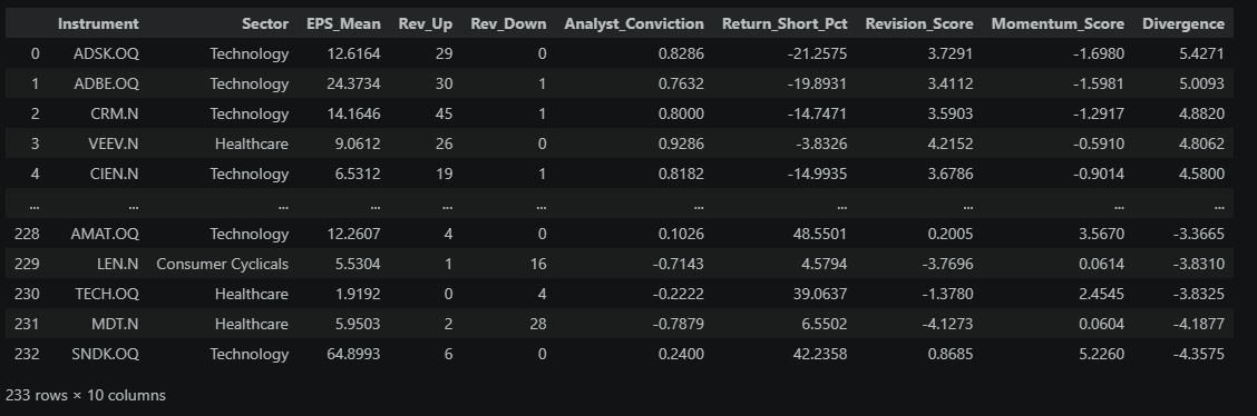
print(f"\nFull ranked view by Divergence (positive to negative):")
divergence_ranked = actionable[[
"Instrument", "Sector", "EPS_Mean", "Rev_Up", "Rev_Down", "Analyst_Conviction",
"Return_Short_Pct", "Revision_Score", "Momentum_Score", "Divergence"
]].sort_values("Divergence", ascending=False).reset_index(drop=True)
divergence_ranked
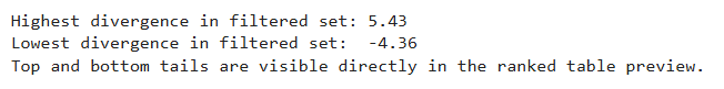
# Optional quick check: extremes from both tails
print(f"Highest divergence in filtered set: {divergence_ranked['Divergence'].max():.2f}")
print(f"Lowest divergence in filtered set: {divergence_ranked['Divergence'].min():.2f}")
print("Top and bottom tails are visible directly in the ranked table preview.")
How to read this ranked table:
- The table is sorted from highest to lowest Divergence.
- The top rows are the strongest positive divergences: analysts are getting more bullish, but price has lagged.
- The bottom rows are the strongest negative divergences: price is strong while analysts are cutting estimates.
Important: This is not a buy/sell list. It is a prioritization list of mismatch extremes — a focused set of names where analyst revisions and price action are most out of sync and worth deeper follow-up.
7. Deep Dive: Revision Trajectory for Top Ideas
What we're doing: For the top-ranked stocks, we look at how the consensus estimate has moved week by week over the past 3 months.
Why it matters: A single snapshot only tells you where estimates are now. The trajectory tells you whether they're still rising (good — the shift is ongoing) or whether they spiked once and flattened (less compelling — it might already be old news).
# Retrieve estimate history for the top 5 positive divergence stocks
top_5_instruments = divergence_ranked["Instrument"].head(5).tolist()
# Get weekly mean estimates over the past 12 weeks
estimate_history_fields = ["TR.EPSMean", "TR.EPSMean.Date"]
estimate_histories = []
for inst in top_5_instruments:
try:
hist = ld.get_data(
universe=inst,
fields=estimate_history_fields,
parameters={
"Period": REVISION_PERIOD,
"SDate": "-12W",
"EDate": "0",
"Frq": "W"
}
)
if hist is not None and len(hist) > 0:
hist["Instrument_Label"] = inst
estimate_histories.append(hist)
except Exception:
continue
if estimate_histories:
all_histories = pd.concat(estimate_histories, ignore_index=True)
print(f"Retrieved estimate history for {len(estimate_histories)} instruments")
all_histories.head()
Retrieved estimate history for 5 instruments
# Visualize estimate trajectory for top positive divergences
if estimate_histories:
# Find EPS and date columns dynamically (column names can vary by API response)
value_cols = [c for c in all_histories.columns if c not in ["Instrument", "Instrument_Label"]]
eps_col = next(c for c in value_cols if "date" not in c.lower())
date_col = next((c for c in value_cols if "date" in c.lower()), None)
plot_df = all_histories.copy()
hover_data = {}
# Keep a sequential x-axis to visually separate each stock's weekly path
# while still showing the true snapshot date on hover.
if date_col:
plot_df[date_col] = pd.to_datetime(plot_df[date_col], errors="coerce")
plot_df = plot_df.sort_values(["Instrument_Label", date_col]).reset_index(drop=True)
hover_data[date_col] = "|%Y-%m-%d"
else:
plot_df = plot_df.reset_index(drop=True)
plot_df["Weekly_Measure"] = plot_df.index + 1
fig = px.line(
plot_df,
x="Weekly_Measure",
y=eps_col,
color="Instrument_Label",
title="Consensus EPS Trajectory — Top Positive Divergences (12 Weeks)",
labels={
eps_col: "Mean EPS Estimate",
"Instrument_Label": "Stock",
"Weekly_Measure": "Weekly Measures"
},
hover_data=hover_data,
markers=True
)
# Hide numeric x-axis scale to avoid implying a time-continuous axis (e.g., 0-60).
fig.update_xaxes(showticklabels=False)
# Keep hover focused on stock/date/estimate, not plotting index.
fig.update_traces(
hovertemplate="Stock=%{fullData.name}<br>Snapshot Date=%{customdata[0]|%Y-%m-%d}<br>Mean EPS Estimate=%{y:.4f}<extra></extra>" if date_col
else "Stock=%{fullData.name}<br>Mean EPS Estimate=%{y:.4f}<extra></extra>"
)
fig.update_layout(
template="plotly_white",
legend=dict(yanchor="top", y=0.99, xanchor="left", x=0.01)
)
fig.show()
else:
print("No estimate history available for visualization.")
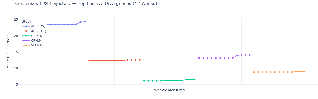
What to look for:
- This chart shows a group of instruments (for example, 5 stocks). Each colored line is one stock from the legend, so you are reading several lines in parallel, not a single series.
- Each marker is one weekly snapshot of that stock's consensus mean EPS estimate. Different stocks can have different numbers of markers if one or more weekly snapshots are missing.
- The x-axis (Weekly Measures) is a sequential plotting index used for readability (to keep the lines visually separated). It is not a shared calendar timeline across stocks.
- The y-axis is the EPS estimate value at each snapshot.
- Hover over any marker to see the stock and its actual snapshot date.
Then focus on line shape within each stock: a steady, rising path means analysts are upgrading over time (typically stronger conviction). A single jump that then flattens may be one analyst catching up. In general, steeper and more recent upward moves are more timely signals.
8. Adding Context: Sector Breakdown
What we're doing: Checking whether the divergences we found are concentrated in specific sectors or spread across the market.
Why it matters: Sometimes an entire sector gets upgraded at once (e.g., chip stocks after a strong demand report). If your top picks are all from one sector, you might just be seeing a sector rotation, not a stock-specific insight. Ideally, you want names that stand out even within their own sector.
# Retrieve sector classification for context (reuse Chapter 6 sector when available)
actionable_with_sector = actionable.copy()
if "Sector" not in actionable_with_sector.columns:
sector_data = ld.get_data(
universe=actionable_with_sector["Instrument"].tolist(),
fields=["TR.TRBCEconomicSector"]
)
sector_data.columns = ["Instrument", "Sector"]
actionable_with_sector = actionable_with_sector.merge(sector_data, on="Instrument", how="left")
else:
missing_sector_mask = actionable_with_sector["Sector"].isna()
if missing_sector_mask.any():
sector_data = ld.get_data(
universe=actionable_with_sector.loc[missing_sector_mask, "Instrument"].tolist(),
fields=["TR.TRBCEconomicSector"]
)
sector_data.columns = ["Instrument", "Sector"]
actionable_with_sector = actionable_with_sector.merge(
sector_data,
on="Instrument",
how="left",
suffixes=("", "_new")
)
actionable_with_sector["Sector"] = actionable_with_sector["Sector"].fillna(
actionable_with_sector["Sector_new"]
)
actionable_with_sector = actionable_with_sector.drop(columns=["Sector_new"])
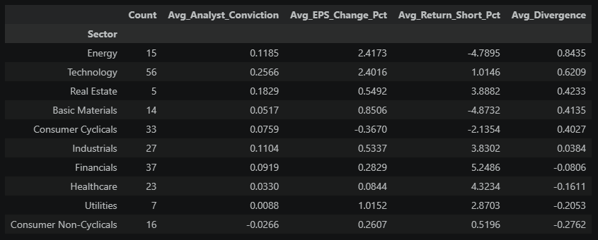
# Sector-level revision and momentum averages
sector_summary = actionable_with_sector.groupby("Sector").agg(
Count=("Instrument", "count"),
Avg_Analyst_Conviction=("Analyst_Conviction", "mean"),
Avg_EPS_Change_Pct=("EPS_Change_Pct", "mean"),
Avg_Return_Short_Pct=("Return_Short_Pct", "mean"),
Avg_Divergence=("Divergence", "mean")
).sort_values("Avg_Divergence", ascending=False)
sector_summary
# Visualize sector divergences
fig = px.bar(
sector_summary.reset_index(),
x="Sector",
y="Avg_Divergence",
color="Avg_Divergence",
color_continuous_scale="RdYlGn",
color_continuous_midpoint=0,
hover_data={"Count": True, "Avg_Analyst_Conviction": ":.2f", "Avg_Return_Short_Pct": ":.1f"},
title="Average Revision-Momentum Divergence by Sector",
labels={"Avg_Divergence": "Avg Divergence Score", "Count": "Stocks in Sector"}
)
fig.update_layout(
template="plotly_white",
xaxis_tickangle=-45
)
fig.show()
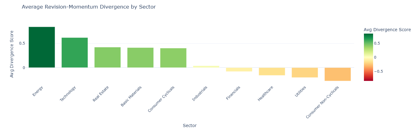
Reading this chart: Each bar shows the average divergence score for all stocks in that sector. The sectors are sorted from most positive (left) to most negative (right), and the color reinforces the direction (green = positive, red = negative).
- Green bars (positive average): Analysts across the sector are broadly upgrading estimates, but prices haven't kept pace. The sector as a whole may be undervalued relative to improving fundamentals.
- Red bars (negative average): Prices across the sector are strong, but analysts are cutting numbers. The sector may be running ahead of its earnings trajectory.
- Bars near zero: This doesn't necessarily mean consistency — it means the average is balanced. A sector near zero could contain stocks that are all genuinely in sync, or it could contain a mix of large positive and large negative divergences that cancel each other out. The sector summary table above lets you check the count and decide.
The practical takeaway: If your top picks from Section 6 are concentrated in a sector with a large green bar, part of what you're seeing may be sector-wide momentum rather than a company-specific story. The most differentiated ideas are stocks that stand out even relative to their own sector's average.
9. Volume Confirmation
What we're doing: Using trading volume to confirm whether the divergence signal is attracting real market participation. In simple terms, we're checking if stocks with strong analyst-vs-price mismatch are also trading more actively than the current market norm.
Why it matters: In the Section 5 divergence map, our main focus is the right side of the chart (positive divergence), especially the lower-right region where analysts are improving but price momentum is still weak. That's the mismatch we care most about here.
Volume tells us whether that mismatch is getting real market traction: if relative volume is high, participation is broadening and a repricing may be underway; if relative volume is low, the signal may still be early or not yet confirmed.
# Scatter: Divergence vs Volume Ratio for actionable names
plot_data = actionable.copy()
# Ensure Volume_Ratio is present on the plotting frame.
if "Volume_Ratio" not in plot_data.columns:
plot_data = plot_data.merge(
momentum_df[["Instrument", "Volume_Ratio"]],
on="Instrument",
how="left"
)
# Volume-ratio sanity diagnostics
vol_actionable = plot_data["Volume_Ratio"].dropna()
vol_combined = combined["Volume_Ratio"].dropna() if "Volume_Ratio" in combined.columns else pd.Series(dtype=float)
universe_median_ratio = vol_combined.median() if len(vol_combined) > 0 else 1.0
if len(vol_combined) > 0:
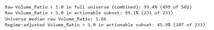
print(
f"Raw Volume_Ratio > 1.0 in full universe (combined): "
f"{(vol_combined > 1.0).mean() * 100:.1f}% "
f"({(vol_combined > 1.0).sum()} of {len(vol_combined)})"
)
print(
f"Raw Volume_Ratio > 1.0 in actionable subset: "
f"{(vol_actionable > 1.0).mean() * 100:.1f}% "
f"({(vol_actionable > 1.0).sum()} of {len(vol_actionable)})"
)
print(
f"Universe median raw Volume_Ratio: {universe_median_ratio:.2f}"
)
# Regime-adjusted ratio: 1.0 means "at universe median volume regime".
plot_data["Volume_Ratio_RegimeAdj"] = plot_data["Volume_Ratio"] / universe_median_ratio
vol_actionable_regime = plot_data["Volume_Ratio_RegimeAdj"].dropna()
print(
f"Regime-adjusted Volume_Ratio > 1.0 in actionable subset: "
f"{(vol_actionable_regime > 1.0).mean() * 100:.1f}% "
f"({(vol_actionable_regime > 1.0).sum()} of {len(vol_actionable_regime)})"
)
fig = px.scatter(
plot_data,
x="Divergence",
y="Volume_Ratio_RegimeAdj",
hover_name="Instrument",
hover_data={
"Analyst_Conviction": ":.2f",
"Return_Short_Pct": ":.2f",
"Volume_Ratio": ":.2f",
"Volume_Ratio_RegimeAdj": False
},
color="Divergence",
color_continuous_scale="RdYlGn",
color_continuous_midpoint=0,
title="Divergence vs. Volume Confirmation (Regime-Adjusted)",
labels={
"Divergence": "Revision-Momentum Divergence",
"Volume_Ratio_RegimeAdj": "Volume Ratio vs Universe Median"
}
)
# Match Chapter 5 hover style: concise fields, rounded values, no extra trace info.
fig.update_traces(
hovertemplate="<b>%{hovertext}</b><br>" +
"Divergence: %{x:.2f}<br>" +
"Volume vs Universe Median: %{y:.2f}<br>" +
"Raw Recent/Average Volume Ratio: %{customdata[2]:.2f}<br>" +
"Analyst Conviction: %{customdata[0]:.2f}<br>" +
"Price Return (1mo): %{customdata[1]:.2f}%<br>" +
"<extra></extra>"
)
fig.add_hline(y=1.0, line_dash="dash", line_color="gray",
annotation_text="Universe-median volume regime")
fig.update_layout(template="plotly_white", width=800, height=500)
fig.show()
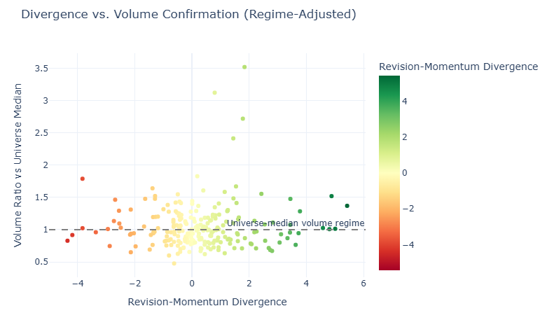
What you're looking at: Each dot is a stock from the Chapter 6 actionable list. The x-axis is its divergence score (how much the revision signal and price disagree), and the y-axis is a regime-adjusted volume ratio (the stock's raw volume ratio divided by the universe median ratio). The dashed line at 1.0 marks the current universe median volume regime: dots above it are trading with stronger-than-median participation for this market environment. The color matches divergence direction from earlier sections: green = positive divergence, red = negative.
Why this adjustment is useful: In some weeks, raw recent/average volume can be elevated for most stocks at once (a market-wide regime shift). Regime adjustment keeps the chart interpretable by showing relative participation instead of only absolute >1.0 readings.
How to read the right side (positive divergence):
- Top-right (x > 0, momentum also strong): analysts and price are both supportive; high relative volume is confirmation but may indicate less valuation gap.
- Lower-right (x > 0, momentum weak): analysts are improving while price lags; high relative volume is the key "catch-up may be starting" signal.
Best case for discovery: Lower-right with elevated relative volume, because it combines revision strength, lagging price, and improving participation.
Interesting edge case: High positive divergence with low relative volume can still work, but conviction is lower because the market has not clearly engaged yet.
10. Putting It Together: The Weekly Screen Output
What we're doing: Combining everything into a single ranked list — the notebook's final deliverable.
The composite score blends two factors: (1) how strong the revision-vs-price mismatch is (70% weight), and (2) whether regime-adjusted volume confirms participation (30% weight). This keeps the ranking aligned with Section 9, where volume is interpreted relative to the current market-wide volume regime.
# Composite signal: prioritize high divergence with regime-adjusted volume confirmation
screen_output = actionable.copy()
# Ensure Volume_Ratio is present on the final scoring frame.
if "Volume_Ratio" not in screen_output.columns:
screen_output = screen_output.merge(
momentum_df[["Instrument", "Volume_Ratio"]],
on="Instrument",
how="left"
)
# Regime adjustment baseline from the full universe used in scoring.
vol_combined = combined["Volume_Ratio"].dropna() if "Volume_Ratio" in combined.columns else pd.Series(dtype=float)
universe_median_ratio = vol_combined.median() if len(vol_combined) > 0 else 1.0
# Convert raw volume ratio to a regime-relative measure.
screen_output["Volume_Ratio_RegimeAdj"] = screen_output["Volume_Ratio"] / universe_median_ratio
# Normalize regime-adjusted volume to z-score.
screen_output["Volume_Regime_Z"] = stats.zscore(screen_output["Volume_Ratio_RegimeAdj"].fillna(1.0))
# Composite score: divergence + relative volume confirmation bonus.
screen_output["Composite_Score"] = (
screen_output["Divergence"] * 0.7 +
screen_output["Volume_Regime_Z"].clip(0, None) * 0.3 # Only reward above-regime participation
)
# Final ranked output
weekly_screen = screen_output.nlargest(TOP_N, "Composite_Score")[[
"Instrument", "Sector", "EPS_Mean", "Analyst_Conviction", "Return_Short_Pct",
"Volume_Ratio", "Volume_Ratio_RegimeAdj", "Divergence", "Composite_Score"
]].reset_index(drop=True)
weekly_screen.index = weekly_screen.index + 1 # 1-based rank
weekly_screen.index.name = "Rank"
print(f"{'='*80}")
print(f"WEEKLY SCREEN: Top {TOP_N} Stocks — Estimate Revisions + Price Momentum")
print(f"Run date: {pd.Timestamp.now().strftime('%Y-%m-%d')}")
print(f"Universe: {UNIVERSE} | Period: {REVISION_PERIOD} | Revision window: {REVISION_WINDOW}")
print(f"Volume regime baseline (universe median raw ratio): {universe_median_ratio:.2f}")
print(f"{'='*80}")
weekly_screen
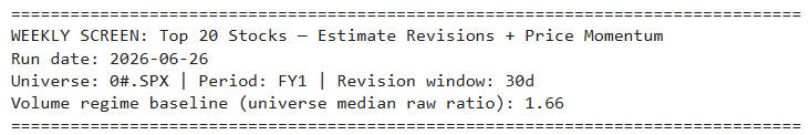
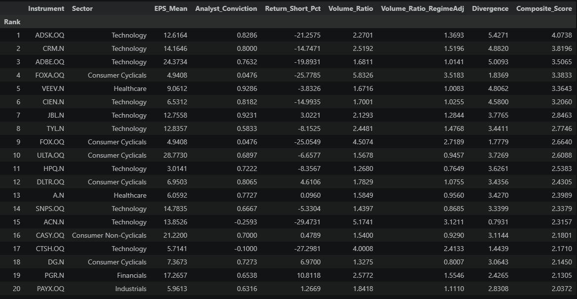
What to do with this table: These are the stocks most worth investigating this week. For each name:
- Open it in Workspace — read the latest broker notes. What's driving the upgrades?
- Check breadth — is the revision ratio driven by many analysts or just a few? (Cross-reference with the Section 6 tables for Rev_Up / Rev_Down counts.)
- Check the timeline — did the revisions just happen, or are they weeks old?
- Form a view — does the mismatch make sense, or is there a reason the market hasn't reacted?
This is a screening tool, not a trading model. It narrows 500 stocks down to ~20 that deserve your time.
11. Extending the Workflow
This notebook shows the core idea, but it's designed to be a starting point. Some natural next steps:
| Extension | What it does | When to use it |
|---|---|---|
| Revenue estimates | Replace EPS with TR.RevenueMean | For high-growth companies where top-line matters more |
| Multi-period (FY1 + FY2) | Check if both this year and next year are being upgraded | Separates one-time beats from structural re-ratings |
| Sector-relative scoring | Score each stock vs. its own sector, not the whole index | Removes sector rotation noise |
| Volume regime calibration | Replace a single baseline with rolling percentiles or long-run ADV comparisons | Useful when market-wide volume regimes shift quickly |
| Estimate convergence | Flag stocks where analyst disagreement is shrinking | A narrowing range often precedes a decisive price move |
| Earnings date overlay | Add TR.EventStartDate with EventType=RES parameter | Time the screen around upcoming catalysts |
| Historical tracking | Save weekly outputs (including regime-adjusted volume and composite score) and measure subsequent returns | Test whether the signal actually predicts performance |
The same I/B/E/S fields work across 20,000+ stocks globally with decades of history — swap in a different universe and the entire workflow adapts without changing a line of logic.
Summary: When analysts change their earnings forecasts, it's one of the clearest signals that something fundamental has shifted at a company. But the stock price doesn't always react right away. This notebook exploits that gap — combining I/B/E/S revision data with price momentum to find stocks where the analyst view and the market view disagree. The output is a weekly watchlist of names worth investigating: stocks being upgraded that haven't moved yet, and stocks rallying despite deteriorating fundamentals. It's a repeatable, data-driven workflow that turns a 500-stock universe into a focused list of 20 ideas.
- Register or Log in to applaud this article
- Let the author know how much this article helped you